- Our College
- Academics
- Student Services
- Public Reports
- Forum
- Library
- Quick Access
The College of Micronesia-FSM specifies Graphics Standards to maintain consistency and quality in its image to its stakeholders and the public at large. The Graphics Standards will:
The Graphic Standard defines the use of the college seal, the official colors of the college, the type of fonts and sizes to be used in publications, and the college's photo policy.
All graphics and templates discussed in this manual can be found on the college's website at http://www.comfsm.fm/?q=publication-standards.
The seal of the College of Micronesia-FSM is as shown and cannot be altered in any way. It must be used in a size at least 1.5 inches across.
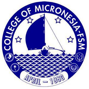
The seal of the College of Micronesia-FSM is a circular graphic with elements that symbolize different aspects of the college and the region it serves. These elements consist of the following:
When printed in color, the college seal must be in COM-FSM Blue and COM-FSM White (official college colors are defined on page 8 of this manual). Use of the college seal in black and white (where all the COM-FSM Blue is replaced with black) is permissible for internal documents in which the seal is copied or scanned.
Dry Seal -transcript Gold
Certificate of enrollment, SS, dry seal...EMBOSS
For print material always use a high definition version of the seal. When printing the seal,
resolution of 150 dpi or higher. This level of resolution will prevent the seal from being pixelated or blurred during the print process.The official college letterhead will adhere to the style guidelines to render it an official document. Communications printed on college letterhead can only be official if it meets the requirements described in this style guide. Copies of official memos are deemed copies and do not carry official bearing.
A template of the letterhead is available via the college’s website in such manner that the user will be able to alter the contact information and the office/department name. See Figure 2 on the following page for an example of the letterhead.
The letterhead will:
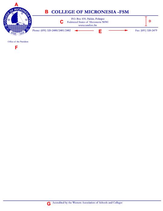
Figure 2. An Example of COM-FSM Letterhead.
COM-FSM specifies two official colors for use in its publications. The table below defines these colors in terms of values in the various color systems.
| Color | Pantone | WEB | CMYK | RGB | LAB |
| COM-FSM Blue | Blue 072 C | #000099 |
C: 100% M: 98% Y: 5% K: 6% |
R:0 G:0 B:153 |
L:15 A:47 B:-77 |
| COM-FSM White | Opaque White has no Pantone No. | #fffff |
C: 0% M: 0% Y: 0% K: 0% |
R:255 G:255 B:255 |
L:100 A:0 B:0 |
Note:
Microsoft Word allows you to select the RGB value for COM-FSM Blue in font colors. (This entire note is colored in COM-FSM Blue.)
The official college type fonts are Arial, Calibri, Cambria, and Garamond. You must use these fonts in all formal college publications. Note that different fonts of the same point size can appear larger or smaller than others.
Font |
Example & Text Size (12 pt.) |
Title/Heading Size (levels should display 4 pt. differences) |
Arial |
Type font |
Type font (24 pt.) |
The only exceptions would be for proposals or reports to external agencies that require specific fonts for submission.
| Font | Example & Text Size (12 pt.) |
Title/Heading Size (levels should display 4 pt. differences) |
Calibri |
Type font |
|
| Cambria | Cambria |
|
| Garamond | Garamond |
|
| Note: different fonts of the same point size can appear relatively larger or smaller. For example, 12 pt. Garamond will seem smaller and more compact than 12 pt. Arial. You can use these differences to your advantage when designing a document. | ||
Photographs can communicate with powerful effects and need to be used with some thought behind their design.
This website and all COM-FSM Internet based services are best viewed with Firefox 3.0 or better.
© Copyright 2026 College of Micronesia-FSM | Site Disclaimer
P. O. Box 159, Kolonia, Pohnpei, 96941 - (691) 320-2480
College of Micronesia-FSM is accredited by the Accrediting Commission for Community and Junior Colleges,
Western Association of Schools and Colleges, 428 J Street., Suite 400 Sacramento, CA 95814, (415) 506-0234,
an institutional accrediting body recognized by the Council for Higher Education Accreditation and the U.S. Department of Education.
Additional information about accreditation, including the filing of complaints against member institutions, can be found at: www.accjc.org