Fifth edition
Dana Lee Ling
Dana Lee Ling
College of Micronesia-FSM
Pohnpei, Federated States of Micronesia
QA276
 2012 College of Micronesia-FSM.
This work is licensed under the Creative Commons Attribution 3.0 License. To view a copy of this license, visit
http://creativecommons.org/licenses/by/3.0/ or send a letter to Creative Commons, 171 Second Street, Suite 300, San Francisco, California, 94105, USA.
2012 College of Micronesia-FSM.
This work is licensed under the Creative Commons Attribution 3.0 License. To view a copy of this license, visit
http://creativecommons.org/licenses/by/3.0/ or send a letter to Creative Commons, 171 Second Street, Suite 300, San Francisco, California, 94105, USA.
Printed in the Federated States of Micronesia
Introduction to Statistics
Using LibreOffice.org Calc
Preface
Chapters
Software notes
This statistics text utilizes LibreOffice.org Calc to make statistical calculations. This text also includes references to Microsoft Excel functions where they differ from LibreOffice.org Calc functions. The text also uses Gnome Gnumeric to generate box plots.
The text does not use any add-ins, add-ons, statistical extensions, or separate dedicated proprietary statistical packages. This choice is very deliberate. Course alumni and readers of this text are most likely to encounter default installations of spreadsheet software without such additional software. Course alumni should not feel that they cannot "do" statistics because they lack a special add-in or dedicated package function that may require administrative privileges to install. Given an "out-of-the-box" installation of a spreadsheet, course alumni, or for that matter any reader of this text, should be able to generate and use the statistics introduced by this text.
This text utilizes HyperText Markup Language, Scalable Vector Graphics, and Mathematics Markup Language (HTML+SVG+MathML). A browser such as FireFox 4 or higher is required to properly display and print this text.
We all walk in an almost invisible sea of data. I walked into a school fair and noticed a jump rope contest. The number of jumps for each jumper until they fouled out was being recorded on the wall. Numbers. With a mode, median, mean, and standard deviation. Then I noticed that faster jumpers attained higher jump counts than slower jumpers. I saw that I could begin to predict jump counts based on the starting rhythm of the jumper. I used my stopwatch to record the time and total jump count. I later find that a linear correlation does exist, and I am able to show by a t-test that the faster jumpers have statistically significantly higher jump counts. I later incorporated this data in the fall 2007 final.
I walked into a store back in 2003 and noticed that Yamasa soy sauce appeared to cost more than Kikkoman soy sauce. I recorded prices and volumes, working out the cost per milliliter. I eventually showed that the mean price per milliliter for Yamasa is higher than Kikkoman. I also ran a survey of students and determined that students prefer Kikkoman to Yamasa.
My son likes articulated mining dump trucks. I find pictures of Terex dump trucks on the Internet. I write to Terex in Scotland and ask them about how the prices vary for the dump trucks, explaining that I teach statistics. "Funny you should ask," a Terex sales representative replied in writing. "The dump trucks are basically priced by a linear relationship between horsepower and price." The representative included a complete list of horsepower and price.
One term I learned that a new Cascading Style Sheets level 3 color specification for hue, luminosity, and luminance was available for HyperText Markup Language web pages. The hue was based on a color wheel with cyan at the 180° middle of the wheel. I knew that Newton had put green in the middle of the red-orange-yellow-green-blue-indigo-violet rainbow, but green is at 120° on a hue color wheel. And there is no cyan in Newton's rainbow. Could the middle of the rainbow actually be at 180° cyan, or was Newton correct to say the middle of the rainbow is at 120° green? I used a hue analysis tool to analyze the image of an actual rainbow taken by a digital camera here on Pohnpei. This allowed an analysis of the true center of the rainbow.
While researching sakau consumption in markets here on Pohnpei I found differences in means between markets, and I found a variation with distance from Kolonia. I asked some of the markets to share their cup tally sheets with me, and a number of them obliged. The data proved interesting.
The point is that data is all around us all the time. You might not go into statistics professionally, yet you will always live in a world filled with numbers and data. For one sixteen week term period in your life I want you to walk with an awareness of the data around you. At midterm you will turn in a proposed ratio level data set with basic statistics. You pick the data - you decide on the sample. At term's end you will add a 95% confidence interval for your data set and turn in a final, completed project.
Numbers flow all around you. A sea of a data pours past your senses daily. The world is numbers. Watch for numbers to happen around you. See the matrix. When you observe numbers happening, record them.
Find something original, something unique to your life. Avoid doing a project on an example used in class such as favorite color, car counts, step counts, or other in-class examples.
Four separate mini-projects are turned in. The first on the day of test one, the second on the day of test two, the third on the day of test three, the fourth is due on the last Friday of class. The data for the mini-projects is based on a theme. Each mini-project will include a written description of the sample and sampling procedure, the data, and the basic statistics as specified for that project. Project should be done in word processing software with tables and graphs pasted in from a spreadsheet. If you are using Google Docs, work with the instructor on limitations peculiar to Docs.
| points | statistics |
|---|---|
| 2 | sample data, sampling procedure description: what was measured, when, how |
| 4 | basics: n, min, max, range |
| 4 | middle: midrange, mode, median, mean |
| 2 | spread: standard deviation, coefficient of variation |
| 5 | frequency table |
| 3 | histogram chart |
| 20 |
| [d] Data [max 4] | |
|---|---|
| 1 | sampling procedure description: what was measured, when, how |
| +2 | xy paired data in two columns |
| +1 | ≥ five data pairs |
| [t] Data table format [max 3] | |
| 3 | Clear, concise, well thought out, informative, labels and units in the head, borders |
| 2 | Missing borders or other minor format inconsistencies, or missing units in the head |
| 1 | Incomplete, runs off edges of page, lacks minimal margins, or missing two or more elements such as borders and units |
| [g] Data display: Graph [max 3] | |
| 3 | Correct graph type, correct axis labels |
| 2 | Missing a label or other element, or reversed x and y axes on an xy scattergraph |
| 1 | wrong graph type, or plotting the wrong data, or wrong result on graph, runs off page, or otherwise incorrect |
| [a] Analysis [max 4] | |
| +1 | slope |
| +1 | intercept |
| +1 | correlation r |
| +1 | corefficient of determination |
| [q] Quality [max 5] | |
| 5 | Excellent: original, interesting, shows strong effort and creativity, data took time and effort to acquire, project shows planning and forethought well laid out and presented. |
| 4 | Good: original, interesting, shows some effort and planning, data may have been easily acquired but is well presented. |
| 3 | Fair: acceptable level of effort, reasonable data for investigation |
| 2 | Weak: unoriginal, clearly no meaningful correlation, data inappropriate to paired analysis, lack of effort. Or a correlation that indicates manufactured data. |
| 1 | Disaster area: data is not paired data, little to no effort made. |
| 19 | |
| points | statistics |
|---|---|
| 4 | sample data, sample description, source citation, citation in APA format |
| 4 | basics: n, min, max, range |
| 4 | middle: midrange, mode, median, mean |
| 2 | spread: standard deviation, coefficient of variation |
| 4 | standard error of the mean, tcritical, margin of error of the mean, 95% confidence interval |
| 18 |
| points | statistics |
|---|---|
| 3 | sample data from term start, sample data from term end, sampling procedure description paragraph: what was measured, when, how |
| 4 | basics: n, min, max, range (both samples) |
| 4 | middle: midrange, mode, median, mean (both samples) |
| 2 | spread: standard deviation, coefficient of variation (both samples) |
| 5 | t-test: null and alternate hypothesis, p-value, maximum confidence, and interpretation of result |
| 18 |
Depending on the instructor's preference, an alternative is a single ongoing term long project. Other designs, besides those included in this text, would also be appropriate.
Ratio level data is preferable. If you opt to work with nominal or ordinal level data, please meet with your instructor for guidance and advice on how to best proceed.
Ideas under consideration due at start of fourth week of class (5 points)
First draft due at midterm (25 points)
Second draft must be an integrated word processing document (max 30 points)
Final draft as integrated word processing document due roughly a week or two prior to the end of the term. (max 30 points)
Statistics to report in the first, second, and final draft vary according to the level of measurement of the projext. Ratio level data is preferred.
Note that at the nominal level, the data is usually reported in a frequency table. That is, the data table and the frequency table are one and the same table.
The items below will appear in the final draft. The corresponding material is not covered until after midterm. If confidence intervals are done by test two, then the second draft should include confidence intervals.
If you found two variable data, then perform a linear regression on the data. Report the slope, intercept, and correlation. Whether or not basic statistics should be reported for one of the variables depends on whether statistics such as the mode, median, and mean have a "meaning" to the study. In most cases the meaning or impact of the study is in the relationship (slope, intercept, r) and not in the basic statistics.
| Start of week four [5] | |
|---|---|
| 5 | Submission of description of project concept, potential sample and sampling method. Should include the appropriate answers to the who, what, where, when, why, and how questions concerning the project and the data to be gathered. In effect, a project topic statement. |
| First draft at test two/midterm [25] | ||
|---|---|---|
| 5 | Submission of description of project concept, potential sample and sampling method. Should include the appropriate answers to the who, what, where, when, why, and how questions concerning the data. What was measured? How was it measured? When? Where? If people were involved, who were they and why were they selected? Is the sample a good random sample or a convenience sample? | |
| 5 | Sample data recorded and reported | |
| Single variable x data | Two variable x,y data | |
| 5 | Basic statistics reported (see list above) | Slope, intercept, r, r² |
| 5 | Frequency table | XY Scattergraph |
| 5 | Histogram chart (done correctly) | |
| Second draft at test three: first draft requirements plus: [30] | |
|---|---|
| 5 | Turned in as a report done using word processing software, document is well laid out, text is double spaced, tables are single spaced, table columns are have head with label and units, table head aligned with data cell contents, tables are appropriately separated, tables and cells have borders |
| Final draft includes first and second draft requirements plus optional bonus: [35] | |
|---|---|
| +5 | For a study using unique and original data that required planning, forethought, and a sustained effort over time to acquire; data that has a variety of values, a study that has thoughtful implications; a thorough study that includes a discussion data outliers (if any) and potential future extensions or impacts of the study. |
This report would be done in a word processing program such as OpenOffice.org Writer or Microsoft Word, with tables and charts cut and pasted in from a spreadsheet program such as Calc or Excel. The report below includes material such as confidence intervals which would not appear until the second draft or final report.
Jump Rope Contest Statistical Report
Data gathered and analyzed by: Dana Lee Ling
| Jumps |
|---|
| 102 |
| 79 |
| 68 |
| 66 |
| 61 |
| 69 |
| 42 |
| 45 |
| 79 |
| 22 |
| 43 |
| 13 |
| 24 |
| 10 |
| 11 |
| 107 |
| 17 |
| 34 |
| 8 |
| 20 |
| 58 |
| 26 |
| 45 |
| 40 |
| 111 |
| 105 |
| 213 |
On Thursday 08 November 2007 a jump rope contest was held at a local elementary school festival. Contestants jumped with their feet together, a double-foot jump. The data seen in the table is the number of jumps for twenty-seven female jumpers. Participants jumped without stopping until they missed a jump, fouled on their rope, or stopped of their own accord. This was a solo jump rope contest, jumpers spun their own rope. The jumpers ranged in age from approximately six years old to twelve years old.
If a jumper made two or more attempts, only her highest number of jumps was retained in the data table. This was also the procedure used on the sheets of paper on the wall at the school on the day of the contest. Data was gathered by the author from the sheets on the wall, not from his own counts. The names of the jumpers were not recorded as the jumpers were minors. The table includes all of the young women who jumped that day.
Note that while the number of jumps data is discrete, the range and diversity of values permit treatment of the data as if it were continuous data. This data represents a convenience sample and is not a random sample of rope jumpers in general.
| Statistic | Value (Jumps) |
|---|---|
| 1. sample size n | 27 |
| 2. minimum | 8 |
| 3. maximum | 213 |
| 4. range | 205 |
| 5. midrange | 110.5 |
| 6. mode | 45 |
| 7. median | 45 |
| 8. sample mean x | 56.22 |
| 9. standard deviation sx | 44.65 |
| 10. coefficient of variation | 0.79 |
| 11. class width for five classes | 41 |
The large coefficient of variation indicates that the jump data is spread away from the mean. Jumpers are inconsistent in the number of jumps attained, the data shows a lot of variability.
The maximum of 213 jumps is an outlier (z-score = 3.51), an unusually high number of jumps for that day. A highly proficient jumper who had made a previous attempt and achieved 102 consecutive jumps returned and accomplished 213 consecutive jumps.
12. Histogram table
| Classes (x) | Frequency f | RF p(x) |
|---|---|---|
| 49 | 15 | 0.56 |
| 90 | 7 | 0.26 |
| 131 | 4 | 0.15 |
| 172 | 0 | 0.00 |
| 213 | 1 | 0.04 |
| Sums: | 27 | 1.00 |
13. Histogram chart
14. Histogram shape: skewed right, bimodal
The skewed histogram illustrates that jump counts above 131 jumps are very rare events.
| Statistic | Value (Jumps) |
|---|---|
| 15. Standard error SE | 8.59 |
| 16. tcritical for a confidence level of 95%: | 2.06 |
| 17. Margin of error E: | 17.66 |
| 18.The 95% confidence interval for this data is: | 38.56 ≤ μ ≤ 73.88 |
The population mean can be estimated to be in the range between 39 and 74 jumps. Observations suggested that faster jumpers achieved higher jump counts than slower jumpers. Future research could examine whether the jump rate is correlated to the total number of jumps.
Statistics studies groups of people, objects, or data measurements and produces summarizing mathematical information on the groups. The groups are usually not all of the possible people, objects, or data measurements. The groups are called samples. The larger collection of people, objects or data measurements is called the population.
Statistics attempts to predict measurements for a population from measurements made on the smaller sample. For example, to determine the average weight of a student at the college, a study might select a random sample of fifty students to weigh. Then the measured average weight could be used to estimate the average weight for all student at the college. The fifty students would be the sample, all students at the college would be the population.
Population: The complete group of elements, objects, observations, or people.
• Parameters: Measurements of the population.
Sample: A part of the population. A sample is usually more than five measurements, observations, objects, or people, and smaller than the complete population.
• Statistics: Measurements of a sample.
Examples
We could use the ratio of females to males in a class to estimate the ratio of females to males on campus. The sample is the class. The population is all students on campus.
We could use the average body fat index for a randomly selected group of females between the ages of 18 and 22 on campus to determine the average body fat index for females in the FSM between the ages of 18 and 22. The sample is those females on campus that we've measured. The population is all females between the ages of 18 and 22 in the FSM.
Measurements are made of individual elements in a sample or population. The elements could be objects, animals, or people.
Sample size n
The sample size is the number of elements or measurements in a sample. The lower case letter n is used for sample size. If the population size is being reported, then an upper case N is used. The spreadsheet function for calculating the sample size is the COUNT function.
=COUNT(data)
Qualitative data refers to descriptive measurements, typically non-numerical.
Quantitative data refers to numerical measurements. Quantitative data can be discrete or continuous.
| Type | Subtype | Level of measurement | Definition | Examples |
|---|---|---|---|---|
| Qualitative | Nominal | In name only | Sorting by categories such as red, orange, yellow, green, blue, indigo, violet | |
| Q u a n t i t a t i v e |
Discrete | Ordinal | In rank order, there exists an order but differences and ratios have no meaning | Grading systems: A, B, C, D, F Sakau market rating system where the number of cups until one is pwopihda... |
| Continuous | Interval | Differences have meaning, but not ratios. There is either no zero or the zero has no mathematical meaning. | The numbering of the years: 2001, 2000, 1999. The year 2000 is 1000 years after 1000 A.D. (the difference has meaning), but it is NOT twice as many years (the ratio has no meaning). Someone born in 1998 is eight years younger than someone born in 1990: 1998 − 1990. A vase made in 2000 B.C., however, is not twice as old as a vase made in 1000 B.C. The complication is subtle and basically can stem from two sources: either there is no zero or the zero is not a true zero. The Fahrenheit and Celsius temperature systems both suffer from the later defect. | |
| Ratio | Difference and ratios have meaning. There is a mathematically meaningful zero | Physical quantities: distance, height, speed, velocity, time in seconds, altitude, acceleration, mass,... 100 kg is twice as heavy as 50 kg. Ten dollars is 1/10 of $100. | ||
Descriptive statistics: Numerical or graphical representations of samples or populations. Can include numerical measures such as mode, median, mean, standard deviation. Also includes images such as graphs, charts, visual linear regressions.
Inferential statistics: Using descriptive statistics of a sample to predict the parameters or distribution of values for a population.
The number of measurements, elements, objects, or people in a sample is the sample size n. A simple random sample of n measurements from a population is one selected in a way that:
Ensuring that a sample is random is difficult. Suppose I want to study how many Pohnpeians own cars. Would people I meet/poll on main street Kolonia be a random sample? Why? Why not?
Studies often use random numbers to help randomly selects objects or subjects for a statistical study. Obtaining random numbers can be more difficult than one might at first presume.
Computers can generate pseudo-random numbers. "Pseudo" means seemingly random but not truly random. Computer generated random numbers are very close to random but are actually not necessarily random. Next we will learn to generate pseudo-random numbers using a computer. This section will also serve as an introduction to functions in spreadsheets.
Coins and dice can be used to generate random numbers.
This course presumes prior contact with a course such as CA 100 Computer Literacy where a basic introduction to spreadsheets is made.
The random function RAND generates numbers between 0 and 0.9999...
=rand()
The random number function consists of a function name, RAND, followed by parentheses. For the random function nothing goes between the parentheses, not even a space.
To get other numbers the random function can be multiplied by coefficient. To get whole numbers the integer function INT can be used to discard the decimal portion.
=INT(argument)
The integer function takes an "argument." The argument is a computer term for an input to the function. Inputs could include a number, a function, a cell address or a range of cell addresses. The following function when typed into a spreadsheet that mimic the flipping of a coin. A 1 will be a head, a 0 will be a tail.
=INT(RAND()*2)
The spreadsheet can be made to display the word "head" or "tail" using the following code:
=CHOOSE(INT(RAND()*2),"head","tail")
A single die can also be simulated using the following function
=INT(6*RAND()+1)
To randomly select among a set of student names, the following model can be built upon.
=CHOOSE(INT(RAND()*5+1),"Jan","Jen","Jin","Jon","Jun")
To generate another random choice, press the F9 key on the keyboard. F9 forces a spreadsheet to recalculate all formulas.
When practical, feasible, and worth both the cost and effort, measurements are done on the whole population. In many instances the population cannot be measured. Sampling refers to the ways in which random subgroups of a population can be selected. Some of the ways are listed below.
Census: Measurements done on the whole population.
Sample: Measurements of a representative random sample of the population.
Today this often refers to constructing a model of a system using mathematical equations and then using computers to run the model, gathering statistics as the model runs.
To ensure a balanced sample: Suppose I want to do a study of the average body fat of young people in the FSM using students in the statistics course. The FSM population is roughly half Chuukese, but in the statistics course only 12% of the students list Chuuk as their home state. Pohnpei is 35% of the national population, but the statistics course is more than half Pohnpeian at 65%. If I choose as my sample students in the statistics course, then I am likely to wind up with Pohnpeians being over represented relative to the actual national proportion of Pohnpeians.
| State | 2010 Population | Fractional share of national population (relative frequency) | Statistics students by state of origin spring 2011 | Fractional share of statistics seats |
|---|---|---|---|---|
| Chuuk | 48651 | 0.47 | 10 | 0.12 |
| Kosrae | 6616 | 0.06 | 7 | 0.09 |
| Pohnpei | 35981 | 0.35 | 53 | 0.65 |
| Yap | 11376 | 0.11 | 12 | 0.15 |
| 102624 | 1.00 | 82 | 1.00 |
The solution is to use stratified sampling. I ensure that my sample subgroups reflect the national proportions. Given that the sample size is small, I could choose to survey all ten Chuukese students, seven Pohnpeian students, two Yapese students, and one Kosraean student. There would still be statistical issues of the small subsample sizes from each state, but the ratios would be closer to that seen in the national population. Each state would be considered a single strata.
Used where a population is in some sequential order. A start point must be randomly chosen. Useful in a measuring a timed event. Never used if there is a cyclic or repetitive nature to a system: If the sample rate is roughly equal to the cycle rate, then the results are not going to be randomly distributed measurements. For example, suppose one is studying whether the sidewalks on campus are crowded. If one measures during the time between class periods when students are moving to their next class - then one would conclude the sidewalks are crowded. If one measured only when classes were in session, then one would conclude that there is no sidewalk crowding problem. This type of problem in measurement occurs whenever a system behaves in a regular, cyclical manner. The solution would be ensure that the time interval between measurements is random.
The population is divided into naturally occurring subunits and then subunits are randomly selected for measurement. In this method it is important that subunits (subgroups) are fairly interchangeable. Suppose we want to poll the people in Kitti's opinion on whether they would pay for water if water was guaranteed to be clean and available 24 hours a day. We could cluster by breaking up the population by kosapw and then randomly choose a few kosapws and poll everyone in these kosapws. The results could probably be generalized to all Kitti.
Results or data that are easily obtained is used. Highly unreliable as a method of getting a random samples. Examples would include a survey of one's friends and family as a sample population. Or the surveys that some newspapers and news programs produce where a reporter surveys people shopping in a store.
In science, statistics are gathered by running an experiment and then repeating the experiment. The sample is the experiments that are conducted. The population is the theoretically abstract concept of all possible runs of the experiment for all time.
The method behind experimentation is called the scientific method. In the scientific method, one forms a hypothesis, makes a prediction, formulates an experiment, and runs the experiment.
Some experiments involve new treatments, these require the use of a control group and an experimental group, with the groups being chosen randomly and the experiment run double blind. Double blind means that neither the experimenter nor the subjects know which treatment is the experimental treatment and which is the control treatment. A third party keeps track of which is which usually using number codes. Then the results are tested for a statistically significant difference between the two groups.
Placebo effect: just believing you will improve can cause improvement in a medical condition.
Replication is also important in the world of science. If an experiment cannot be repeated and produce the same results, then the theory under test is rejected.
Some of the steps in an experiment are listed below:
Observational studies gather statistics by observing a system in operation, or by observing people, animals, or plants. Data is recorded by the observer. Someone sitting and counting the number of birds that land or take-off from a bird nesting islet on the reef is performing an observational study.
Surveys are usually done by giving a questionnaire to a random sample. Voluntary responses tend to be negative. As a result, there may be a bias towards negative findings. Hidden bias/unfair questions: Are you the only crazy person in your family?
The process of extending from sample results to population. If a sample is a good random sample, representative of the population, then some sample statistics can be used to estimate population parameters. Sample means and proportions can often be used as point estimates of a population parameter.
Although the mode and median, covered in chapter three, do not always well predict the population mode and median, there there situations in which a mode may be used. If a good, random, and representative sample of students finds that the color blue is the favorite color for the sample, then blue is a best first estimate of the favorite color of the population of students or any future student sample.
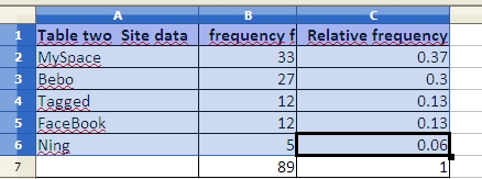
| Favorite color | Frequency f | Relative Frequency or p(color) |
|---|---|---|
| Blue | 32 | 35% |
| Black | 18 | 20% |
| White | 10 | 11% |
| Green | 9 | 10% |
| Red | 6 | 7% |
| Pink | 5 | 5% |
| Brown | 4 | 4% |
| Gray | 3 | 3% |
| Maroon | 2 | 2% |
| Orange | 1 | 1% |
| Yellow | 1 | 1% |
| Sums: | 91 | 100% |
If the above sample of 91 students is a good random sample of the population of all students, then we could make a point estimate that roughly 35% of the students in the population will prefer blue.

The table below includes FSM census 2000 data and student seat numbers for the national site of COM-FSM circa 2004.
| State | Population (2000) | Fractional share of national population (relative frequency) | Number of student seats held by state at the national campus | Fractional share of the national campus student seats |
|---|---|---|---|---|
| Chuuk | 53595 | 0.5 | 679 | 0.2 |
| Kosrae | 7686 | 0.07 | 316 | 0.09 |
| Pohnpei | 34486 | 0.32 | 2122 | 0.62 |
| Yap | 11241 | 0.11 | 287 | 0.08 |
| 107008 | 1 | 3404 | 1 |
In a circle chart the whole circle is 100% Used when data adds to a whole, e.g. state populations add to yield national population.
A pie chart of the state populations:
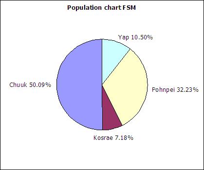
The following table includes data from the 2010 FSM census as an update to the above data.
| State | Population (2010) | Relative frequency |
|---|---|---|
| Chuuk | 48651 | |
| Kosrae | 6616 | |
| Pohnpei | 35981 | |
| Yap | 11376 | |
| Sum: | 102624 |
Column charts are also called bar graphs. A column chart of the student seats held by each state at the national site:
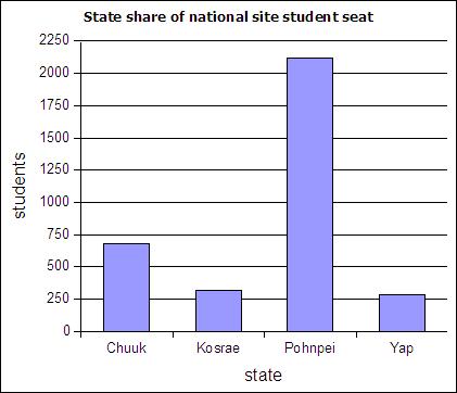
If a column chart is sorted so that the columns are in descending order, then it is called a Pareto chart. Descending order means the largest value is on the left and the values decrease as one moves to the right. Pareto charts are useful ways to convey rank order as well as numerical data.
A line graph is a chart which plots data as a line. The horizontal axis is usually set up with equal intervals. Line graphs are not used in this course and should not be confused with xy scattergraphs.
When you have two sets of continuous data (value versus value, no categories), use an xy graph. These will be covered in more detail in the chapter on linear regressions.
A distribution counts the number of elements of data in either a category or within a range of values. Plotting the count of the elements in each category or range as a column chart generates a chart called a histogram. The histogram shows the distribution of the data. The height of each column shows the frequency of an event. This distribution often provides insight into the data that the data itself does not reveal. In the histogram below, the distribution for male body fat among statistics students has two peaks. The two peaks suggest that there are two subgroups among the men in the statistics course, one subgroup that is at a healthy level of body fat and a second subgroup at a higher level of body fat.

The ranges into which values are gathered are called bins, classes, or intervals. This text tends to use classes or bins to describe the ranges into which the data values are grouped.
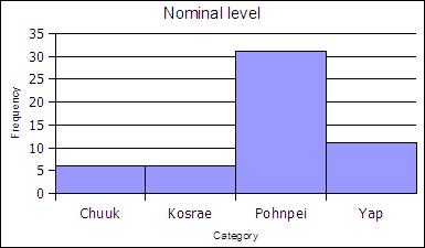
At the nominal level of measurement one can determine the frequency of elements in a category, such as students by state in a statistics course.
| State | Frequency | Rel Freq |
|---|---|---|
| Chuuk | 6 | 0.11 |
| Kosrae | 6 | 0.11 |
| Pohnpei | 31 | 0.57 |
| Yap | 11 | 0.20 |
| Sums: | 54 | 1,00 |
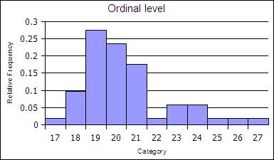
At the ordinal level, a frequency distribution can be done using the rank order, counting the number of elements in each rank order to obtain a frequency. When the frequency data is calculated in this way, the distribution is not grouped into a smaller number of classes.
| Age | Frequency | Rel Freq |
|---|---|---|
| 17 | 1 | 0.02 |
| 18 | 5 | 0.1 |
| 19 | 14 | 0.27 |
| 20 | 12 | 0.24 |
| 21 | 9 | 0.18 |
| 22 | 1 | 0.02 |
| 23 | 3 | 0.06 |
| 24 | 3 | 0.06 |
| 25 | 1 | 0.02 |
| 26 | 1 | 0.02 |
| 27 | 1 | 0.02 |
| sums | 51 | 1 |
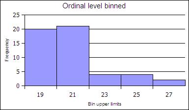
The ranks can be collected together, classed, to reduce the number of rank order categories. in the example below the age data in gathered into two-year cohorts.
| Age | Frequency | Rel Freq |
|---|---|---|
| 19 | 20 | 0.39 |
| 21 | 21 | 0.41 |
| 23 | 4 | 0.08 |
| 25 | 4 | 0.08 |
| 27 | 2 | 0.04 |
| Sums: | 51 | 1 |
At the ratio level data is always gathered into ranges. At the ratio level, classed histograms are used. Ratio level data is not necessarily in a finite number of ranks as was ordinal data.
The ranges into which data is gathered are defined by a class lower limit and a class upper limit. The width is the class upper limit minus the class lower limit. The frequency function in spreadsheets uses class upper limits. In this text histograms are also generated using the class upper limits.
To calculate the class lower and upper limits the minimum and maximum value in a data set must be determined. Spreadsheets include functions to calculate the minimum value MIN and maximum value MAX in a data set.
=MIN(data)
=MAX(data)
In LibreOffice the MIN and MAX function can take a list of comma separated numbers or a range of cells in a spreadsheet. In statistics a range of cells is the most common input for these functions. When a range of cells is the usual input, this text uses the word "data" to refer to the fact that the range of cells is usually your data! Ranges of cells use two cell addresses separated by a full colon. An example is shown below where the data is arranged in a vertical column from A2 to A42. Sort the original data from smallest to largest before you begin!
=MIN(A2:A42)
How to make a frequency table at the ratio level
range = maximum value - minimum value| Class Upper Limits (CUL) | Frequency |
| =min + class width | |
| + class width | |
| + class width | |
| + class width | |
| + class width = max |
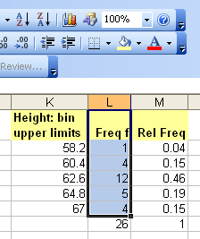
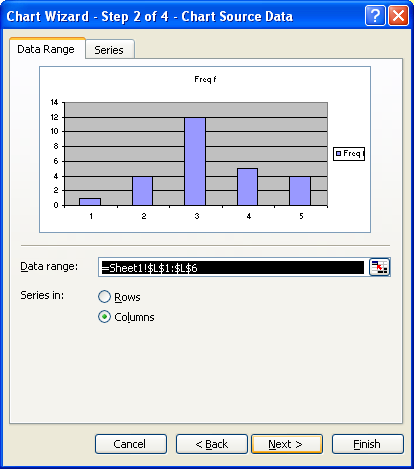
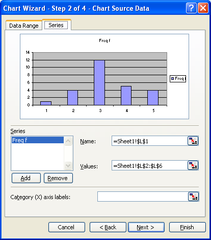
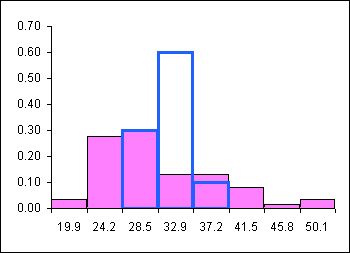
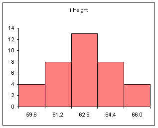
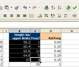
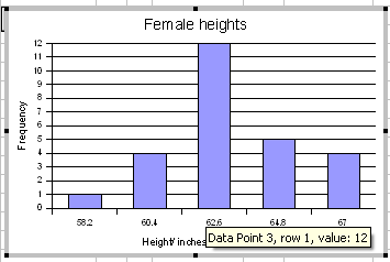
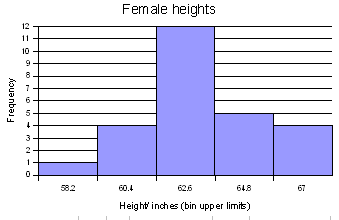
For the female height data:
58, 58, 59.5, 59.5, 60, 60, 60, 60, 60, 61, 61, 61.2, 61.5, 62, 62, 62, 62, 62, 62, 62, 62, 62, 62, 62, 62, 63, 63, 63, 63.5, 64, 64, 64, 64, 65, 65, 66, 66
Five classes would produce the following results:
Min = 58
Max = 66
Range = 66 - 58 = 8
Width = 8/5 = 1.6
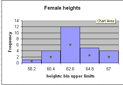
| Calculation | Height (CUL) | Frequency |
|---|---|---|
| 58 + 1.6 | 59.6 | 4 |
| 59.6 + 1.6 | 61.2 | 8 |
| 61.2 + 1.6 | 62.8 | 13 |
| 62.8 + 1.6 | 64.4 | 8 |
| 64.4 + 1.6 | 66 | 4 |
| Sum: | 37 |
Note that 61.2 is INCLUDED in the class that ends at 61.2. The class includes values at the class upper limit. In other words, a class includes all values up to and including the class upper limit.
Note too that the frequencies add to the sample size.
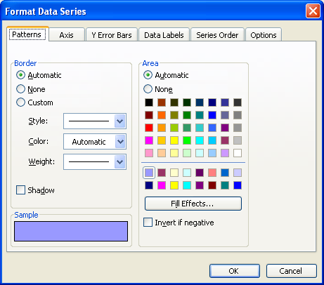
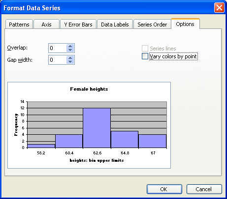
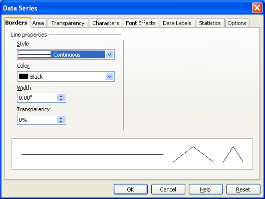
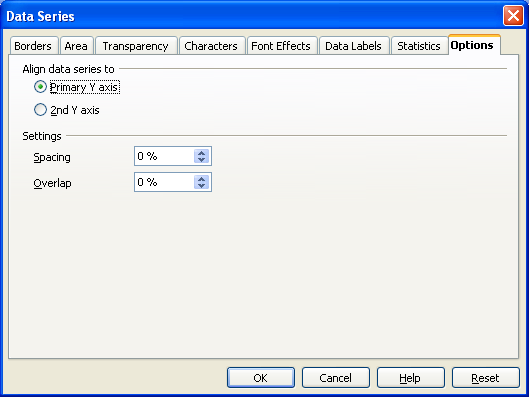
After making the column chart, double click on the columns to open the data series dialog box. Find the Options tab and set the spacing (or gap width) to zero.
Note that the spacing or gap width on the columns has been set to zero.
Relative frequency is one way to determine a probability.
Divide each frequency by the sum (the sample size) to get the relative frequency
| Height CUL | Frequency | Relative Frequency f/n or P(x) |
|---|---|---|
| 59.6 | 4 | 0.11 |
| 61.2 | 8 | 0.22 |
| 62.8 | 13 | 0.35 |
| 64.4 | 8 | 0.22 |
| 66 | 4 | 0.11 |
| Sum: | 37 | 1.00 |
The relative frequency always adds to one (rounding causes the above to add to 1.01, if all the decimal places were used the relative frequencies would add to one.
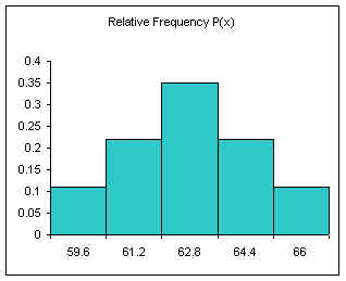
The area under the relative frequency columns is equal to one.
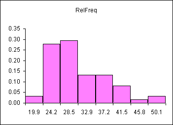
Another example using integers:
0, 1, 2, 2, 3, 3, 3, 4, 4, 4, 4.5, 5, 5, 5, 6, 6, 7, 8, 9, 10
Five classes
min = 0
max = 10
range = 10
width = 10/5 = 2
| Class Num | Calculation | CUL | Frequency | Relative Frequency f/n or P(x) |
|---|---|---|---|---|
| 1 | min + width | 2 | 4 | 0.20 |
| 2 | + width | 4 | 6 | 0.30 |
| 3 | + width | 6 | 6 | 0.30 |
| 4 | + width | 8 | 2 | 0.10 |
| 5 | + width | 10 | 2 | 0.10 |
| Sum: | 20 | 1.00 |
The above method produces equal width classes and to conforms the inclusion of the class upper limit by spreadsheet packages.
The final class upper limit must be equal to the maximum value in the data set. The frequencies must sum to the sample size n. The relative frequencies must add to 1.00.
| CUL | Frequency | Relative Frequency f/n |
|---|---|---|
| min + width | ||
| + width | ||
| + width | ||
| + width | ||
| + width = MAX | ||
| Sum: | sample size n | 1.00 |
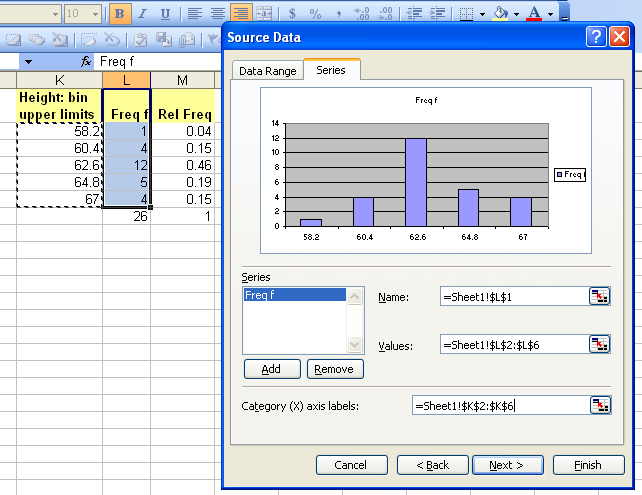
For more advanced spreadsheet users, frequency data can be obtained using the frequency function FREQUENCY. This function is also very useful when working with large data sets. The frequency function is:
=FREQUENCY(DATA,CLASSES)
DATA refers to the range of cells containing the data, CLASSES refers to the range of cells containing the class upper limits.
The data set seen below are the height measurements for 49 female students in statistics courses during two consecutive terms.
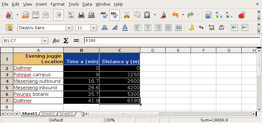
The frequency function built into spreadsheets works very differently from all other functions. The frequency function called an "array" function because the function places values into an array of cells. For the function to do this, you must first select the cells into which the function will place the frequency values.
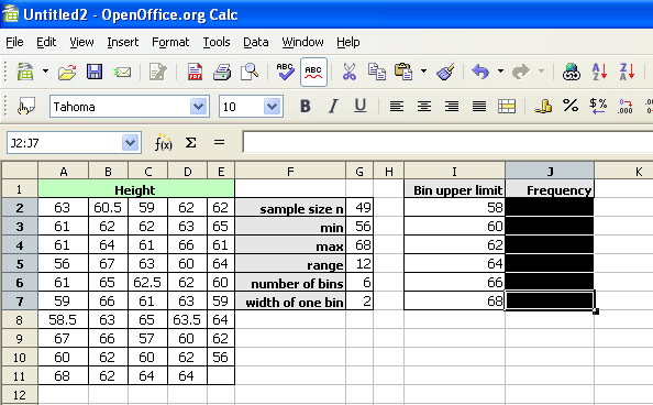
With the cells still highlighted, start typing the frequency function.
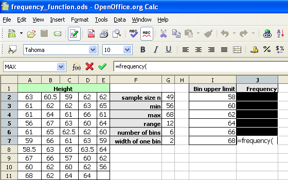
After typing the opening parenthesis, drag and select the data to be classed. If the data is more than can be selected by dragging, type the data range in by hand.
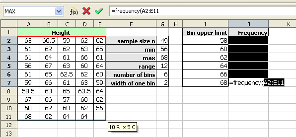
The frequency function usually uses a comma, not a semi-colon as seen in the image below.
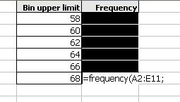
Drag and select the class upper limits.
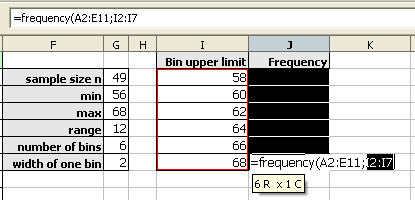
Type the closing parenthesis.
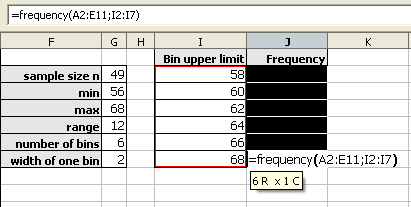
Then press and hold down BOTH the CONTROL (Ctrl) key and the SHIFT key. With both the control and shift keys held down, press the Enter (or Return) key.
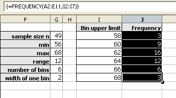
As noted above, the frequencies should add to the sample size. When working with spreadsheets, internal rounding errors can cause the maximum value in a data set to not get included in the final class. In the last class, use the value obtained by the MAX function and not the previous class + a width formula to generate that class upper limit.
The shapes of distributions have names by which they are known.
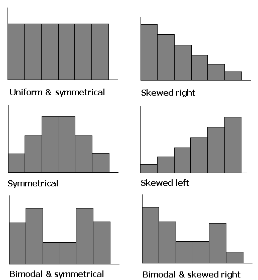
One of the aspects of a sample that is often similar to the population is the shape of the distribution. If a good random sample of sufficient size has a symmetric distribution, then the population is likely to have a symmetric distribution. The process of projecting results from a sample to a population is called generalizing. Thus we can say that the shape of a sample distribution generalizes to a population.
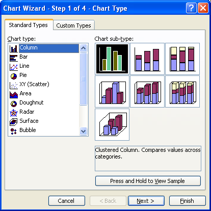
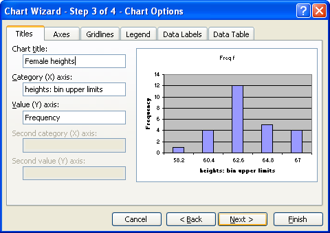
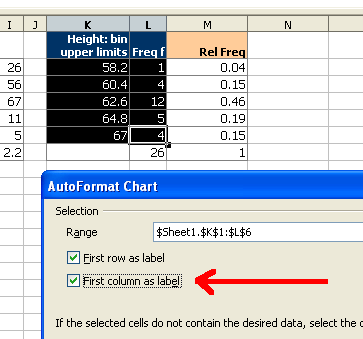
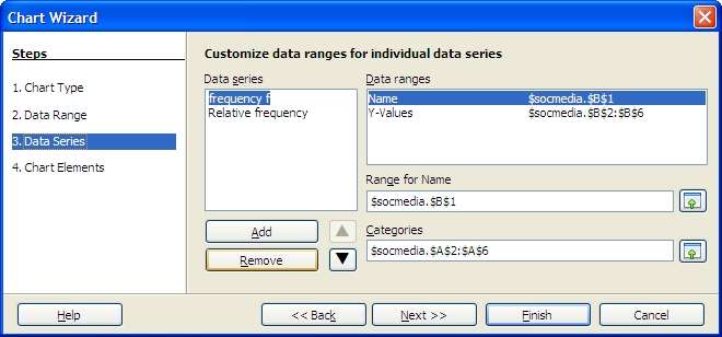
Select both the column with the class and the column with the frequencies.
Click on the chart wizard button and then drag the mouse to place and size the histogram.
At the first dialog box be sure to click on the "First column as label" check box as indicated by the arrow in the diagram below.
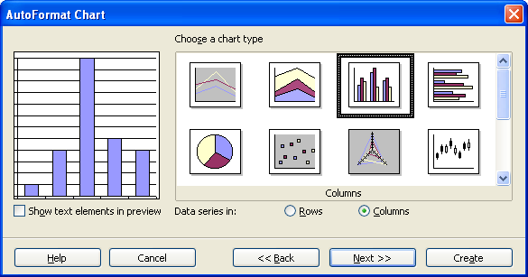
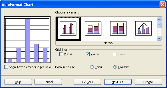
For the next two screens simply click on "Next"
On the next screen fill in the appropriate titles. The legend can be "unchecked" as seen below.
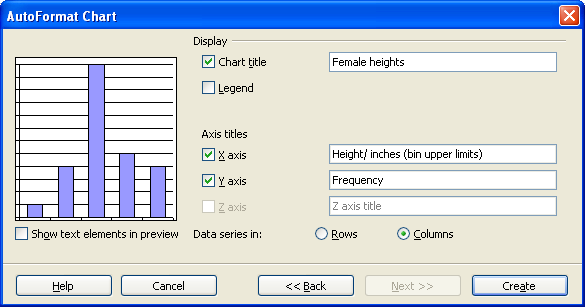
When done, click on Create.
Double click any column to open up the data series dialog box.
Click on the options tab and set the spacing to zero.
Click on OK.
The chart wizard for OpenOffice.org 3.1 running on Ubuntu 9.10 will not produce a two-dimensional column chart from a "split selection." This complicates producing a relative frequency chart. To produce a relative frequency chart, select all three columns and then delete the frequency column.
In step three, remove the frequency series to chart only the relative frequency.
The mode is the value that occurs most frequently in the data. Spreadsheet programs such as Microsoft Excel or OpenOffice.org Calc can determine the mode with the function MODE.
=MODE(data)
In the Fall of 2000 the statistics class gathered data on the number of siblings for each member of the class. One student was an only child and had no siblings. One student had 13 brothers and sisters. The complete data set is as follows:
1,2,2,2,2,2,3,3,4,4,4,5,5,5,7,8,9,10,12,12,13
The mode is 2 because 2 occurs more often than any other value. Where there is a tie there is no mode.
For the ages of students in that class
18,19,19,20,20,21,21,21,21,22,22,22,22,23,23,24,24,25,25,26
...there is no mode: there is a tie between 21 and 22, hence there no single must frequent value. Spreadsheets will, however, usually report a mode of 21 in this case. Spreadsheets often select the first mode in a multi-modal tie.
If all values appear only once, then there is no mode. Spreadsheets will display #N/A or #VALUE to indicate an error has occurred - there is no mode. No mode is NOT the same as a mode of zero. A mode of zero means that zero is the most frequent data value. Do not put the number 0 (zero) for "no mode." An example of a mode of zero might be the number of children for students in statistics class.
The median is the central (or middle) value in a data set. If a number sits at the middle, then it is the median. If the middle is between two numbers, then the median is half way between the two middle numbers.
For the sibling data...
1,2,2,2,2,2,3,3,4,4,|4|,5,5,5,7,8,9,10,12,12,13
...the median is 4.
Note the data must be in order (sorted) before you can find the median. For the data 2, 4, 6, 8 the median is 5: (4+6)/2.
The median function in spreadsheets is MEDIAN.
=MEDIAN(data)
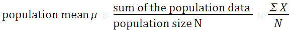
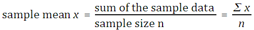
The mean, also called the arithmetic mean and also called the average, is calculated mathematically by adding the values and then dividing by the number of values (the sample size n).
If the mean is the mean of a population, then it is called the population mean μ. The letter μ is a Greek lower case "m" and is pronounced "mu."
If the mean is the mean of a sample, then it is the sample mean x. The symbol x is pronounced "x bar."
The sum of the data ∑ x can be determined using the function =SUM(data). The sample size n can be determined using =COUNT(data). Thus =SUM(data)/COUNT(data) will calculate the mean. There is also a single function that calculates the mean. The function that directly calculates the mean is AVERAGE
=AVERAGE(data)
Resistant measures: One that is not influenced by extremely high or extremely low data values. The median tends to be more resistant than mean.
If the mean is measured using the whole population then this would be the population mean. If the mean was calculated from a sample then the mean is the sample mean. Mathematically there is no difference in the way the population and sample mean are calculated.
The midrange is the midway point between the minimum and the maximum in a set of data.
To calculate the minimum and maximum values, spreadsheets use the minimum value function MIN and maximum value function MAX.
=MIN(data)
=MAX(data)
The MIN and MAX function can take a list of comma separated numbers or a range of cells in a spreadsheet. If the data is in cells A2 to A42, then the minimum and maximum can be found from:
=MIN(A2:A42)
=MAX(A2:A42)
The midrange can then be calculated from:
midrange = (maximum + minimum)/2
In a spreadsheet use the following formula:
=(MAX(data)+MIN(data))/2
The range is the maximum data value minus the minimum data value.
=MAX(data)−MIN(data)
The range is a useful basic statistic that provides information on the distance between the most extreme values in the data set.
The range does not show if the data if evenly spread out across the range or crowded together in just one part of the range. The way in which the data is either spread out or crowded together in a range is referred to as the distribution of the data. One of the ways to understand the distribution of the data is to calculate the position of the quartiles and making a chart based on the results.
The median is the value that is the middle value in a sorted list of values. At the median 50% of the data values are below and 50% are above. This is also called the 50th percentile for being 50% of the way "through" the data.
If one starts at the minimim, 25% of the way "through" the data, the point at which 25% of the values are smaller, is the 25th percentile. The value that is 25% of the way "through" the data is also called the first quartile.
Moving on "through" the data to the median, the median is also called the second quartile.
Moving past the median, 75% of the way "through" the data is the 75th percentile also known as the third quartile.
Note that the 0th percentile is the minimum and the 100th percentile is the maximum.
Spreadsheets can calculate the first, second, and third quartile for data using a function, the quartile function.
=QUARTILE(data,type)
Data is a range with data. Type represents the type of quartile. (0 = minimum, 1 = 25% or first quartile, 2 = 50% (median), 3 = 75% or third quartile and 4 = maximum. Thus if data is in the cells A1:A20, the first quartile could be calculated using:
=QUARTILE(A1:A20,1)
The InterQuartile Range (IQR) is the range between the first and third quartile:
=QUARTILE(Data,3)-QUARTILE(Data,1)
There are some subtleties to calculating the IQR for sets with even versus odd sample sizes, but this text leaves those details to the spreadsheet software functions.
The above is very abstract and hard to visualize. A box and whisker plot takes the above quartile information and plots a chart based on the quartiles.
A box and whisker plot is built around a box that runs from the value at the 25th percentile (first quartile) to the value at the 75th percentile (third quartile). The length of the box spans the distance from the value at the first quartile to the third quartile, this is called the Inter-Quartile Range (IQR). A line is drawn inside the box at the location of the 50th percentile. The 50th percentile is also known as the second quartile and is the median for the data. Half the scores are above the median, half are below the median. Note that the 50th percentile is the median, not the mean.
| s1 | s2 |
|---|---|
| 10 | 11 |
| 20 | 11 |
| 30 | 12 |
| 40 | 13 |
| 50 | 15 |
| 60 | 18 |
| 70 | 23 |
| 80 | 31 |
| 90 | 44 |
| 100 | 65 |
| 110 | 99 |
| 120 | 154 |
The basic box plot described above has lines that extend from the first quartile down to the minimum value and from the third quartile to the maximum value. These lines are called "whiskers" and end with a cross-line called a "fence". If, however, the minimum is more than 1.5 × IQR below the first quartile, then the lower fence is put at 1.5 × IQR below the first quartile and the values below the fence are marked with a round circle. These values are referred to as potential outliers - the data is unusually far from the median in relation to the other data in the set.
Likewise, if the maximum is more than 1.5 × IQR beyond the third quartile, then the upper fence is located at 1.5 × IQR above the 3rd quartile. The maximum is then plotted as a potential outlier along with any other data values beyond 1.5 × IQR above the 3rd quartile.
There are actually two types of outliers. Potential outliers between 1.5 × IQR and 3.0 × IQR beyond the fence . Extreme outliers are beyond 3.0 × IQR. In the program Gnome Gnumeric potential outliers are marked with a circle colored in with the color of the box. Extreme outiers are marked with an open circle - a circle with no color inside.
An example with hypothetical data sets is given to illustrate box plots. The data consists of two samples. Sample one (s1) is a uniform distribution and sample two (s2) is a highly skewed distribution.

Box and whisker plots can be generated by the Gnome Gnumeric program or by using on line box plot generators.
The box and whisker plot is a useful tool for exploring data and determining whether the data is symmetrically distributed, skewed, and whether the data has potential outliers - values far from the rest of the data as measured by the InterQuartile Range. The distribution of the data often impacts what types of analysis can be done on the data.
The distribution is also important to determining whether a measurement that was done is performing as intended. For example, in education a "good" test is usually one that generates a symmetric distibution of scores with few outliers. A highly skewed distribution of scores would suggest that the test was either too easy or too difficult. Outliers would suggest unusual performances on the test.

Two data sets, one uniform, the other with one potential outlier and one extreme outlier.
Consider the following data:
| Data | mode | median | mean μ | min | max | range | midrange | |
|---|---|---|---|---|---|---|---|---|
| Data set 1 | 5, 5, 5, 5 | 5 | 5 | 5 | 5 | 5 | 0 | 0 |
| Data set 2 | 2, 4, 6, 8 | none | 5 | 5 | 2 | 8 | 6 | 5 |
| Data set 3 | 2, 2, 8, 8 | none | 5 | 5 | 2 | 8 | 6 | 5 |
Neither the mode, median, nor the mean reveal clearly the differences in the distribution of the data above. The mean and the median are the same for each data set. The mode is the same as the mean and the median for the first data set and is unavailable for the last data set (spreadsheets will report a mode of 2 for the last data set). A single number that would characterize how much the data is spread out would be useful.
As noted earlier, the range is one way to capture the spread of the data. The range is calculated by subtracting the smallest value from the largest value. In a spreadsheet:
=MAX(data)−MIN(data)
The range still does not characterize the difference between set 2 and 3: the last set has more data further away from the center of the data distribution. The range misses this difference.
To capture the spread of the data we use a measure related to the average distance of the data from the mean. We call this the standard deviation. If we have a population, we report this average distance as the population standard deviation. If we have a sample, then our average distance value may underestimate the actual population standard deviation. As a result the formula for sample standard deviation adjusts the result mathematically to be slightly larger. For our purposes these numbers are calculated using spreadsheet functions.
One way to distinguish the difference in the distribution of the numbers in data set 2 and data set 3 above is to use the standard deviation.
| Data | mean μ | stdev | |
|---|---|---|---|
| Data set 1 | 5, 5, 5, 5 | 5 | 0.00 |
| Data set 2 | 2, 4, 6, 8 | 5 | 2.58 |
| Data set 3 | 2, 2, 8, 8 | 5 | 3.46 |
The function that calculates the sample standard deviation is:
=STDEV(data)
In this text the symbol for the sample standard deviation is usually sx.
In this text the symbol for the population standard deviation is usually σ.
The symbol sx usually refers the standard deviation of single variable x data. If there is y data, the standard deviation of the y data is sy. Other symbols that are used for standard deviation include s and σx. Some calculators use the unusual and confusing notations σxn−1 and σxn for sample and population standard deviations.
In this class we always use the sample standard deviation in our calculations. The sample standard deviation is calculated in a way such that the sample standard deviation is slightly larger than the result of the formula for the population standard deviation. This adjustment is needed because a population tends to have a slightly larger spread than a sample. There is a greater probability of outliers in the population data.
The Coefficient of Variation is calculated by dividing the standard deviation (usually the sample standard deviation) by the mean.
=STDEV(data)/AVERAGE(data)
Note that the CV can be expressed as a percentage: Group 2 has a CV of 52% while group 3 has a CV of 69%. A deviation of 3.46 is large for a mean of 5 (3.46/5 = 69%) but would be small if the mean were 50 (3.46/50 = 7%). So the CV can tell us how important the standard deviation is relative to the mean.
As an approximation, the standard deviation for data that has a symmetrical, heap-like distribution is roughly one-quarter of the range. If given only minimum and maximum values for data, this rule of thumb can be used to estimate the standard deviation.
At least 75% of the data will be within two standard deviations of the mean, regardless of the shape of the distribution of the data.
At least 89% of the data will be within three standard deviations of the mean, regardless of the shape of the distribution of the data.
If the shape of the distribution of the data is a symmetrical heap, then as much as 95% of the data will be within two standard deviations of the mean.
Data beyond two standard deviations away from the mean is considered "unusual" data.
Levels of measurement and appropriate measures
| Level of measurement | Appropriate measure of middle | Appropriate measure of spread |
|---|---|---|
| nominal | mode | none or number of categories |
| ordinal | median | range |
| interval | median or mean | range or standard deviation |
| ratio | mean | standard deviation |
At the interval level of measurement either the median or mean may be more appropriate depending on the specific system being studied. If the median is more appropriate, then the range should be quoted as a measure of the spread of the data. If the mean is more appropriate, then the standard deviation should be used as a measure of the spread of the data.
Another way to understand the levels at which a particular type of measurement can be made is shown in the following table.
Levels at which a particular statistic or parameter has meaning
| Level of measurement | ||||
|---|---|---|---|---|
|
Statistic/ Parameter |
Nominal | Ordinal | Interval | Ratio |
| sample size | ||||
| mode | ||||
| minimum | ||||
| maximum | ||||
| range | ||||
| median | ||||
| mean | ||||
| standard deviation | ||||
| coefficient of variation | ||||
For example, a mode, median, and mean can be calculated for ratio level measures. Of those, the mean is usually considered the best measure of the middle for a random sample of ratio level data.
When there are a countable number of values that result from observations, we say the variable producing the results is discrete. The nominal and ordinal levels of measurement almost always measure a discrete variable.
The following examples are typical values for discrete variables:
The last example above is a typical result of a type of survey called a Likert survey developed by Renis Likert in 1932.
When reporting the "middle value" for a discrete distribution at the ordinal level it is usually more appropriate to report the median. For further reading on the matter of using mean values with discrete distributions refer to the pages by Nora Mogey and by the Canadian Psychiatric Association.
Note that if the variable measures only the nominal level of measurement, then only the mode is likely to have any statistical "meaning", the nominal level of measurement has no "middle" per se.
There may be rare instances in which looking at the mean value and standard deviation is useful for looking at comparative performance, but it is not a recommended practice to use the mean and standard deviation on a discrete distribution. The Canadian Psychiatric Association discusses when one may be able to "break" the rules and calculate a mean on a discrete distribution. Even then, bear in mind that ratios between means have no "meaning!"
For example, questionnaire's often generate discrete results:
| Never 0 | About once a month 1 | About once a week 2 |
A few times a week 3 | Every day 4 | |
|---|---|---|---|---|---|
| How often do you drink caffeinated drinks such as coffee, tea, or cola? | |||||
| How often do you chew tobacco without betelnut? | |||||
| How often do you chew betelnut without tobacco? | |||||
| How often do you chew betelnut with tobacco? | |||||
| How often do you drink sakau en Pohnpei? | |||||
| How often do you drink beer? | |||||
| How often do you drink wine? | |||||
| How often do you drink hard liquor (whisky, rum, vodka, tequila, etc.)? |
|||||
| How often do you smoke cigarettes? | |||||
| How often do you smoke marijuana? | |||||
| How often do you use controlled substances other than marijuana? (methamphetamines, cocaine, crack, ice, shabu, etc.)? |
The results of such a questionnaire are numeric values from 0 to 4. For an example of a real student alcohol questionnaire, see: http://www.indiana.edu/~engs/saq.html
When there is a infinite (or uncountable) number of values that may result from observations, we say that the variable is continuous. Physical measurements such as height, weight, speed, and mass, are considered continuous measurements. Bear in mind that our measurement device might be accurate to only a certain number of decimal places. The variable is continuous because better measuring devices should produce more accurate results.
The following examples are continuous variables:
When reporting the "middle value" for a continuous distribution it is appropriate to report the mean and standard deviation. The mean and standard deviation only have "meaning" for the ratio level of measurement.
| Level of measurement | Typical variable type | Appropriate measure of middle | Appropriate measure of variation |
|---|---|---|---|
| nominal | discrete | mode | none |
| ordinal | discrete | median (can also report mode) | range |
| ratio | continuous | mean (can also report median and mode) | sample standard deviation |
Z-scores are a useful way to combine scores from data that has different means and standard deviations. Z-scores are an application of the above measures of center and spread.
Remember that the mean is the result of adding all of the values in the data set and then dividing by the number of values in the data set. The word mean and average are used interchangeably in statistics.
Recall also that the standard deviation can be thought of as a mathematical calculation of the average distance of the data from the mean of the data. Note that although I use the words average and mean, the sentence could also be written "the mean distance of the data from the mean of the data."
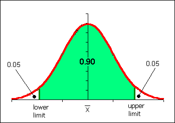
Z-scores simply indicate how many standard deviations away from the mean is a particular score. This is termed "relative standing" as it is a measure of where in the data the score is relative to the mean and "standardized" by the standard deviation. The formula for z is:
If the population mean µ and population standard deviation σ are known, then the formula for the z-score for a data value x is:
Using the sample mean x and sample standard deviation sx, the formula for a data value x is:
Note the parentheses!
Data that is two standard deviations below the mean will have a z-score of −2, data that is two standard deviations above the mean will have a z-score of +2. Data beyond two standard deviations away from the mean will have z-scores below −2 or above 2. A data value that with a z-score below −2 or above +2 is considered an unusual value, an extraordinary data value. These values may also be outliers on a box plot depending on the distribution. Box plot outliers and extraordinary z-scores are two ways to characterize unusually extreme data values. There is no simple relationship between box plot outliers and extraordinary z-scores.

Suppose a test has a mean score of 10 and a standard deviation of 2 with a total possible of 20. Suppose a second test has the same mean of 10 and total possible of 20 but a standard deviation of 8.
On the first test a score of 18 would be rare, an unusual score. On the first test 89% of the students would have scored between 6 and 16 (three standard deviations below the mean and three standard deviations above the mean.
On the second test a score of 18 would only be one standard deviation above the mean. This would not be unusual, the second test had more spread.
Adding two scores of 18 and saying the student had a score of 36 out of 40 devalues what is a phenomenal performance on the first test.
Converting to z-scores, the relative strength of the performance on test one is valued more strongly. The z-score on test one would be (18-10)/2 = 4, while on test two the z-score would be (18-10)/8 = 1. The unusually outstanding performance on test one is now reflected in the sum of the z-scores where the first test contributes a sum of 4 and the second test contributes a sum of 1.
When values are converted to z-scores, the mean of the z-scores is zero. A student who scored a 10 on either of the tests above would have a z-score of 0. In the world of z-scores, a zero is average!
Z-scores also adjust for different means due to differing total possible points on different tests.
Consider again the first test that had a mean score of 10 and a standard deviation of 2 with a total possible of 20. Now consider a third test with a mean of 100 and standard deviation of 40 with a total possible of 200. On this third test a score of 140 would be high, but not unusually high.
Adding the scores and saying the student had a score of 158 out of 220 again devalues what is a phenomenal performance on test one. The score on test one is dwarfed by the total possible on test three. Put another way, the 18 points of test one are contributing only 11% of the 158 score. The other 89% is the test three score. We are giving an eight-fold greater weight to test three. The z-scores of 4 and 1 would add to five. This gives equal weight to each test and the resulting sum of the z-scores reflects the strong performance on test one with an equal weight to the ordinary performance on test three.
Z-scores only provide the relative standing. If a test is given again and all students who take the test do better the second time, then the mean rises and like a tide "lifts all the boats equally." Thus an individual student might do better, but because the mean rose, their z-score could remain the same. This is also the downside to using z-scores to compare performances between tests - changes in "sea level" are obscured. One would have to know the mean and standard deviation and whether they changed to properly interpret a z-score.
A runner runs from the College of Micronesia-FSM National campus to PICS via the powerplant/Nahnpohnmal back road. The runner tracks his time and distance.
| Location | Time x (minutes) | Distance y (km) |
|---|---|---|
| College | 0 | 0 |
| Dolon Pass | 20 | 3.3 |
| Turn-off for Nahnpohnmal | 25 | 4.5 |
| Bottom of the beast | 33 | 5.7 |
| Top of the beast | 34.5 | 5.9 |
| Track West | 55 | 9.7 |
| PICS | 56 | 10.1 |
Is there a relationship between the time and the distance? If there is a relationship,
then data will fall in a patterned fashion on an xy graph. If there is no relationship,
then there will be no shape to the pattern of the data on a graph.
If the relationship is linear, then the data will fall roughly along a line. Plotting the
above data yields the following graph:
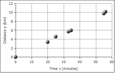
The data falls roughly along a line, the relationship appears to linear. If we can find the equation of a line through the data, then we can use the equation to predict how long it will take the runner to cover distances not included in the table above, such as five kilometers. In the next image a best fit line has been added to the graph.
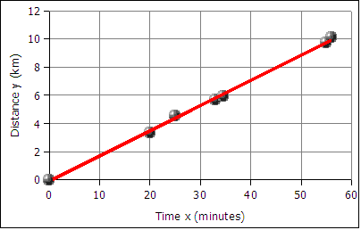
The best fit line is also called the least squares line because the mathematical process for determining the line minimizes the square of the vertical displacement of the data points from the line. The process of determining the best fit line is also known and performing a linear regression. Sometimes the line is referred to as a linear regression.
The graph of time versus distance for a runner is a line because a runner runs at the same pace kilometer after kilometer.
A spreadsheet is used to find the slope and the y-intercept of the best fit line through the data.
To get the slope m use the function:
=SLOPE(y-values,x-values)
Note that the y-values are entered first, the x-values are entered second. This is the reverse of traditional algebraic order where coordinate pairs are listed in the order (x, y). The x and y-values are usually arranged in columns. The column containing the x data is usually to the left of the column containing the y-values. An example where the data is in the first two columns from row two to forty-two can be seen below.
=SLOPE(B2:B42,A2:A42)
The intercept is usually the starting value for a function. Often this is the y data value at time zero, or distance zero.
To get the intercept:
=INTERCEPT(y-values,x-values)
Note that intercept also reverses the order of the x and y values!
For the runner data above the equation is:
distance = slope * time + y-intercept
distance = 0.18  * time + − 0.13
       y = 0.18  *  x   + − 0.13
         or
       y = 0.18x − 0.13
       where x is the time and y is the distance
In algebra the equation of a line is written as y = m*x + b where m is the slope and b is the intercept. In statistics the equation of a line is written as y = a + b*x where a is the intercept (the starting value) and b is the slope. The two fields have their own traditions, and the letters used for slope and intercept are a tradition that differs between the field of mathematics and the field of statistics.
Using the y = mx + b equation we make predictions about how far the runner will travel given a time, or how long the runner will runner given a distance. For example, according the equation above, a 45 minute run will result in the runner covering 0.18*45 - 0.13 = 7.97 kilometers. Using the inverse of the equation we can predict that the runner can run a five kilometer distance in 28.5 minutes (28 minutes and 30 seconds).
Given any time, we can calculate the distance. Given any distance, can solve for the time.
Making an xy scattergraph using LibreOffice.org
First select the data to be graphed.
Then click on the chart wizard button
![]() or
or
![]() in the toolbar to start the chart wizard.
in the toolbar to start the chart wizard.
Choose an XY (Scatter) graph in the first dialog box.
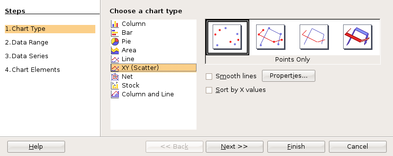
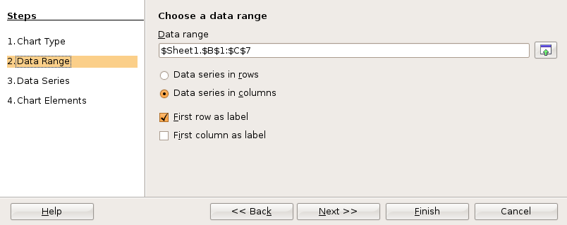
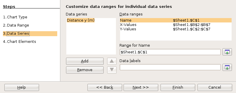
For statistics class, click through the next two dialog boxes.
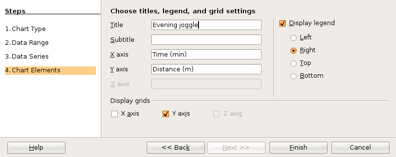
In the fourth and final dialog box you can set up the x and y axis labels as well as a chart title. Then click on Finish.
Before clicking anywhere else, choose Insert: Trend Lines from the menu.

The Trend Lines dialog box permits selection of linear and non-linear regression lines. For a straight line regression, choose the linear regression type. Click on the check boxes for the function and the R2. You may have to click twice to obtain the check mark.

Click on OK to close the dialog box.
All versions of OpenOffice.org Calc can calculate the slope and intercept using spreadsheet functions.
After plotting the x and y data, the xy scattergraph helps determine the nature of the relationship between the x values and the y values. If the points lie along a straight line, then the relationship is linear. If the points form a smooth curve, then the relationship is non-linear (not a line). If the points form no pattern then the relationship is random.

Relationships between two sets of data can be positive: the larger x gets, the larger y
gets.
Relationships between two sets of data can be negative: the larger x gets, the smaller y
gets.
Relationships between two sets of data can be non-linear
Relationships between two sets of data can be random: no relationship exists!
For the runner data above, the relationship is a positive relationship. The points line along a line, therefore the relationship is linear.
An example of a negative relationship would be the number of beers consumed by a student and a measure of the physical coordination. The more beers consumed the less their coordination!
For a linear relationship, the closer to a straight line the points fall, the stronger the relationship. The measurement that describes how closely to a line are the points is called the correlation.

The following example explores the correlation between the distance of a business from a city center versus the amount of product sold per person. In this case the business are places that serve pounded Piper methysticum plant roots, known elsewhere as kava but known locally as sakau. This business is unique in that customers self-limit their purchases, buying only as many cups of sakau as necessary to get the warm, sleepy, feeling that the drink induces. The businesses are locally referred to as sakau markets. The local theory is that the further one travels from the main town (and thus deeper into the countryside of Pohnpei) the stronger the sakau that is served. If this is the case, then the mean number of cups should fall with distance from the main town on the island.
The following table uses actual data collected from these businesses, the names of the businesses have been changed.
| Sakau Market | distance/km (x) | mean cups per person (y) |
|---|---|---|
| Upon the river | 3.0 | 5.18 |
| Try me first | 13.5 | 3.93 |
| At the bend | 14.0 | 3.19 |
| Falling down | 15.5 | 2.62 |
The first question a statistician would ask is whether there is a relationship between the distance and mean cup data. Determining whether there is a relationship is best seen in an xy scattergraph of the data.
If we plot the points on an xy graph using a spreadsheet, the y-values can be seen to fall with increasing x-value. The data points, while not all exactly on one line, are not far away from the best fit line. The best fit line indicates a negative relationship. The larger the distance, the smaller the mean number of cups consumed.
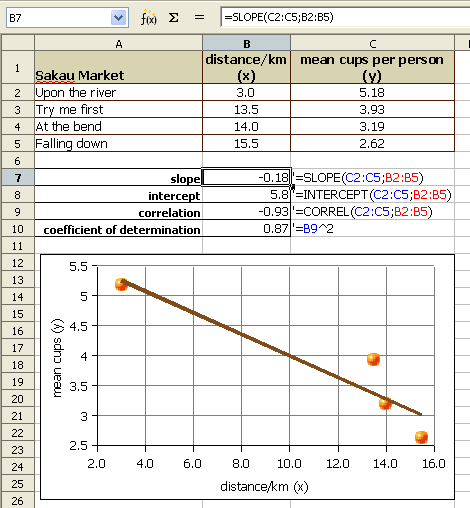
We use a number called the Pearson product-moment correlation coefficient r to tell us how well the data fits to a straight line. The full name is long, in statistics this number is called simply r. R can be calculated using a spreadsheet function.
The function for calculating r is:
=CORREL(y-values,x-values)
Note that the order does not technically matter. The correlation of x to y is the same as that of y to x. For consistency the y-data,x-data order is retained above.
The Pearson product-moment correlation coefficient r (or just correlation r) values that result from the formula are always between -1 and 1. One is perfect positive linear correlation. Negative one is perfect negative linear correlation. If the correlation is zero or close to zero: no linear relationship between the variables.
A guideline to r values:
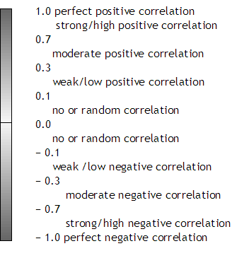
Note that perfect has to be perfect: 0.99999 is very close, but not perfect. In real world systems perfect correlation, positive or negative, is rarely or never seen. A correlation of 0.0000 is also rare. Systems that are purely random are also rarely seen in the real world.
Spreadsheets usually round to two decimals when displaying decimal numbers. A correlation r of 0.999 is displayed as "1" by spreadsheets. Use the the Format menu to select the cells item. In the cells dialog box, click on the numbers tab to increase the number of decimal places. When the correlation is not perfect, adjust the decimal display and write out all the decimals.
The correlation r of − 0.93 is a strong negative correlation. The relationship is strong and the relationship is negative. The equation of the best fit line, y = −0.18x + 5.8 where y is the mean number of cups and x is the distance from the main town. The equations that generated the slope, y-intercept, and correlation can be seen in the earlier image.
The strong relationship means that the equation can be used to predict mean cup values, at least for distances between 3.0 and 15.5 kilometers from town.
A second example explores the correlation between female students pounds of fat in a statistics course. The table provides the x and y data.
The table below continues beyond the boundaries of the page.
| Age/years (x) | 18 | 18 | 19 | 19 | 19 | 19 | 19 | 19 | 19 | 19 | 19 | 19 | 19 | 19 | 19 | 19 | 20 | 20 | 20 | 20 | 20 | 20 | 20 | 20 | 20 | 20 | 20 | 20 | 20 | 20 | 20 | 21 | 21 | 21 | 21 | 22 | 22 | 22 | 22 | 23 | 23 |
|---|---|---|---|---|---|---|---|---|---|---|---|---|---|---|---|---|---|---|---|---|---|---|---|---|---|---|---|---|---|---|---|---|---|---|---|---|---|---|---|---|---|
| Fat/pounds (y) | 29.5 | 51.6 | 14.9 | 25.7 | 26.4 | 29.0 | 29.8 | 29.9 | 30.8 | 30.9 | 33.5 | 35.1 | 36.2 | 36.8 | 37.0 | 69.0 | 20.6 | 27.7 | 28.2 | 33.2 | 33.4 | 36.5 | 39.3 | 39.4 | 40.2 | 48.9 | 50.4 | 56.7 | 57.8 | 59.7 | 107.8 | 22.7 | 34.2 | 65.0 | 76.9 | 28.1 | 34.8 | 37.2 | 38.3 | 28.0 | 46.8 |
The first question a statistician would ask is whether there is a relationship seen in the xy scattergraph between the age of a female student at COMFSM and the pounds of fat? Can we use our data to predict a pounds of body fat based on age alone?
If we plot the points on an xy graph using a spreadsheet, the data does not appear to be strongly linear. The data appears to be scattered randomly about the graph. Although a spreadsheet is able to give us a best fit line (a linear regression or least squares line), we will later have to consider whether the relationship is strong enough to make the equation useful.
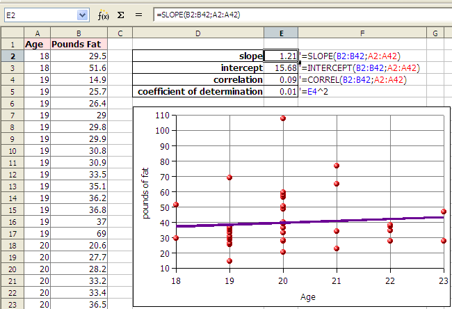
In the example above the correlation r is 0.09. Zero would be random correlation. This value is so close to zero that the correlation is effectively random. The relationship is random. There is no relationship. The linear equation y = 1.21x + 15.68, where y is the pounds of fat and x is the age, cannot be used to predict the pounds of fat given the age.
We cannot usually predict values that are below the minimum x or above the maximum x values and make meaningful predictions. In the example of the runner, we could calculate how far the runner would run in 72 hours (three days and three nights) but it is unlikely the runner could run continuously for that length of time. For some systems values can be predicted below the minimum x or above the maximum x value. When we do this it is called extrapolation. Very few systems can be extrapolated, but some systems remain linear for values near to the provided x values.
The coefficient of determination, r², is a measure of how much of the variation in the independent x variable explains the variation in the dependent y variable. This does NOT imply causation. In spreadsheets the ^ symbol (shift-6) is exponentiation. In OpenOffice Calc we can square the correlation with the following formula:
=(CORREL(y-values,x-values))^2
The result, which is between 0 and 1 inclusive, is often expressed as a percentage.
Imagine a Yamaha outboard motor fishing boat sitting out beyond the reef in an open ocean swell. The swell moves the boat gently up and down. Now suppose there is a small boy moving around in the boat. The boat is rocked and swayed by the boy. The total motion of the boat is in part due to the swell and in part due to the boy. Maybe the swell accounts for 70% of the boat's motion while the boy accounts for 30% of the motion. A model of the boat's motion that took into account only the motion of the ocean would generate a coefficient of determination of about 70%.
Finding that a correlation exists does not mean that the x-values cause the y-values. A line does not imply causation: Your age does not cause your pounds of body fat, nor does time cause distance for the runner.
Studies in the mid 1800s of Micronesia would have shown of increase each year in church attendance and sexually transmitted diseases (STDs). That does NOT mean churches cause STDs! What the data is revealing is a common variable underlying our data: foreigners brought both STDs and churches. Any correlation is simply the result of the common impact of the increasing influence of foreigners.
Some calculators will generate a best fit line. Be careful. In algebra straight lines had the form y = mx + b where m was the slope and b was the y-intercept. In statistics lines are described using the equation y = a + bx. Thus b is the slope! And a is the y-intercept! You would not need to know this but your calculator will likely use b for the slope and a for the y-intercept. The exception is some TI calculators that use SLP and INT for slope and intercept respectively.
Note only for those in physical science courses. In some physical systems the data point (0,0) is the most accurately known measurement in a system. In this situation the physicist may choose to force the linear regression through the origin at (0,0). This forces the line to have an intercept of zero. There is another function in spreadsheets which can force the intercept to be zero, the LINear ESTimator function. The following functions use time versus distance, common x and y values in physical science.
=LINEST(distance (y) values,time (x) values,0)
Note that the same as the slope and intercept functions, the y-values are entered first, the x-values are entered second.
A probability is the likelihood of an event or outcome. Probabilities are specified mathematically by a number between 0 and 1 including 0 or 1.
We use the notation P(eventLabel) = probability to report a probability.
There are three ways to assign probabilities.
Intuition/subjective measure. An educated best guess. Using available information to make a best estimate of a probability. Could be anything from a wild guess to an educated and informed estimate by experts in the field.
Equally Likely Events: Probabilities from mathematical formulas
In the following the word "event" and the word "outcome" are taken to have the same meaning.
The study of problems with equally likely outcomes is termed the study of probabilities. This is the realm of the mathematics of probability. Using the mathematics of probability, the outcomes can be determined ahead of time. Mathematical formulas determine the probability of a particular outomce. All measures are population parameters. The mathematics of probability determines the probabilities for coin tosses, dice, cards, lotteries, bingo, and other games of chance.
This course focuses not on probability but rather on statistics. In statistics, measurement are made on a sample taken from the population and used to estimate the population's parameters. All possible outcomes are not usually known. is usually not known and might not be knowable. Relative frequencies will be used to estimate population parameters.
Where each and every event is equally likely, the probability of an event occurring can be determined from
probability = ways to get the desired event/total possible events
or
probability = ways to get the particular outcome/total possible outcomes
P(head on a penny) = one way to get a head/two sides = 1/2 = 0.5 or 50%
That probability, 0.5, is the probability of getting a heads or tails prior to the toss. Once the toss is done, the coin is either a head or a tail, 1 or 0, all or nothing. There is no 0.5 probability anymore.
Over any ten tosses there is no guarantee of five heads and five tails: probability does not work like that. Over any small sample the ratios of expected outcomes can differ from the mathematically calculated ratios.
Over thousands of tosses, however, the ratio of outcomes such as the number of heads to the number of tails, will approach the mathematically predicted amount. We refer to this as the law of large numbers.
In effect, a few tosses is a sample from a population that consists, theoretically, of an infinite number of tosses. Thus we can speak about a population mean μ for an infinite number of tosses. That population mean μ is the mathematically predicted probability.
Population mean μ = (number of ways to get a desired outcome)/(total possible outcomes)
A six-sided die. Six sides. Each side equally likely to appear. Six total possible outcomes. Only one way to roll a one: the side with a single pip must face up. 1 way to get a one/6 possible outcomes = 0.1667 or 17%
P(1) = 0.17
The formula remains the same: the number of possible ways to get a particular roll divided by the number of possible outcomes (that is, the number of sides!).
Think about this: what would a three sided die look like? How about a two-sided die? What about a one sided die? What shape would that be? Is there such a thing?
Ways to get a five on two dice: 1 + 4 = 5, 2 + 3 = 5, 3 + 2 = 5, 4 + 1 = 5 (each die is unique). Four ways to get/36 total possibilities = 4/36 = 0.11 or 11%
Homework:
The sample space set of all possible outcomes in an experiment or system.
Bear in mind that the following is an oversimplification of the complex biogenetics of achromatopsia for the sake of a statistics example. Achromatopsia is controlled by a pair of genes, one from the mother and one from the father. A child is born an achromat when the child inherits a recessive gene from both the mother and father.
A is the dominant gene
a is the recessive gene
A person with the combination AA is "double dominant" and has
"normal" vision.
A person with the combination Aa is termed a carrier and has "normal" vision.
A person with the combination aa has achromatopsia.
Suppose two carriers, Aa, marry and have children. The sample space for this situation is as follows:
| mother | |||
| father | \ | A | a |
|---|---|---|---|
| A | AA | Aa | |
| a | Aa | aa | |
The above diagram of all four possible outcomes represents the sample space for this exercise. Note that for each and every child there is only one possible outcome. The outcomes are said to be mutually exclusive and independent. Each outcome is as likely as any other individual outcome. All possible outcomes can be calculated. the sample space is completely known. Therefore the above involves probability and not statistics.
The probability of these two parents bearing a child with achromatopsia is:
P(achromat) = one way for the child to inherit aa/four possible combinations = 1/4 = 0.25 or 25%
This does NOT mean one in every four children will necessarily be an achromat. Suppose they have eight children. While it could turn out that exactly two children (25%) would have achromatopsia, other likely results are a single child with achromatopsia or three children with achromatopsia. Less likely, but possible, would be results of no achromat children or four achromat children. If we decide to work from actual results and build a frequency table, then we would be dealing with statistics.
The probability of bearing a carrier is:
P(carrier) = two ways for the child to inherit Aa/four possible combinations = 2/4 = 0.50
Note that while each outcome is equally likely,there are TWO ways to get a carrier, which results in a 50% probability of a child being a carrier.
At your desk: mate an achromat aa father and carrier mother Aa.
Homework: Mate a AA father and an achromat aa mother.
See: http://www.achromat.org/ for more information on achromatopsia.
Genetically linked schizophrenia is another genetic example:
Mol Psychiatry. 2003 Jul;8(7):695-705, 643. Genome-wide scan in a large complex pedigree with predominantly male schizophrenics from the island of Kosrae: evidence for linkage to chromosome 2q. Wijsman EM, Rosenthal EA, Hall D, Blundell ML, Sobin C, Heath SC, Williams R, Brownstein MJ, Gogos JA, Karayiorgou M. Division of Medical Genetics, Department of Medicine, University of Washington, Seattle, WA, USA. It is widely accepted that founder populations hold promise for mapping loci for complex traits. However, the outcome of these mapping efforts will most likely depend on the individual demographic characteristics and historical circumstances surrounding the founding of a given genetic isolate. The 'ideal' features of a founder population are currently unknown. The Micronesian islandic population of Kosrae, one of the four islands comprising the Federated States of Micronesia (FSM), was founded by a small number of settlers and went through a secondary genetic 'bottleneck' in the mid-19th century. The potential for reduced etiological (genetic and environmental) heterogeneity, as well as the opportunity to ascertain extended and statistically powerful pedigrees makes the Kosraen population attractive for mapping schizophrenia susceptibility genes. Our exhaustive case ascertainment from this islandic population identified 32 patients who met DSM-IV criteria for schizophrenia or schizoaffective disorder. Three of these were siblings in one nuclear family, and 27 were from a single large and complex schizophrenia kindred that includes a total of 251 individuals. One of the most startling findings in our ascertained sample was the great difference in male and female disease rates. A genome-wide scan provided initial suggestive evidence for linkage to markers on chromosomes 1, 2, 3, 7, 13, 15, 19, and X. Follow-up multipoint analyses gave additional support for a region on 2q37 that includes a schizophrenia locus previously identified in another small genetic isolate, with a well-established recent genealogical history and a small number of founders, located on the eastern border of Finland. In addition to providing further support for a schizophrenia susceptibility locus at 2q37, our results highlight the analytic challenges associated with extremely large and complex pedigrees, as well as the limitations associated with genetic studies of complex traits in small islandic populations. PMID: 12874606 [PubMed - indexed for MEDLINE]
The above article is both fascinating and, at the same time, calls into question privacy issues. On the small island of Kosrae "three siblings from one nuclear family" are identifiable people.
The third way to assign probabilities is from relative frequencies. Each relative frequency represents a probability of that event occurring for that sample space. Body fat percentage data was gathered from 58 females here at the College since summer 2001. The data had the following characteristics:
| count | 59 |
|---|---|
| mean | 28.7 |
| sx | 7.1 |
| min | 15.6 |
| max | 50.1 |
A five class frequency and relative frequency table has the following results:
BFI = Body Fat Index (percentage*100)
CLL = Class (bin) Lower Limit
CUL = Class (bin) Upper Limit (Excel uses)
Note that the classes are not equal width in this example.
| Medical Category | BFI fem CUL x |
Frequency f | Relative Frequency f/n or P(x) |
|---|---|---|---|
| Athletically fit* | 20 | 3 | 0.05 |
| Physically fit | 24 | 15 | 0.25 |
| Acceptable | 31 | 24 | 0.41 |
| Borderline obese (overfat) | 39 | 12 | 0.20 |
| Medically obese | 51 | 5 | 0.08 |
| Sample size n: | 59 | 1.00 |
* body fat percentage category
This means there is a...
The most probable result (most likely) is a body fat measurement between 24.1 and 31 with a 41% probability of a student being in each of either of these intervals.
The same table, but for male students:
| Medical Category | BFI male CUL x |
Frequency f |
Relative Frequency f/n or P(x) |
|---|---|---|---|
| Athletically fit* | 13 | 9 | 0.18 |
| Physically fit | 17 | 11 | 0.22 |
| Acceptable | 20 | 10 | 0.20 |
| Borderline obese (overfat) | 25 | 9 | 0.18 |
| Medically obese | 50 | 12 | 0.24 |
Sample size n: |
51 | 1.00 |
The male students have a higher probability of being obese than the female students!
What is the probability that a Kosraen lives outside of Kosrae? An informal survey done on the 25th of December 2007 produced the following data. The table also includes data gathered Christmas 2003.
Kosraen population estimates
| Location | 2003 Conservative | 2003 Possible | 2007 | Growth |
|---|---|---|---|---|
| Ebeye | - | - | 30 | - |
| Guam | 200 | 300 | 300 | 50% |
| Honolulu | 600 | 1000 | 1000 | 67% |
| Kona | 200 | 200 | 800 | 300% |
| Maui | 100 | 100 | 60 | -40% |
| Pohnpei | 200 | 200 | 300 | 50% |
| Seattle | 200 | 200 | 600 | 200% |
| Texas | 200 | 200 | N/A | - |
| Virgina Beach | 200 | 200 | N/A | - |
| USA Other | - | 200 | N/A | - |
| Diaspora sums: | 1700 | 2400 | 3090 | - |
| Kosrae | 7663 | 7663 | 8183 | - |
| Est. Total Pop.: | 9363 | 10063 | 11273 | - |
| Percentage abroad: | 18.2% | 23.8% | 27% | 48% |
The relative frequency of 27% is a point estimate for the probability that a Kosraen lives outside of Kosrae.
For relative frequency probability calculations, as the sample size increases the probabilities get closer and closer to the true population parameter (the actual probability for the population). Bigger samples are more accurate.
Mathematically equally likely outcomes usually produce symmetric distributions. Simple probabilities of a single coin or single die are uniform in their shape. The probabilities of multiple coins or dice form a symmetric heap that is called a binomial distribution. As the number of dice and pennies increase, the distribution approaches a shape we will later learn to call the "normal" distribution.
Distributions based on relative frequencies can have a variety of shapes, symmetrical or non-symmetrical.
The shape of the distibution of a sample is often reflective of the shape of the distribution of a population. If the sample is a good, random sample, then the shape of the sample distribution is a good predictor of the shape of the population distribution.
A probability distribution usually refers to a relative frequency histogram drawn as a line chart.
Both discrete and continuous variables can have a probability distribution. Classes (or bins or intervals) can be constructed, relative frequencies (or probabilities) can be calculated and a relative frequency histogram can be drawn. If the data is continuous, then a mean can be calculated for the data from the original data. There is also a way to recover the mean from the class values and the probabilities, although this depends on the class values being treated as being a part of a continuous distribution. In later chapters the columns of the histogram chart will be replaced by a line, specifically a "heap" or "mound" shaped line. The diagrams further below show how one might move from a column chart representation of data to a line chart representation.
The following data consists of 39 body fat measurements for female students at the College of Micronesia-FSM Summer 2001 and Fall 2001. Following the table is a relative frequency histogram, the probability distribution for this data.
| BFI fem CUL x |
Frequency f |
Relative Frequency f/n or P(x) |
|---|---|---|
| 20.1 | 2 | 0.05 |
| 24.6 | 12 | 0.31 |
| 29.2 | 13 | 0.33 |
| 33.7 | 5 | 0.13 |
| 38.1 | 7 | 0.18 |
| Sum (n): | 39 | 1.00 |
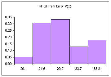
The area under the bars is equal to one, the sum of the relative frequencies. The above diagram consists of five discrete classes. Later we will look at continuous probability distributions using lines to depict the probability distribution. Imagine a line connecting the tops of the columns:
If the columns are removed and the class upper limits are shifted to where the right side of each column used to be:
The orange vertical line has been drawn at the value of the mean. This line splits the area under the "curve" in half. Half of the females have a body fat measurement less than this value, half have a body fat measurement greater than this value.
We could also draw a vertical line that splits the area under the curve such that we have ten percent of the area to the left of the orange line and ninety percent to the right of the orange line. This line would be at the value below which only ten percent of the measurements occur.
In some situations we have only the intervals and the frequencies but we do not have the original data. In these situations it would be useful to still be able to calculate a mean and a standard deviation for our data.
If we only have the intervals and frequencies, then we can calculate both the mean and the standard deviation from the class upper limits and the relative frequencies. Here is the mean and standard deviation for the sample of 39 female students:
| BFI fem CUL x |
Frequency f |
Relative Frequency f/n or P(x) | Mean μ: ∑(x*P(x)) |
stdev σ: √(∑((x-μ)ҪP(x))) |
|---|---|---|---|---|
| 20.1 | 2 | 0.05 | 1.03 | 4.52 |
| 24.6 | 12 | 0.31 | 7.58 | 7.29 |
| 29.2 | 13 | 0.33 | 9.72 | 0.04 |
| 33.7 | 5 | 0.13 | 4.32 | 2.23 |
| 38.1 | 7 | 0.18 | 6.86 | 13.56 |
| Sum: | 39 | 1.00 | μ = 29.51 | ∑ = 27.64 |
| σ = 5.26 |
A spreadsheet with the above data is available at:
http://www.comfsm.fm/~dleeling/statistics/statistics_fall2001.xls
Note that the results are not exactly the same as those attained by analyzing the data directly. Where we can, we will analyze the original data. This is not always possible. The following table was taken from the 1994 FSM census. Here the data has already been tallied into intervals, we do not have access to the original data. Even if we did, it would be 102,724 rows, too many for some of the computers on campus.
| Age x | Total f | Relative frequency f/n or P(x) | x*P(x) | (x-μ)²*P(x) |
|---|---|---|---|---|
| 4 | 14662 | 0.14 | 0.57 | 57.78 |
| 9 | 15090 | 0.15 | 1.32 | 33.58 |
| 14 | 14944 | 0.15 | 2.04 | 14.90 |
| 19 | 12425 | 0.12 | 2.30 | 3.17 |
| 24 | 9192 | 0.09 | 2.15 | 0.00 |
| 29 | 7042 | 0.07 | 1.99 | 1.63 |
| 34 | 6800 | 0.07 | 2.25 | 6.46 |
| 39 | 5998 | 0.06 | 2.28 | 12.93 |
| 44 | 3131 | 0.03 | 1.34 | 12.05 |
| 49 | 3601 | 0.04 | 1.72 | 21.70 |
| 54 | 2271 | 0.02 | 1.19 | 19.74 |
| 59 | 2089 | 0.02 | 1.20 | 24.74 |
| 64 | 1978 | 0.02 | 1.23 | 30.62 |
| 69 | 1308 | 0.01 | 0.88 | 25.65 |
| 74 | 1169 | 0.01 | 0.84 | 28.31 |
| 79 | 544 | 0.01 | 0.42 | 15.95 |
| 84 | 313 | 0.00 | 0.26 | 10.93 |
| 89 | 99 | 0.00 | 0.09 | 4.06 |
| 94 | 56 | 0.00 | 0.05 | 2.66 |
| 98 | 12 | 0.00 | 0.01 | 0.64 |
| Sums: | 102724 | 1 | 24.12 | 327.50 |
| sqrt: | 18.10 |
The mean μ = 24.12
The population standard deviation σ = 18.10
The result is an average age of 24.12 years for a resident of the FSM in 1994 and a standard deviation of 18.10 years. This means at least half the population of the nation is under 24.12 years old! Actually, due to the skew in the distribution, fully 56% of the nation is under 19. Bear in mind that 56% is in school. That means we will need new jobs for that 56% as they mature and enter the workplace. On the order of 57,121 new jobs.
How old are you? Below, at, or above the mean (average)? Do you have a job?
Note we used the class upper limits to calculate the average age. Potentially this inflates the national average by as much as half a class width or 2.5 years. Taking this into account would yield an average age of 21.62 years old.
There is one more small complication to consider. Since the population of the FSM is growing, the number of people at each age in years is different across the five year span of the class. The age groups at the bottom of the class (near the class lower limit) are going to be bigger than the age groups at the top of the class (near the class upper limit). This would act to further reduce the average age.
Homework: Use the 2000 Census data to calculate the mean age in the FSM in 2000.
| Age | 2000 |
|---|---|
| 4 | 14782 |
| 9 | 14168 |
| 14 | 14213 |
| 19 | 13230 |
| 24 | 9527 |
| 29 | 7620 |
| 34 | 6480 |
| 39 | 6016 |
| 44 | 5560 |
| 49 | 4650 |
| 54 | 3205 |
| 59 | 1903 |
| 64 | 1733 |
| 69 | 1487 |
| 74 | 993 |
| 79 | 1441 |
Alternate Homework:
Use the following data to calculate the overall grade point average and standard deviation of the grade point data for the Pohnpeian students at the national campus during the terms Fall 2000 and Spring 2001
| Grade Point Value x |
Frequency f |
Relative Frequency f/n or P(x) |
Mean: ∑(x*P(x)) |
stdev: √(∑((x-μ)ҪP(x))) |
|---|---|---|---|---|
| 4 | 851 | ______ | ______ | ______ |
| 3 | 1120 | ______ | ______ | ______ |
| 2 | 1023 | ______ | ______ | ______ |
| 1 | 459 | ______ | ______ | ______ |
| 0 | 690 | ______ | ______ | ______ |
| Sums: | ______ | ______ | ______ | ______ |
| Sqrt: | ______ |
Inferential statistics is all about measuring a sample and then using those values to predict the values for a population. The measurements of the sample are called statistics, the measurements of the population are called parameters. Some sample statistics are good predictors of their corresponding population parameter. Other sample statistics are not able to predict their population parameter.
The sample size will always be smaller than the population. The population size N cannot be predicted from the sample size n. The sample mode is not usually the same as the population mode. The sample median is also not necessarily a good predictor of the population median.
The sample mean for a good, random sample, is a good point estimate of the population mean μ. The sample standard deviation sx predicts the population standard deviation σ. The shape of the distribution of the sample is a good predictor of the shape of the distribution of the population.
That the shape of the population distribution can be predicted by the shape of the distribution of a good random sample is important. Later in the course we will be predicting the population mean μ. Instead of predicting a single value we will predict a range in which the population mean will likely be found.
Consider as an example the following question, "How long does it take to drive from Kolonia to the national campus on Pohnpei?" A typical answer would be "Ten to twenty minutes." Everyone knows that the time varies, so a range is quoted. The average time to drive to the national campus is somewhere in that range.
Determining the appropriate range in which a population mean will be found depends on the shape of the distribution. A bimodal distribution is likely to need a larger range than a symmetrical bell shaped distribution in order to be sure to capture the population mean.
As a result of the above, we need to understand the shape of distributions generated by different systems. The most important shape in statistics is the shape of a purely random distribution, like that generated by tossing many pennies.
In class exercise: flipping seven pennies. Student flip seven pennies and record the number of heads. The data for a section is gathered and tabulated. The students then prepare a relative frequency histogram of the number of heads and calculate the mean number of heads from Σ x*p(x).
In the table below, seven pennies are tossed eight hundred and fifty eight times. For each toss of the seven pennies, the number of pennies landing heads up are counted.
| # of heads x | Frequency | Rel Freq P(x) |
|---|---|---|
| 7 | 9 | 0.0105 |
| 6 | 112 | 0.1305 |
| 5 | 147 | 0.1713 |
| 4 | 228 | 0.2657 |
| 3 | 195 | 0.2273 |
| 2 | 120 | 0.1399 |
| 1 | 45 | 0.0524 |
| 0 | 2 | 0.0023 |
| 858 | 1.00 |
The relative frequency histogram for a large number of pennies is usually a heap-like shape. For seven pennies the theoretic shape of an infinite number of tosses can be calculated by considering the whole sample space for seven pennies
HHHHHHH HHHHHHT HHHHHHTT HHHHTTT HHHTTTT HHTTTTTT HTTTTTT TTTTTTT
        HHHHHTH HHHHHTHT HHHTHTT HHTHTTT THTTTTTH TTTTTTH
        HHHHTHH HHHHTHHT HHTHHTT HTHHTTT THTTTTHT TTTTTHT
          ...     ...       ...    ...      ...     ...
If one works out all the possible combinations then one attains:
(two sides)^(7 pennies) = 128 total possibilities
1 way to get seven heads/128 total possible outcomes = 1/128= 0.0078
7 ways to get six heads and one tail/128 possibilities = 7/128 =0.0547
21 ways to get five heads and two tails/128 = 21/128 = 0.1641
35 ways to get four heads and three tails/128 = 35/128 = 0.2734
35 ways to get three heads and four tails/128 = 35/128 = 0.2734
21 ways to get two heads and five tails/128 = 21/128 = 0.1641
7 ways to get one head and six tails/128 possibilities = 7/128 =0.0547
1 way to get seven tails/128 total possible outcomes = 1/128= 0.0078
If the theoretic relative frequencies (probabilities) are added to our table:
| # of heads x | Frequency | Rel Freq P(x) | Theoretic |
|---|---|---|---|
| 7 | 9 | 0.0105 | 0.0078 |
| 6 | 112 | 0.1305 | 0.0547 |
| 5 | 147 | 0.1713 | 0.1641 |
| 4 | 228 | 0.2657 | 0.2734 |
| 3 | 195 | 0.2273 | 0.2734 |
| 2 | 120 | 0.1399 | 0.1641 |
| 1 | 45 | 0.0524 | 0.0547 |
| 0 | 2 | 0.0023 | 0.0078 |
| 858 | 1.00 | 1.00 |
If the theoretic relative frequencies are added as a line to our graph, the following graph results:
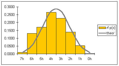
The gray line represents the shape of the distribution for an infinite number of coin tosses. The shape of the distribution is symmetrical.
If both the number of pennies is increased as well as the number of tosses, then the graph would become smoother and increasingly symmetrical. Below is a graph for tens of thousands of tosses of 21 pennies.
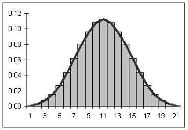
If the number of pennies and tosses are both allowed to go to infinity, then a smooth curve results looking a lot like the curve seen above. The smooth curve that results can be described by a function. Statistical mathematicians would say that as the number of sides and tosses approaches infinity, the discrete distribution approaches a continuous distribution described by the function below.

In the above function, σ is the population standard deviation, μ is the population mean, e is the base e, and π is pi. The name of this function is the "normal" curve. I like to think of it as being called normal because it is what "normally" happens if you toss a lot of pennies a lot of times! If the above function is graphed for a mean μ = 0 and a population standard deviation σ = 1, then the following graph results:
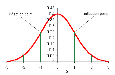
The above function has the following properties:
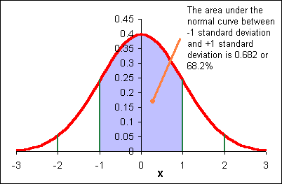
The area under each "section" of the normal curve can be seen in the following diagram.
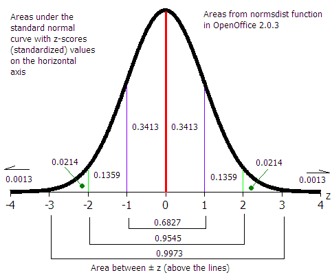
For example, the area under the curve beyond (to the right of) μ + 2σ is 0.0228 or 2.28%. The probability of a data value being greater than μ + 2σ is 0.0228. A data value could be expected out here once in about 44 instances.
6σ: "Six sigma" A business quality program that attempts to bring error down to 3 in a million (μ + 6σ)
When we speak of the "area under" the normal curve, one can think of a chapter two histogram. As per chapter five, the relative frequency is the probability x will be in a given class.
The shape of the normal curve is affected by the standard deviation. In the diagram below m is the mean μ and sx is the standard deviation.
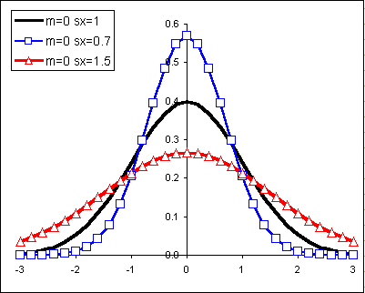
Changes to the mean shift the normal curve horizontally:
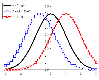
Let us begin with a more familiar example from our work earlier in the term.
Heap like shapes often result from histograms of data. The following is a frequency table for the height data for 60 females in statistics class in an earlier term.
| Female height CUL | Frequency | Relative Frequency |
|---|---|---|
| 59.6 | 6 | 0.10 |
| 61.2 | 16 | 0.27 |
| 62.8 | 18 | 0.30 |
| 64.4 | 16 | 0.27 |
| 66 | 4 | 0.07 |
| Sums: | 60 | 1.00 |
The following relative frequency histogram for the heights of 60 females above has the following distribution:
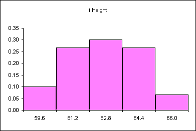
Imagine changing this discrete distribution into a continuous distribution.
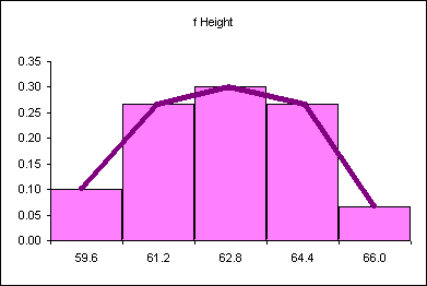
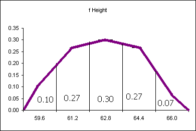
The probability distribution above says that 10% of the women are less than or equal to 59.6 inches tall. 27% of the women measured are taller than 59.6 inches and shorter than or equal to 61.2 inches. What is the probability of finding a female student taller than 64.4 inches tall? Seven percent. The area "under" each segment of the "curve" is the probability of a women being in that range of heights.
The difficulty with the above analysis is seen in attempting to answer the following question: What percentage of female students are taller than 60 inches? This cannot easily be determined from the above data. An answer could be interpolated, but that would be the best we would be able to do.
In some instances the actual shape of the population distribution is not exactly known, but the distribution is expected to be heaped, to behave "normally" and heap up in the manner of the normal distribution.
Because there is a mathematical equation for the normal distribution, the probabilities (the areas under the curve!) can be determined mathematically.
Suppose we know that sixty customers arrive at a sakau market on a Friday night at a mean time of μ = 7:00 P.M. with a standard deviation of σ = 30 minutes (0.5 hours). Suppose also that the time of arrival for the customers is normally distributed (note that areas are rounded).
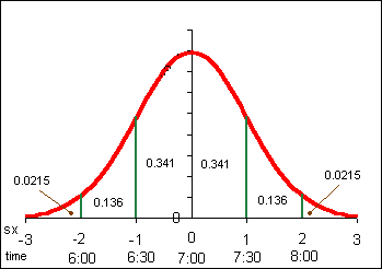
Note that in the above example the population mean μ and population standard deviation σ are used. Our normal distribution work is based on a theories that use the population parameters. Later in the course we will use a modified normal distribution called the student's t-distribution to work with sample statistics such as the sample mean x and the sample standard deviation sx for small samples. For many examples in this text, the population parameters are not known. Until the student's t-distribution is introduced, data that forms a reasonably "heap-like" shape will be analyzed using the normal distribution.
The probability p is the same as the area under the normal curve. Probability, expressed often as a percentage, is area. Probability is also the relative frequency. In this class probability, p, area, and relative frequency are all used interchangeably.
If x is not an whole number of standard deviations from the mean, then we cannot use a diagram as seen above. Spreadsheets have a function that calculates the area (probability) to the left of ANY x value. The letter p for probability is used for the area to the left of x.
The function that calculates the area to the left of x is:
=normdist(x,μ,σ,1)
The mean height μ for 43 female students in statistics is 62.0 inches with a standard deviation of 1.9. Determine the probability that a student is less than 60 inches tall (five feet tall).
In OpenOffice the probability p =
=normdist(60,62,1.9,1)
=0.1463
14.63% of the area is to the left of 60 inches. The probability a female student in statistics class is below 60 inches is 14.63%.
Notation note: In probability notation the above would be written p(x < 60) = 0.1463
When the words "less than, smaller, shorter, fewer, up to and including" are used then the NORMDIST function can be used to calculate the probability.
The mean number of cups of sakau consumed in sakau markets on Pohnpei is μ = 3.65 with a standard deviation of σ = 2.52. Note that this data is actually based on customer data for 227 customers at four markets - one near Kolonia and three in Kitti. Although this data is actually sample data and not population data, we will treat the mean and standard deviation as population parameters. The data is not perfectly normally distributed. The data is, however, distributed in a reasonably smooth heap.
What is the probability a customer will drink more than five cups?
Note the word "more." If the question were "What is the probability that a customer will drink less than five cups, then the solution would be =NORMDIST(5,3.65,2.52,1). This result is 0.70 or a 70% probability a customer will drink less than five cups.
The area under the whole normal curve is 1.00. Remember that 1.00 is also 100%. If 70% drink less than five cups, then we can calculate the probability that those who drink more than five cups is 30%. 100% − 70% = 30%.
Or 1.00 − 0.70 = 0.30
Making a sketch of the normal curve including the mean, the x-value, and the area of interest can help determine when to subtract a result from one and when to not.
A study of the prevalence of diabetes in a village on Pohnpei found a mean fasting blood sugar level of μ = 117 with a standard deviation σ = 33 in mg/dl for females aged 20 to 29 years old. Blood sugar levels between 120 and 130 are considered borderline diabetes cases. What percentage of the females aged 20 to 29 years old in this village are between a mean fasting blood sugar of 120 and 130 mg/dl?
For this example, presume that the distribution is normal.
The probability is the percentage. The probability is the area between x = 120 and x = 130 as seen in the image below.
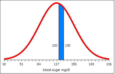
In probability notation this would be written p(120 < x < 130) = ?
To obtain the area between 120 and 130, calculate the area to the left of 120.
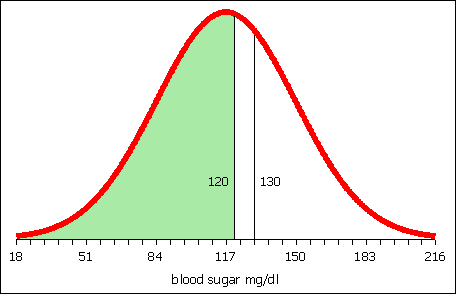
Then calculate the area to the left of 130.
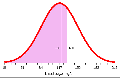
Subtract the area to the left of 120 from the area to the left of 130. What remains is the area between 120 and 130.
The table below represents a spreadsheet laid out to calculate the area to the left of 120 in column B and the area to the left of 130 in column C.
| A | B | C | D | |
|---|---|---|---|---|
| 1 | x | 120 | 130 | |
| 2 | mean μ | 117 | 117 | |
| 3 | stdev σ | 33 | 33 | |
| 4 | normdist | =NORMDIST(B1,B2,B3,1) | =NORMDIST(C1,C2,C3,1) | =C4-B4 |
| 4 | normdist | 0.54 | 0.65 | 0.11 |
Row four is presented twice: once with the formulas and once with the results of the formulas.
The area to the left of 120 is 0.54. The area to the left of 130 is 0.65. 0.65 − 0.54 is 0.11. The probability that females aged 20 to 29 years old in this village have a blood sugar level between 120 and 130 is 11%.
Conversely, given a probability, a mean, and a standard deviation, an x value can be calculated.
On the college essay admissions test a perfect score is 40. In a recent spring run of the admissions test the mean score was 21 and the standard deviation was 12. Below what score x are the lowest 33% of the student scores? Presume that the data is normally distributed.
In this case we have an area. Percentages are probabilities. Probabilities are area under the curve. We do not know x. To find the area to the left of x the function NORMINV is used. The letter p is the probability, the area.
=NORMINV(p,μ,σ)
In this case area =NORMINV(0.33,21,12). Note that the area is expressed as a decimal. Alternatively the area could be entered as 33%. The result of this calculation is 15.72. 33% of the students scored below a 15.72 on the essay test.
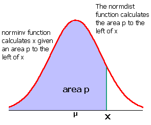
Suppose the height of women at the College is normally distributed with a mean of 62.0 inches and a standard deviation of 1.9 inches. Suppose I want to know the minimum height of the top 10% of the female students at the College.
In this instance I have a probability, the top 10%. The NORMINV function, however, requires the area to the right of x. If the area to the right is 10%, then the area to the left is 100% − 10% = 90%.
area =NORMINV(0.90,62,1.9)
The result is 64.43.
Thus the minimum height of the top 10% is 64.43 inches. If there are 350 women at the college, then 0.10 * 350 = 35 women can be expected to be taller than 64.4 inches.
Domino's pizza knows that the average length of time from receiving an order to delivering to the customer is 20 minutes with a standard deviation 7 min 45 seconds. Treat these sample statistics as population parameters for now. Dominoes wants to guarantee a delivery time as part of a marketing campaign, "Your pizza in ___ minutes of your money back!" Dominoes is willing to refund 10% of their orders, what is the quickest delivery time they should set the grantee at?
The area to the left of x is 90% therefore the correct function is =NORMINV(0.9,20,7.75)
The result is 29.92 minutes
So you guarantee delivery in 30 minutes or less and you'll only pay out on 10% of the pizzas. (From another perspective this is a "Buy ten to get one free program").
As noted in earlier chapters, statistics are the measures of a sample. The measures are used to characterize the sample and to infer measures of the population termed parameters.
A parameter is a numerical description of a population. Examples include the population mean μ and the population standard deviation σ.
A statistic is a numerical description of a sample. Examples include a sample mean x and the sample standard deviation sx.
Good samples are random samples where any member of the population is equally likely to be selected and any sample of any size n is equally likely to be selected. Consider four samples selected from a population. The samples need not be mutually exclusive as shown, they may include elements of other samples.
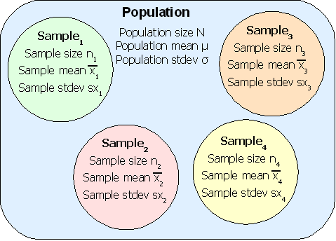
The sample means x1, x2, x3, x4, can include a smallest sample mean and a largest sample mean. Choosing a number of classes can generate a histogram for the sample means. The question this chapter answers is whether the shape of the distribution of sample means from a population is any shape or a specific shape.
The shape of the distribution of the sample mean is not any possible shape. The shape of the distribution of the sample mean, at least for good random samples with a sample size larger than 30, is a normal distribution. That is, if you take random samples of 30 or more elements from a population, calculate the sample mean, and then create a relative frequency distribution for the means, the resulting distribution will be normal.
In the following diagram the underlying data is bimodal and is depicted by the columns with thin outlines. Thirty data elements were sampled forty times and forty sample means were calculated. A relative frequency histogram of the sample means is plotted with a heavy black outline. Note that though the underlying distribution is bimodal, the distribution of the forty means is heaped and close to symmetrical. The distribution of the forty sample means is normal.
The center of the distribution of the sample means is, theoretically, the population mean. To put this another simpler way, the average of the sample averages is the population mean. Actually, the average of the sample averages approaches the population mean as the number of sample averages approaches infinity.
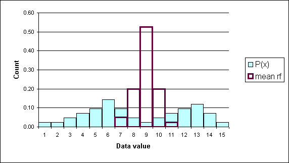
The sample mean distribution is a heap shaped, as in the shape of the normal distribution, and centered on the population mean.
If the sample size is 30 or more, then the sample means are NORMALLY distributed even when the underlying data is NOT normally distributed! If the sample size is less than 30, then the distribution of the samples means is normal if and only if the underlying data is normally distributed.
The normal distribution of the sample means (averages) allows us to use our normal distribution probabilities to estimate a range for μ. The mean of the sample means is a point estimate for the population mean μ.
The mean of the sample means can be written as:
![]()
In this text the above is sometimes written as μ x
The value of the mean of the sample means μ x is, for a very large number of samples each of which has a very large sample size, the population mean. As a practical matter we use the mean of a single large sample. How large? The sample size must be at least n = 30 in order for the sample mean (a statistic) to be a good estimate for the population mean (a parameter). This requirement is necessary to ensure that the distribution of the sample means will be normal even when the underlying data is not normal. If we are certain the data is normally distributed, then a sample size n of less than 30 is acceptable.
Later in the course we will modify the normal distribution to handle samples of sizes less than 30 for which the distribution of the underlying data is either unknown or not normal. This modification will be called the student's t-distribution. The student's t-distribution is also heap-shaped.
The normal distribution, and later the student's t-distribution, will be used to quote a range of possible values for a population mean based on a single sample mean. Knowing that the sample mean comes from a heap-shaped distribution of all possible means, we will center the normal distribution at the sample mean and then use the area under the curve to estimate the probability (confidence) that we have "captured" the population mean in that range.
The Central Limit Theorem is the theory that says "for increasingly large sample sizes n, the sample mean approaches ever closer the population mean."
The standard deviation of the distribution of the sample means
There is one complication: the sample standard deviation of a single sample is not a good estimate of the standard deviation of the sample means. Note that the distribution of the sample means is NARROWER than the sample in the above example. The shape of the distribution of the sample means is narrower and taller than the shape of the underlying data. In the diagram, the shape of the underlying data is normal, the taller narrower distribution is the distribution of all the sample means for all possible samples.
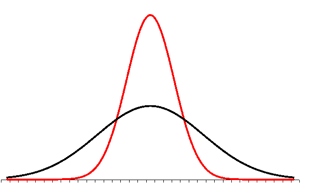
The standard deviation of a single sample has to be reduced to reflect this. This reduction turns out to be inversely related to the square root of the sample size. This is not proven here in this text.
The standard deviation of the distribution of the sample means is equal to the actual population standard deviation divided by the square root of n.
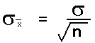
The standard deviation divided by the square root of the sample size is called the standard error of the mean.
If σ is known, then the above formula can be used and the distribution of the sample mean is normal.
As a practical matter, since we rarely know the population standard deviation σ, we will use the sample standard deviation sx in class to estimate the standard deviation of the sample means. This formula will then appear in various permutations in formulas used to estimate a population mean from a sample mean. When we use the sample standard deviation sx we will use the student's t-distribution. The student's t-distribution looks like a normal distribution. The student's t-distribution, however, is adjusted to be a more accurate predictor of the range for a population mean. Later we will learn to use the student's t-distribution. Until that time we will play a little fast and loose and use sample standard deviations to calculate the standard error of the mean.
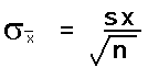
Whenever we use a single statistic to estimate a parameter we refer to the estimate as a point estimate for that parameter. When we use a statistic to estimate a parameter, the verb used is "to infer." We infer the population parameter from the sample statistic.
Some population parameters cannot be inferred from the statistic. The population size N cannot be inferred from the sample size n. The population minimum, maximum, and range cannot be inferred from the sample minimum, maximum, and range. Populations are more likely to have single outliers than a smaller random sample.
The population mode and median usually cannot be inferred from a smaller random sample. There are special circumstances under which a sample mode and median might be a good estimate of a population mode and median, these circumstances are not covered in this class.
The statistic we will focus on is the sample mean x. The normal distribution of sample means for many samples taken from a population provides a mathematical way to calculate a range in which we expect to "capture" the population mean and to state the level of confidence we have in that range's ability to capture the population mean µ.
The sample mean x is a point estimate for the population mean µ
The sample mean x for a random sample will not be the exact same value as the true population mean µ.
The error of a point estimate is the magnitude of estimate minus the actual parameter (where the magnitude is always positive). The error in using x for µ is ( x − µ ). Note that to take a positive value we need to use either the absolute value |( x - µ )| or √( x - µ )2.
Note that the error of an estimate is the distance of the statistic from the parameter.
Unfortunately, the whole reason we were using the sample mean x to estimate the population mean µ is because we did not know the population mean µ.
For example, given the mean body fat index (BFI) of 51 male students at the national campus is x = 19.9 with a sample standard deviation of sx = 7.7, what is the error |( x - µ )| if µ is the average BFI for male COMFSM students?
We cannot calculate this. We do not know µ! So we say x is a point estimate for µ. That would make the error equal to √(x − x)2 = zero. This is a silly and meaningless answer.
Is x really the exact value of µ for all the males at the national campus? No, the sample mean is not going to be the same as the true population mean.
The sample standard deviation sx is a reasonable point estimate for the population standard deviation σ. In more advanced statistics classes concern over bias in the sample standard deviation as an estimator for the population standard deviation is considered more carefully. In this class, and in many applications of statistics, the sample standard deviation sx is used as the point estimate for the population standard deviation σ.
We might be more accurate if we were to say that the mean µ is somewhere between two values. We could estimate a range for the population mean µ by going one standard error below the sample mean and one standard error above the sample mean. Remember, the standard error is the σ/√(n). Note that the formula for the standard error requires knowing the population standard deviation σ. We do not usually know this value. In fact, if we knew σ then we would probably also know the population mean µ. In section 9.2 we will use the sample standard deviation or sx/√(n) and the student's t-distribution to calculate a range in which we expect to find the population mean µ.
In the diagram the lower curve represents the distribution of data in a population with a normal distribution. Remember, distribution simply means the shape of the frequency or relative frequency histogram, now charted as a continuous line. The narrower and taller line is the distribution of all possible sample means from that population.
For the population curve (lower, broader) the distance to each inflection point is one standard deviation: ± σ. For the sample means (higher, narrower) the distance to each inflection point is one standard error of the mean: ± σ/√(n).
The area from minus one standard error to plus one standard error is still 68.2%.
Here is a key point: If I set my estimate for µ to be between x - σ/√n and x + σ/√n, then there is a 0.682 probability that µ will be included in that interval.
The "68.2% probability" is termed "the level of confidence."
Probability note: the reality is that the population mean is either inside or outside the range we have calculated. We are right or wrong, 100% or 0%. Thus saying that there is a 68.2% probability that the population mean has been "captured" by the range is not actually correct. This is the main reason why we shift to calling the range for the mean a confidence interval. We start saying things such as "I am 68.2 percent confident the mean is in the range quoted." Statisticians assert that over the course of a lifetime, if one always uses a 68.2% confidence interval one will right 68.2% of the time in life. This is small comfort when an individual experimental result might be very important to you.
In many fields of inquiry a common level of confidence used is a 95% level of confidence. For the purposes of this course a 95% confidence interval is often used.

Note that when a confidence interval is not 95%, then specific reference to the chosen confidence level must be stated. Stating the level of confidence is always good form. While many studies are done at a 95% level of confidence, in some fields higher or lower levels of confidence may be common. Scientific studies often use 99% or higher levels of confidence.
There is always, however, a chance that one will be wrong. In Florida an election was "called" in favor of candidate Al Gore in the year 2000 in the United States based on a 99.5% level of confidence. Hours later the news organizations said George Bush had won Florida. A few hours later the news organizations would retract this second estimate and decide that the race was too close too call. The news organizations decided they had been wrong two times in row. Eventually a court case finally settled who had won the state of Florida. Even at a half a percent chance of being wrong one can still be wrong, even two times in a row.
When using the sample standard deviation sx to generate a confidence interval for the population mean, a distribution called the Student's t-distribution is used. The Student's t-distribution looks like the normal distribution, but the t-distribution changes shape slightly as the sample size n changes. The t-distribution looks like a normal distribution, but the shape "flattens" as n decreases. As the sample size decreases, the t-distribution becomes flatter and wider, spreading out the confidence interval and "pushing" the lower and upper limits away from the center. For n > 30 the Student's t-distribution is almost identical to the normal distribution. When we sketch the Student's t-distribution we draw the same heap shape with two inflection points.
To use the Student's t-distribution the sample must be a good, random sample. The sample size can be as small as n = 5. For n ≤ 10 the t-distribution will generate very large ranges for the population mean. The range can be so large that the estimate is without useful meaning. A basic rule in statistics is "the bigger the sample size, the better."
The spreadsheet function used to find limits from the Student's t-distribution does not calculate the lower and upper limits directly. The function calculates a value called "t-critical" which is written as tc. t-critical muliplied by the Standard Error of the mean SE will generate the margin of error for the mean E.
Do not confuse the standard error of the mean with the margin of error for the mean. The Standard Error of the mean is sx/√(n). The Margin of Error for the mean (E) is the distance from either end of the condifendence interval to the middle of the confidence interval. The margin of error is produced from the Standard Error:
Margin of Error for the mean = tc*standard error of the mean
Margin of Error for the mean = tc*sx/√n
The confidence interval will be:
x - E ≤ µ ≤ x + E
The t-critical valus will be calculated using the spreadsheet function TINV. TINV uses the area in the tails to calculate t-critical. The area under the whole curve is 100%, so the area in the tails is 100% − confidence level c. Remember that in decimal notation 100% is just 1. If the confidence level c is in decimal form use the spreadsheet function below to calculate tc:
=TINV(1−c,n−1)
If the confidence level c is entered as a percentage with the percent sign, then make sure the 1 is written as 100%:
=TINV(100%−c%,n−1)
The TINV function adjusts t-critical for the sample size n. The formula uses n − 1. This n − 1 is termed the "degrees of freedom." For confidence intervals of one variable the degrees of freedom are n − 1.
Runners run at a very regular and consistent pace. As a result, over a fixed distance a runner should be able to repeat their time consistently. While individual times over a given distance will vary slightly, the long term average should remain approximately the same. The average should remain within the 95% confidence interval.
For a sample size of n = 10 runs from the college in Palikir to Kolonia town, a runner has a sample mean x time of 61 minutes with a sample standard deviation sx of 7 minutes. Construct a 95% confidence interval for my population mean run time.
Step 1: Determine the basic sample statistics
sample size n = 10
sample mean x = 61
 [61 is also the point est. for the pop. mean µ]
sample standard deviation sx = 7

Step 2: Calculate degrees of freedom, tc, standard error SE
degrees of freedom = 10 - 1 = 9
tc =TINV(1-0.95,10-1) = 2.2622
Standard Error of the mean sx/√n = 7/sqrt(10) = 2.2136
Keeping four decimal places in intermediate calculations can help reduce rounding errors in calculations. Alternatively use a spreadsheet and cell references for all calculations.
Step 3: Determine margin of error E
Margin of error E for the mean
 = tc*sx/√n = 2.2622*7/√10 = 5.01
Given that: x - E ≤ µ ≤ x + E, we can substitute the values for x and E to obtain the 95% confidence interval for the population mean µ:
Step 4: Calcuate the confidence interval for the mean
61 − 5.01 ≤ µ ≤ 61 + 5.01
    55.99 ≤ µ ≤ 66.01
I can be 95% confident that my population mean µ run time should be between 56 and 66 minutes.
| Jumps | ||||||||
|---|---|---|---|---|---|---|---|---|
| 102 | 66 | 42 | 22 | 24 | 107 | 8 | 26 | 111 |
| 79 | 61 | 45 | 43 | 10 | 17 | 20 | 45 | 105 |
| 68 | 69 | 79 | 13 | 11 | 34 | 58 | 40 | 213 |
On Thursday 08 November 2007 a jump rope contest was held at a local elementary school festival. Contestants jumped with their feet together, a double-foot jump. The data seen in the table is the number of jumps for twenty-seven female jumpers. Calculate a 95% confidence interval for the population mean number of jumps.
The sample mean x for the data is 56.22 with a sample standard deviation of 44.65. The sample size n is 27. You should try to make these calculations yourself. With those three numbers we can proceed to calculate the 95% confidence interval for the population mean µ:
Step 1: Determine the basic sample statistics
sample size n = 27
sample mean x = 56.22
sample standard deviation sx = 44.65

Step 2: Calculate degrees of freedom, tc, standard error SE
The degrees of freedom are n − 1 = 26
Therefore tcritical = TINV(1-0.95,27-1) = 2.0555
The Standard Error of the mean SE = sx/√27 = 8.5924

Step 3: Determine margin of error E
Therefore the Margin of error for the mean E
  tc* SE = 2.0555*8.5924 = 17.66
The 95% confidence interval for the mean is x − E ≤ µ ≤ x + E
Step 4: Calcuate the confidence interval for the mean
56.22 − 17.66 ≤ µ ≤ 56.22 + 17.66
        38.56 ≤ µ ≤ 73.88
The population mean for the jump rope jumpers is estimated to be between 38.56 and 73.88 jumps.
In 2003 a staffer at the Marshall Islands department of education noted in a newspaper article that Marshall's Island public school system was not the weakest in Micronesia. The staffer noted that Marshall's was second weakest, commenting that education metrics in the Marshall's outperform those in Chuuk's public schools.
In 2004 fifty students at Marshall Islands High School took the entrance test. Ten students Achieved admission to regular college programs. In Chuuk state 7% of the public high school students gain admission to the regular college programs. If the 95% confidence interval for the Marshall Islands proportion includes 7%, then the Marshallese students are not academically more capable than the Chuukese students, not statistically significantly so. If the 95% confidence interval does not include 7%, then the Marshallese students are statistically significantly stronger in their admissions rate.
Finding the 95% confidence interval for a proportion involves estimating the population proportion p. The fifty students at Marshall Islands High School are taked as a sample. The proportion who gained admission, 10/50 or 20%, is the sample proportion. The population proportion is treated as unknown, and the sample proportion is used as the point estimate for the population proportion.
Note: In this text the letter p is used for the sample proportion of successes instead of "p hat". A capital P is used to refer to the population proportion.
The letter n refers to the sample size. The letter p is the sample proportion of successes. The letter q is the sample proportion of failures. In the above example n is 50, p is 10/50 or 0.20, and q is 40/50 or 0.80
Estimating the population proportion P can only be done if the following conditions are met:
np > 5
nq > 5
In the example np = (50)(0.20) = 10 which is > 5. nq = (50)(0.80) = 40 which is also > 5
The standard error of a proportion is:
For the example above the standard error is:
=sqrt(0.2*0.8/50)
For the calculation of the confidence interval of a proportion, only the standard error calculation is new. The rest of the steps are the same as in the preceding section.
The standard error for the proportion is 0.0566. The margin of error E is then calculated in much the same way as in the section above, by multiplying tc by the standard error. tc is still found from the TINV function. The degrees of freedom will remain n-1.
The margin of error E is:
=TINV(1-0.95,50-1)*sqrt((0.2)*(0.8)/50)
The margin of error E is 0.1137
The confidence interval for the population proportion P is:
p − E ≤ P ≤ p + E
0.20 − 0.1137 ≤ P ≤ 0.20 + 0.1137
0.0863 ≤ P ≤ 0.3137
The result is that the expected population mean for Marshall Island High School is between 8.6% and 31.2%. The 95% confidence interval does not include the 7% rate of the Chuuk public high schools. While the college entrance test is not a measure of overall academic capability, there are few common measures that can be used across the two nations. The result does not contradict the staffer's assertion that MIHS outperformed the Chuuk public high schools. This lack of contradiction acts as support for the original statement that MIHS outperformed the public high schools of Chuuk in 2004.
Homework: In twelve sumo matches Hakuho bested Tochiazuma seven times. What is the 90% confidence interval for the population proportion of wins by Hakuho over Tochiazuma. Does the interval extend below 50%? A commentator noted that Tochiazuma is not evenly matched. If the interval includes 50%, however, then we cannot rule out the possibility that the two-win margin is random and that the rikishi (wrestlers) are indeed evenly matched.
Hakuho won that night, upping the ratio to 8 wins to 5 losses to Tochiazuma. Is Hakuho now statistically more likely to win or could they still be evenly matched at a confidence level of 90%?
Suppose you are designing a study and you have in mind a particular error E you do not want to exceed. You can determine the sample size n you'll need if you have prior knowledge of the standard deviation sx. How would you know the sample standard deviation in advance of the study? One way is to do a small "pre-study" to obtain an estimate of the standard deviation. These are often called "pilot studies."
If we have an estimate of the standard deviation, then we can estimate the sample size needed to obtain the desired error E.
Since E = tc*sx/√n, then solving for n yields = (tc*sx/E)²
Note that this is not a proper mathematical solution because tc is also dependent on n. While many texts use zc from the normal distribution in the formula, we have not learned to calculate zc.
In the "real world" what often happens is that a result is found to not be statistically significant as the result of an initial study. Statistical significance will be covered in more detail later. The researchers may have gotten "close" to statistical significance and wish to shrink the confidence interval by increasing the sample size. A larger sample size means a smaller standard error (n is in the denominator!) and this in turn yields a smaller margin of error E. The question is how big a sample would be needed to get a particular margin of error E.
The value for tc from pilot study can be used to estimate the new sample size n. The resulting sample size n will be slightly overestimated versus the traditional calculation made with the normal distribution. This overestimate, while slightly unorthodox, provides some assurance that the error E will indeed shrink as much as needed.
In a study of body fat for 51 males students a sample mean x of 19.9 with a standard deviation of 7.7 was measured. This led to a margin of error E of 2.17 and a confidence interval 17.73 ≤ µ ≤ 22.07
Suppose we want a margin of error E = 1.0 at a confidence level of 0.95 in this study of male student body fat. We can use the sx from the sample of 51 students to estimate my necessary sample size:
n = (2.0086*7.7/1)2 = 239.19 or 239 students. Thus I estimate that I will need 239 male students to reduce my margin of error E to ±1 in my body fat study.
Other texts which use zc would obtain the result of 227.77 or 228 students. The eleven additional students would provide assurance that the margin of error E does fall to 1.0.
That one can calculate a sample size n necessary to reduce a margin of error E to a particular level means that for any hypothesis test (chapter ten) in which the means have a mathematical difference, statistical significance can be eventually be attained by sufficiently increasing the sample size. This may sound appealing to the researcher trying to prove a difference exists, but philosophically it leaves open the concept that all things can be proven true for sufficiently large samples.
In this chapter we explore whether a sample has a sample mean x that could have come from a population with a known population mean μ. There are two possibilities. In Case I below, the sample mean x comes from the population with a known mean μ. In Case II, on the right, the sample mean x does not come from the population with a known mean μ. For our purposes the population mean μ could be a pre-existing mean, an expected mean, or a mean against which we intend to run the hypothesis test. In the next chapter we will consider how to handle comparing two samples to each other to see if they come from the same population.

Suppose we want to do a study of whether the female students at the national campus gain body fat with age during their years at COM-FSM. Suppose we already know that the population mean body fat percentage for the new freshmen females 18 and 19 years old is μ = 25.4.
We measure a sample size n = 12 female students at the national campus who are 21 years old and older and determine that their sample mean body fat percentage is x = 30.5 percent with a sample standard deviation of sx = 8.7.
Can we conclude that the female students at the national campus gain body fat as they age during their years at the College?
Not necessarily. Samples taken from a population with a population mean of μ = 25.4 will not necessarily have a sample mean of 25.4. If we take many different samples from the population, the sample means will distribute normally about the population mean, but each individual mean is likely to be different than the population mean.
In other words, we have to consider what the likelihood of drawing a sample that is 30.5 - 25.4 = 5.1 units away from the population mean for a sample size of 12. If we knew more about the population distribution we would be able to determine the likelihood of a 12 element sample being drawn from the population with a sample mean 5.1 units away from the actual population mean.
In this case we know more about our sample and the distribution of the sample mean. The distribution of the sample mean follows the student's t-distribution. So we shift from centering the distribution on the population mean and center the distribution on the sample mean. Then we determine whether the confidence interval includes the population mean or not. We construct a confidence interval for the range of the population mean for the sample.
If this confidence interval includes the known population mean for the 18 to 19 years olds, then we cannot rule out the possibility that our 12 student sample is from that same population. In this instance we cannot conclude that the women gain body fat.
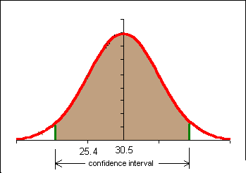
If the confidence interval does NOT include the known population mean for the 18 to 19 year old students then we can say that the older students come from a different population: a population with a higher population mean body fat. In this instance we can conclude that the older women have a different and probably higher body fat level.
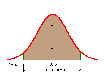
One of the decisions we obviously have to make is the level of confidence we will use in the problem. Here we enter a contentious area. The level of confidence we choose, our level of bravery or temerity, will determine whether or not we conclude that the older females have a different body fat content. For a detailed if somewhat advanced discussion of this issue see The Fallacy of the Null-Hypothesis Significance Test by William Rozeboom.
In education and the social sciences there is a tradition of using a 95% confidence interval. In some fields three different confidence intervals are reported, typically a 90%, 95%, and 99% confidence interval. Why not use a 100% confidence interval? The normal and t-distributions are asymptotic to the x-axis. A 100% confidence interval would run to plus and minus infinity. We can never be 100% confident.
In the above example a 95% confidence interval would be calculated in the following way:
n = 12
x = 30.53
sx = 8.67
c = 0.95
degrees of freedom = 12 -1 = 11
tc = tinv((1-0.95,11) = 2.20
E = tc*sx/sqrt(12) = 5.51
x - E < μ <
x + E
25.02 < μ < 36.04
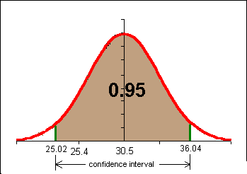
The 95% confidence interval for our n = 12 sample includes the population mean 25.3. We CANNOT conclude at the 95% confidence level that this sample DID NOT come from a population with a population mean μ of 25.3.
Another way of thinking of this is to say that 30.5 is not sufficiently separated from 25.8 for the difference to be statistically significant at a confidence level of 95% in the above example.
In common language, the women are not gaining body fat.
The above process is reduced to a formulaic structure in hypothesis testing. Hypothesis testing is the process of determining whether a confidence interval includes a previously known population mean value. If the population mean value is included, then we do not have a statistically significant result. If the mean is not encompassed by the confidence interval, then we have a statistically significant result to report.
Homework
If I expand my study of female students 21+ to n = 24 and find a sample mean x = 28.7 and an sx=7, is the new sample mean statistically significantly different from a population mean μ of 25.4 at a confidence level of c = 0.90?
The null hypothesis is the supposition that there is no change in a value from some pre-existing, historical, or expected value. The null hypothesis literally supposes that the change is null, non-existent, that there is no change.
In the previous example the null hypothesis would have been H0: μ = 25.4
The alternate hypothesis is the supposition that there is a change in the value from some pre-existing, historical, or expected value. Note that the alternate hypothesis does NOT say the "new" value is the correct value, just that whatever the mean μ might be, it is not that given by the null hypothesis.
H1: μ ≠ 25.4
We run hypothesis test to determine if new data confirms or rejects the null hypothesis.
If the new data falls within the confidence interval, then the new data does not contradict the null hypothesis. In this instance we say that "we fail to reject the null hypothesis." Note that we do not actually affirm the null hypothesis. This is really little more than semantic shenanigans that statisticians use to protect their derriers. Although we run around saying we failed to reject the null hypothesis, in practice it means we left the null hypothesis standing: we de facto accepted the null hypothesis.
If the new data falls outside the confidence interval, then the new data would cause us to reject the null hypothesis. In this instance we say "we reject the null hypothesis." Note that we never say that we accept the alternate hypothesis. Accepting the alternate hypothesis would be asserting that the population mean is the sample mean value. The test does not prove this, it only shows that the sample could not have the population mean given in the null hypothesis.
For two-tailed tests, the results are identical to a confidence interval test. Note that confidence interval never asserts the exact population mean, only the range of possible means. Hypothesis testing theory is built on confidence interval theory. The confidence interval does not prove a particular value for the population mean , so neither can hypothesis testing.
In our example above we failed to reject the null hypothesis H0 that the population mean for the older students was 25.4, the same population mean as the younger students.
In the example above a 95% confidence interval was used. At this point in your statistical development and this course you can think of this as a 5% chance we have reached the wrong conclusion.
Imagine that the 18 to 19 year old students had a body fat percentage of 24 in the previous example. We would have rejected the null hypothesis and said that the older students have a different and probably larger body fat percentage.
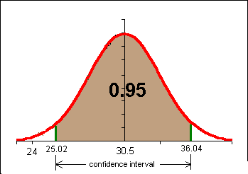
There is, however, a small probability (less than 5%) that a 12 element sample with a mean of 30.5 and a standard deviation of 8.7 could come from a population with a population mean of 24. This risk of rejecting the null hypothesis when we should not reject it is called alpha α. Alpha is 1-confidence level, or α = 1-c. In hypothesis testing we use α instead of the confidence level c.
| Suppose | And we accept H0 as true | Reject H0 as false |
|---|---|---|
| H0 is true | Correct decision. Probability: 1 − α | Type I error. Probability: α |
| H0 is false | Type II error. Probability: β | Correct decision. Probability: 1 − β |
Hypothesis testing seeks to control alpha α. We cannot determine β (beta) with the statistical tools you learn in this course.
Alpha α is called the level of significance. 1 − β is called the "power" of the test.
The regions beyond the confidence interval are called the "tails" or critical regions of the test. In the above example there are two tails each with an area of 0.025. Alpha α = 0.05
For hypothesis testing it is simply safest to always use the t-distribution. In the example further below we will run a two-tail test.
Steps
Using the data from the first section of these notes:
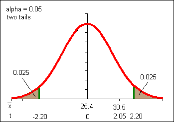
Note the changes in the above sketch from the confidence interval work. Now the distribution is centered on μ with the distribution curve described by a t-distribution with eleven degrees of freedom. In our confidence interval work we centered our t-distribution on the sample mean. The result is, however, the same due to the symmetry of the problems and the curve. If our distribution were not symmetric we could not perform this sleight of hand.
The hypothesis test process reduces decision making to the question, "Is the t-statistic t greater than the t-critical value tc? If t > tc, then we reject the null hypothesis. If t < tc, then we fail to reject the null hypothesis. Note that t and tc are irrational numbers and thus unlikely to ever be exactly equal.
I have a previously known population mean μ running pace of 6'09" (6.15). In 2001 I've been too busy to run regularly. On my five most recent runs I've averaged a 6'23" (6.38) pace with a standard deviation 1'00" At an alpha α = 0.05, am I really running differently this year?
H0: μ = 6.15
H1: μ ≠ 6.15
Pay close attention to the above! We DO NOT write H1: μ = 6.23. This is a common beginning mistake.
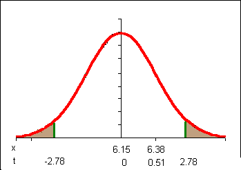
Note that in my sketch I am centering my distribution on the population mean and looking at the distribution of sample means for sample sizes of 5 based on that population mean. Then I look at where my actual sample mean falls with respect to that distribution.
Note that my t-statistic t does not fall "beyond" the critical values. I do not have enough separation from my population mean: I cannot reject H0. So I fail to reject H0. I am not performing differently than last year. The implication is that I am not slower.
Return to our first example in these notes where the body fat percentage of 12 female students 21 years old and older was x = 30.53 with a standard deviation sx=8.67 was tested against a null hypothesis H0 that the population mean body fat for 18 to 19 year old students was μ = 25.4. We failed to reject the null hypothesis at an alpha of 0.05. What if we are willing to take a larger risk? What if we are willing to risk a type I error rate of 10%? This would be an alpha of 0.10.
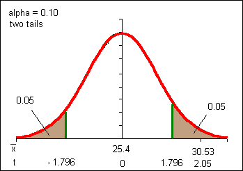
With an alpha of 0.10 (a confidence interval of 0.90) our results are statistically significant. These same results were NOT statistically significant at an alpha α of 0.05. So which is correct:
Note how we would have said this in confidence interval language:
The answer is that it depends on how much risk you are willing take, a 5% chance of committing a Type I error (rejecting a null hypothesis that is true) or a larger 10% chance of committing a Type I error. The result depends on your own personal level of aversity to risk. That's a heck of a mathematical mess: the answer depends on your personal willingness to take a particular risk.
Consider what happens if someone decides they only want to be wrong 1 in 15 times: that corresponds to an alpha of α = 0.067. They cannot use either of the above examples to decide whether to reject the null hypothesis. We need a system to indicate the boundary at which alpha changes from failure to reject the null hypothesis to rejection of the null hypothesis.
Consider what it would mean if t-critical were equal to the t-statistic. The alpha at which t-critical equals the t-statistic would be that boundary value for alpha α. We will call that boundary value the p-value.
The p-value is the alpha for which tinv(α , df) = . But how to solve for α?
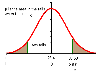
The solution is to calculate the area in the tails under the t-distribution using the tdist function. The p-value is calculated using the OpenOffice Calc formula:
=TDIST(ABS(t),degrees of freedom,number of tails)
The degrees of freedom are n − 1 for comparison of a sample mean to a known or pre-existing population mean μ.
Note that TDIST can only handle positive values for the t-statistic, hence the absolute value function.
p-value = TDIST(ABS(2.05,11,2) = 0.06501
The p-value represents the SMALLEST alpha α for which the test is statistically significant.
The p-value is the SMALLEST alpha α for which we reject the null hypothesis.
Thus for all alpha greater than 0.065 we reject the null hypothesis. The "one in fifteen" person would reject the null hypothesis (0.0667 > 0.065). The alpha = 0.05 person would not reject the null hypothesis.
If the pre-chosen alpha is more than the p-value, then we reject the null hypothesis. If the pre-chosen alpha is less than the p-value, then we fail to reject the null hypothesis.
The p-value lets each person decide on their own level of risk and removes the arbitrariness of personal risk choices.
Because many studies in education and the social sciences are done at an alpha of 0.05, a p-value at or below 0.05 is used to reject the null hypothesis.
1 − p-value is the confidence interval for which the new value does not include the pre-existing population mean. Another way to say this is that 1 − p-value is the maximum confidence level c we can have that the difference (change) is significant. We usually look for a maximum confidence level c of 0.95 (95%) or higher.
Note:
p-value = TDIST(ABS(t),n−1,number_tails)
All of the work above in confidence intervals and hypothesis testing has been with two-tailed confidence intervals and two-tailed hypothesis tests. There are statisticians who feel one should never leave the realm of two-tailed intervals and tests.
Unfortunately, the practice by scientists, business, educators and many of the fields in social science, is to use one-tailed tests when one is fairly certain that the sample has changed in a particular direction. The effect of moving to a one tailed test is to increase one's risk of committing a Type I error.
One tailed tests, however, are popular with researchers because they increase the probability of rejecting the null hypothesis (which is what most researchers are hoping to do).
The complication is that starting with a one-tailed test presumes a change, as in ANY change in ANY direction has occurred. The proper way to use a one-tailed test is to first do a two-tailed test for change in any direction. If change has occurred, then one can do a one-tailed test in the direction of the change.
Returning to the earlier example of whether I am running slower, suppose I decide I want to test to see if I am not just performing differently (≠), but am actually slower (<). I can do a one tail test at the 95% confidence level. Here alpha will again be 0.05. In order to put all of the area into one tail I will have to use the OpenOffice Calc function TINV(2*α,df).
H0: μ = 6.15
H1: μ < 6.15
μ=6.15
x = 6.38
sx = 1.00
n = 5
degrees of freedom (df)=4
tc = TINV(2*α,df) = TINV(2*0.05,4) = 2.13
t-statistic =
=
(6.38-6.15)/(1.00/sqrt(5)) = 0.51
Note that the t-statistic calculation is unaffected by this change in the problem.
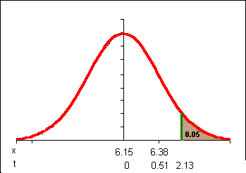
Note that my t-statistic would have to exceed only 2.13 instead of 2.78 in order to achieve statistical significance. Still, 0.51 is not beyond 2.13 so I still DO NOT reject the null hypothesis. I am not really slower, not based on this data.
Thus one tailed tests are identical to two-tailed tests except the formula for tc is TINV(2*α,df) and the formula for p is =TDIST(ABS(t),n−1,1).
Suppose we decide that the 30.53 body fat percentage for females 21+ at the college definitely represents an increase. We could opt to run a one tailed test at an alpha of 0.05.
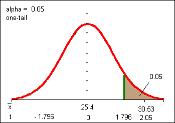
This result should look familiar: it is the result of the two tail test at alpha = 0.10, only now we are claiming we have halved the Type I error rate (α) to 0.05. Some statisticians object to this saying we are attempting to artificially reduce our Type I error rate by pre-deciding the direction of the change. Either that or we are making a post-hoc decision based on the experimental results. Either way we are allowing assumptions into an otherwise mathematical process. Allowing personal decisions into the process, including those involving α, always involve some controversy in the field of statistics.
=TDIST(0.51,4,2) = 0.64
For a sample proportion p and a known or pre-existing population proportion P, a hypothesis can be done to determine if the sample with a sample proportion p could have come from a population with a proportion P. Note that in this text, due to typesetting issues, a lower-case p is used for the sample proportion while an upper case P is used for the population proportion.
In another departure from other texts, this text uses the student's t-distribution for tc providing a more conservative determination of whether a change is significant in smaller samples sizes. Rather than label the test statistic as a z-statistic, to avoid confusing the students and to conform to usage in earlier sections the test statistic is referred to as a t-statistic.
A survey of college students found 18 of 32 had sexual intercourse. An April 2007 study of abstinence education programs in the United States reported that 51% of the youth, primarily students, surveyed had sexual intercourse. Is the proportion of sexually active students in the college different from that reported in the abstinence education program study at a confidence level of 95%?
The null and alternate hypotheses are written using the population proportion, in this case the value reported in the study.
H0: P = 0.51
H1: P ≠ 0.51
sample proportion p = 18/32 = 0.5625
sample proportion q = 1 − p = 0.4375
Note that n*p must be > 5 and n*q must also be > 5 just as was the case in constructing a confidence interval.
Confidence level c = 0.95
The t-critical value is still calculated using alpha α along with the degrees of freedom:
=TINV(0.05,32−1)
=2.04
The only "new" calculation is the t-statistic t:
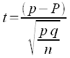
Note that the form is still (sample statistic - population parameter)/standard error for the statistic.
=(0.5625-0.51)/SQRT(0.5625*0.4375/32)
=0.5545
The t-statistic t does not exceed the t-critical value, so the difference is not statistically significant. We fail to reject the null hypothesis of no change.
The p-value is calculated as above using the absolute value of the t-statistic.
=TDIST(ABS(0.5545),32-1,2)
=0.58
The maximum level of confidence c we can have that this difference is significant is only 42%, far too low to say there is a difference.
Many studies investigate systems where there are measurements taken before and after. Usually there is an experimental treatment or process between the two measurements. A typical such system would be a pre-test and a post-test. Inbetween the pre-test and the post-test would typically be an educational or training event. One could examine each student's score on the pre-test and the post-test. Even if everyone did better on the post-test, one would have to prove that the difference was statistically significant and not just a random event.
These studies are called "paired t-tests" or "inferences from matched pairs". Each element in the sample is considered as a pair of scores. The null hypothesis would be that the average difference for all the pairs is zero: there is no difference. For a confidence interval test, the confidence interval for the mean differences would include zero if there is no statistically significant difference.
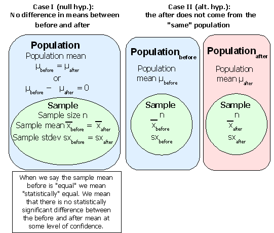
If the difference for each data pair is referred to as d, then the mean difference could be written d. The hypothesis test is whether this mean difference d could come from a population with a mean difference μd equal to zero (the null hypothesis). If the mean difference d could not come from a population with a mean difference μd equal to zero, then the change is statistically significant. In the diagram above the mean difference μd is equal to μbefore − μ after.
Consider the paired data below. The first column are female body fat measurements from the beginning of a term. The second column are the body fat measurements sixteen weeks later. The third column is the difference d for each pair.
| BodyFat before | Bodyfat after | Bodyfat difference d |
|---|---|---|
| 23.5 | 20.8 | -2.7 |
| 28.9 | 27.5 | -1.4 |
| 29.2 | 28.4 | -0.8 |
| 24.7 | 24.1 | -0.6 |
| 26.4 | 26.1 | -0.3 |
| 23.7 | 24 | 0.3 |
| 46.9 | 47.2 | 0.3 |
| 23.6 | 24 | 0.4 |
| 26.4 | 27.1 | 0.7 |
| 15.9 | 17 | 1.1 |
| 30.3 | 31.5 | 1.2 |
| 28.0 | 29.3 | 1.3 |
| 36.2 | 37.6 | 1.4 |
| 31.3 | 32.8 | 1.5 |
| 31.5 | 33.2 | 1.7 |
| 26.7 | 28.6 | 1.9 |
| 26.5 | 29.0 | 2.5 |
The confidence interval is calculated on the differences d (third column above) using the sample size n, sample mean difference d, and the sample standard deviation of the difference data d. The following table includes calculations using a 95% confidence interval.
| Count of the differences | 17 |
| sample mean difference d | 0.50 |
| Standard deviation of the difference data d | 1.33 |
| Standard error for the mean of the difference data d | 0.32 |
| tc for confidence level = 0.95 | 2.12 |
| Margin of the error E for the mean | 0.68 |
| Lower bound for the 95% confidence interval | -0.18 |
| Upper bound for the 95% confidence interval | 1.18 |
The 95% confidence interval includes a possible population mean of zero. The population mean difference μd could be equal to zero.
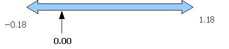
This means that "no change" is a possible population mean. To use the double negative, we cannot rule out the possibility of no change. We fail to reject the null hypothesis of no change. The women have not statistically significantly gained body fat over the sixteen weeks of the term.
Spreadsheets provide a function to calculate the p-value for paired data using the student's t-distribution. This function is the TTEST function. If the the p-value is less than your chosen risk of a type I error α then the difference is significant. The function does not require generating the difference column d as seen above, only the original data is used in this function.
The function takes as inputs the before data (data_range_x), the after data (data_range_y), the number of tails, and a final variable that specifies the type of test. A paired t-test is test type number one.
=TTEST(data_range_x,data_range_y,2,1)
To ensure that the spreadsheet calculates the p-value correctly, delete any data missing the x or y value in the pair. Data missing an x or y value is not paired data!
The maximum confidence we can have that the difference is statistically significant is 1 − p-value.
| p-value | 0.14 |
| Maximum confidence level c | 0.86 |
The p-value confirms the confidence interval analysis, we fail to reject the null hypothesis. At a 5% risk of a type I error we would fail to reject the null hypothesis. We can have a maximum confidence of only 86%, not the 95% standard typically employed. Some would argue that our concern for limited the risk of rejecting a true null hypothesis (a type I error) has led to a higher risk of failing to reject a false null hypothesis (a type II error). Some would argue that because of other known factors - the high rates of diabetes, high blood pressure, heart disease, and other non-communicable diseases - one should accept a higher risk of a type I error. The average shows an increase in body fat. Given the short time frame (a single term), some might argue for reacting to this number and intervening to reduce body fat. They would argue that given other information about this population's propensity towards obesity, 86% is "good enough" to show a developing problem. Ultimately these debates cannot be resolved by statisticians.
One of the more common situations is when one is seeking to compare two independent samples to determine if the means for each sample are statistically significantly different. In this case the samples may differ in sample size n, sample mean, and sample standard deviation.
In this text the two samples are refered to as the x data and the y data. The sample size for the x data is nx. The sample mean for the x data is x. The sample standard deviation for the x data is sx. For the y data, the sample size is ny, the sample mean is y, and the sample standard deviation is sy.
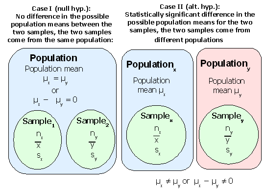
Two possibilities exist. Either the two samples come from the same population and the population mean difference is statistically zero. Or the two samples come from different populations where the population mean difference is statistically not zero.
Each sample has a range of probable values for their population mean μ. If the confidence interval for the sample mean differences includes zero, then there is no statistically significant difference in the means between the two samples. If the confidence interval does not include zero, then the difference in the means is statistically significant.
Note that the margin of error E for the mean difference is still tc multiplied by the standard error. The standard error formula changes to account for the differences in sample size and standard deviation.
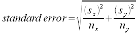
Thus the margin of error E can be calculated using:
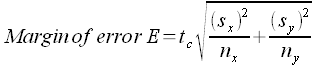
For the degrees of freedom in the t-critical tc calculation use n − 1 for the sample with the smaller size. This produces a conservative estimate of the degrees of freedom. Advanced statistical software uses another more complex formula to determine the degrees of freedom.
The confidence interval is calculated from:
(x − y) − E < (μx − μy) < (x − y) + E
Where x is the sample mean of one data set and y is the sample mean of the other data. Some texts use the symbol xd for this difference and μd for the hypothesized difference in the population means. This leads to the more familiar looking formulation:
xd − E < μd < xd + E
Where:
μd = μx − μy and
xd = x − y
Remember, μx and μy are not known. These are left as symbols. After calculating the interval, check to see if the confidence includes zero. If zero is inside the interval, then the sample means are not significantly different and we fail to reject the null hypothesis.
The following table uses a local business example. Data was recorded as to how many cup of sakau were consumed in a single night at two sakau markets on Pohnpei. The implication is that the lower the average, the stronger the sakau. The average difference, however, has to be statistically significant.
| Song mahs (x) | Rush Hour (y) | |
|---|---|---|
| 2 | 2 | |
| 3 | 10 | |
| 6 | 1.5 | |
| 3 | 5.5 | |
| 3.5 | 9 | |
| 4.5 | 7.5 | |
| 1 | 5.5 | |
| 5 | 3 | |
| 3 | 3 | |
| 7 | 6 | |
| 4 | 3 | |
| 2.5 | 4.5 | |
| 5.5 | 10 | |
| 2 | 9 | |
| 1 | 2 | |
| 2 | 2 | |
| 4 | ||
| 5 | ||
| 5 | ||
| 5.5 | ||
| 15 | ||
| 14 | ||
| 2 | ||
| 2 | ||
| 4 | ||
| Sample statistics | ||
| sample size n | 16 | 25 |
| sample mean | 3.44 | 5.6 |
| sample stdev | 1.77 | 3.73 |
| Confidence interval statistics | ||
| standard error | 0.87 | |
| t-critical tc | 2.13 | |
| margin of error E | 1.85 | |
| difference of means | -2.16 | |
| lower bound ci | -4.01 | |
| upper bound ci | -0.31 | |
Note that 15 was used for the degrees of freedom in the t-critical calculation. Sixteen is the sample size of the smaller sample.
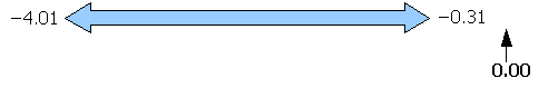
Note that the confidence interval does not include zero. The confidence interval indicates that whatever the population mean difference μd might be, the population mean μd cannot be zero. This means that the sample means are statistically significantly different. We would reject a null hypothesis of no difference between the two markets. The implication is that Song Mahs is stronger than Rush Hour, at least on these two nights.
As noted above, spreadsheets provide a function to calculate p-values. If the the p-value is less than your chosen risk of a type I error α then the difference is significant.
The function takes as inputs one the data for one if the two samples (data_range_x), the data for the other sample (data_range_y), the number of tails, and a final variable that specifies the type of test. A t-test for means from independent samples is test type number three.
=TTEST(data_range_1,data_range_2,number of tails,3)
For the above data, the p-value is given in the following table:
| p-value | 0.02 |
| Maximum confidence level c | 0.98 |
The TTEST function does not use the smaller sample size to determine the degrees of freedom. The TTEST function uses a different formula that calculates a larger number of degrees of freedom, which has the effect of reducing the p-value. Thus the confidence interval result could produce a failure to reject the null hypothesis while the TTEST could produce a rejection of the null hypothesis. This only occurs when the p-value is close to your chosen α.
[Optional material!] If you have doubts and want to explore further, take the difference of the means and divide by the standard error to obtain the t-statistic t. Then use the TDIST function to determine the p-value, using the smaller sample size − 1 to calculate the degrees of freedom.
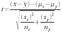
Note that (μx − μy) is presumed to be equal to zero. Thus the formula is the difference of the means divided by the standard error (given further above).
t = xd ÷ (standard error)
Once t is calculated, use the TDIST function to determine the p-value.
=TDIST(ABS(t),n−1,2)
Technical side-note: TTEST type three does not presume that the population standard deviations σx and σy are equal. This is in keeping with modern practice and reality. TTEST type two presumes σx = σy. One rarely knows either value, and if one did know those values, why would not they also know the actual population means? With the true population means in hand, then any difference would be significant.