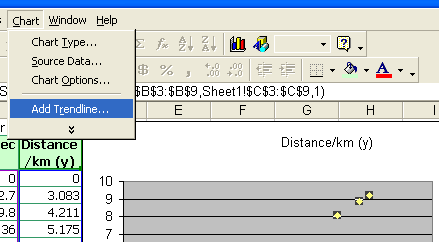
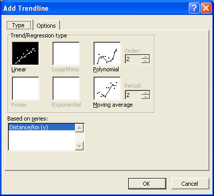
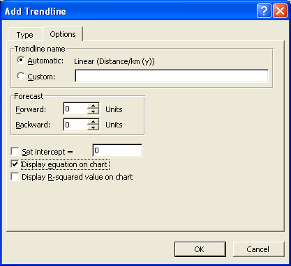
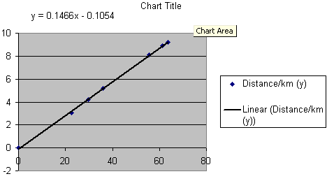
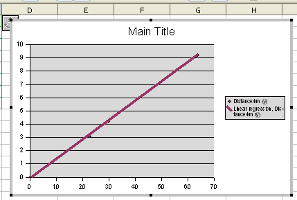
Creating an xy scattergraph in Microsoft Excel
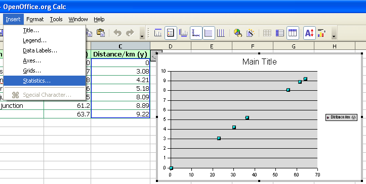
Creating an xy scattergraph in OpenOffice.org Calc 2.0
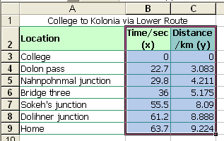
To obtain the slope and intercept in Excel for the above data, use the following functions:
=slope(c2:c8,b2:b8)
=intercept(c2:c8,b2:b8)
Note the use of the semi-colon. Excel uses a comma by default, OpenOffice 2.0 a semi-colon. OpenOffice.org 3.0 and 3.1 on Ubuntu 9.04 and 9.10 respectively use a comma. Distribution of OpenOffice.org 3.0 and 3.1 on Windows continue to use a semi-colon.
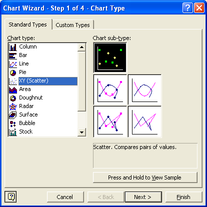
Excel 2007 uses different screens to obtain a linear regression.


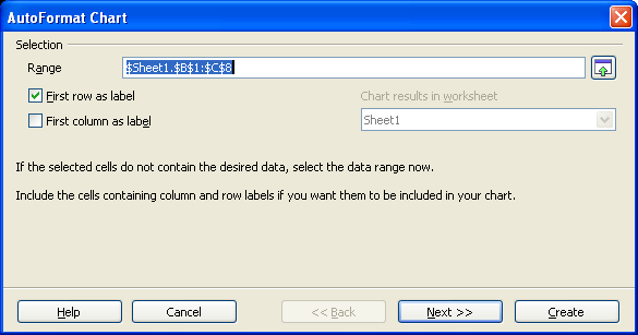
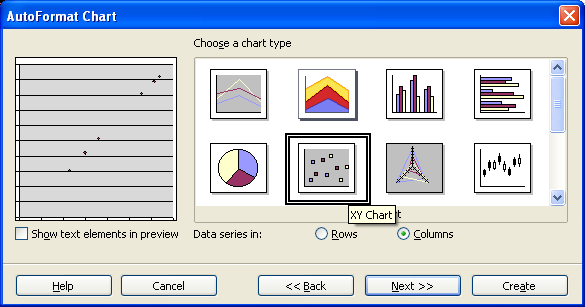
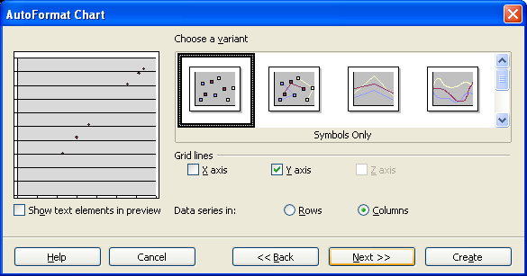
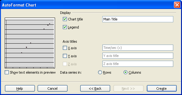
The following directions apply to OpenOffice.org Calc versions 2.0, 2.1, and 2.2. In version 2.3 the chart wizard was altered. Starting with version 2.3, the chart wizard does not wait for the user to use the mouse to drag the chart location. For directions on using version 2.3, refer to the notes on version 2.4.
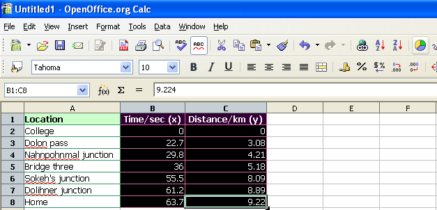
To display the slope and intercept in OpenOffice for the above data, use the following functions:
=slope(c2:c8;b2:b8)
=intercept(c2:c8;b2:b8)
Note the use of the semi-colon. Excel uses a comma by default, OpenOffice a semi-colon.