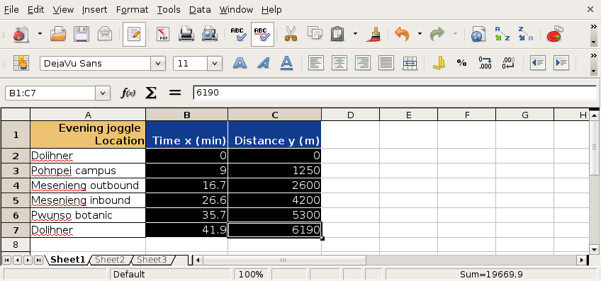
A runner runs from the College of Micronesia-FSM National campus to PICS via the powerplant/Nahnpohnmal back road. The runner tracks his time and distance.
| Location | Time x (minutes) | Distance y (km) |
|---|---|---|
| College | 0 | 0 |
| Dolon Pass | 20 | 3.3 |
| Turn-off for Nahnpohnmal | 25 | 4.5 |
| Bottom of the beast | 33 | 5.7 |
| Top of the beast | 34.5 | 5.9 |
| Track West | 55 | 9.7 |
| PICS | 56 | 10.1 |
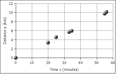
Is there a relationship between the time and the distance? If there is a relationship,
then data will fall in a patterned fashion on an xy graph. If there is no relationship,
then there will be no shape to the pattern of the data on a graph.
If the relationship is linear, then the data will fall roughly along a line. Plotting the
above data yields the following graph:
The data falls roughly along a line, the relationship appears to linear. If we can find the equation of a line through the data, then we can use the equation to predict how long it will take the runner to cover distances not included in the table above, such as five kilometers. In the next image a best fit line has been added to the graph.
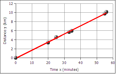
The best fit line is also called the least squares line because the mathematical process for determining the line minimizes the square of the vertical displacement of the data points from the line. The process of determining the best fit line is also known and performing a linear regression. Sometimes the line is referred to as a linear regression.
The graph of time versus distance for a runner is a line because a runner runs at the same pace kilometer after kilometer.
A spreadsheet is used to find the slope and the y-intercept of the best fit line through the data.
To get the slope m with OpenOffice Calc use the function:
=SLOPE(y-values,x-values)
OpenOffice.org Calc on Ubuntu 10.04 uses commas in formulas. Microsoft Excel and the Gnumeric spreadsheet also use commas. If using OpenOffice.org Calc on Windows computers, the function uses a semi-colon:
=SLOPE(y-values;x-values)
Note that the y-values are entered first, the x-values are entered second. This is the reverse of traditional algebraic order where coordinate pairs are listed in the order (x, y). The x and y-values are usually arranged in columns. The column containing the x data is usually to the left of the column containing the y-values. An example where the data is in the first two columns from row two to forty-two can be seen below.
=SLOPE(B2:B42,A2:A42)
The intercept is usually the starting value for a function. Often this is the y data value at time zero, or distance zero.
To get the intercept:
=INTERCEPT(y-values,x-values)
For OpenOffice.org Calc on Windows use semi-colons:
=INTERCEPT(y-values;x-values)
Note that intercept also reverses the order of the x and y values!
For the runner data above the equation is:
distance = slope * time + y-intercept
distance = 0.18  * time + − 0.13
       y = 0.18  *  x   + − 0.13
         or
       y = 0.18x − 0.13
       where x is the time and y is the distance
In algebra the equation of a line is written as y = m*x + b where m is the slope and b is the intercept. In statistics the equation of a line is written as y = a + b*x where a is the intercept (the starting value) and b is the slope. The two fields have their own traditions, and the letters used for slope and intercept are a tradition that differs between the field of mathematics and the field of statistics.
Using the y = mx + b equation we make predictions about how far the runner will travel given a time, or how long the runner will runner given a distance. For example, according the equation above, a 45 minute run will result in the runner covering 0.18*45 - 0.13 = 7.97 kilometers. Using the inverse of the equation we can predict that the runner can run a five kilometer distance in 28.5 minutes (28 minutes and 30 seconds).
Given any time, we can calculate the distance. Given any distance, can solve for the time.
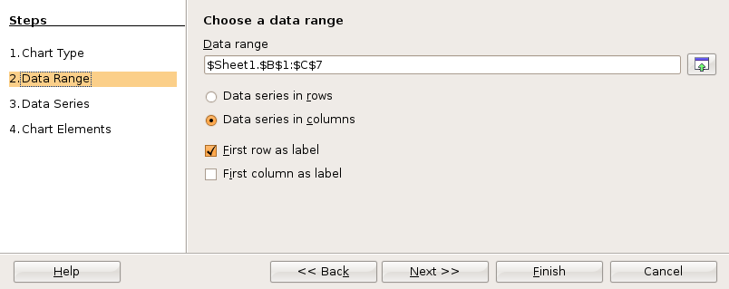
Making an xy scattergraph using OpenOffice.org 3.0 and 3.1
First select the data to be graphed.
Then click on the chart wizard button
![]() or
or
![]() in the toolbar to start the chart wizard.
in the toolbar to start the chart wizard.
Choose an XY (Scatter) graph in the first dialog box.
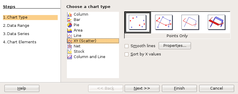
For statistics class, click through the next two dialog boxes.
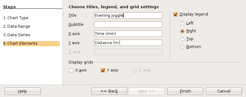
In the fourth and final dialog box you can set up the x and y axis labels as well as a chart title. Then click on Finish.
Before clicking anywhere else, choose Insert: Trend Lines from the menu.

The Trend Lines dialog box permits selection of linear and non-linear regression lines. For a straight line regression, choose the linear regression type. Click on the check boxes for the function and the R2. You may have to click twice to obtain the check mark.

Click on OK to close the dialog box.
All versions of OpenOffice.org Calc can calculate the slope and intercept using spreadsheet functions.
After plotting the x and y data, the xy scattergraph helps determine the nature of the relationship between the x values and the y values. If the points lie along a straight line, then the relationship is linear. If the points form a smooth curve, then the relationship is non-linear (not a line). If the points form no pattern then the relationship is random.

Relationships between two sets of data can be positive: the larger x gets, the larger y
gets.
Relationships between two sets of data can be negative: the larger x gets, the smaller y
gets.
Relationships between two sets of data can be non-linear
Relationships between two sets of data can be random: no relationship exists!
For the runner data above, the relationship is a positive relationship. The points line along a line, therefore the relationship is linear.
An example of a negative relationship would be the number of beers consumed by a student and a measure of the physical coordination. The more beers consumed the less their coordination!
For a linear relationship, the closer to a straight line the points fall, the stronger the relationship. The measurement that describes how closely to a line are the points is called the correlation.

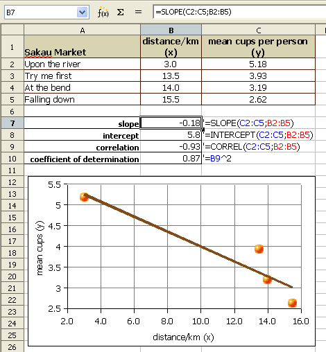
The following example explores the correlation between the distance of a business from a city center versus the amount of product sold per person. In this case the business are places that serve pounded Piper methysticum plant roots, known elsewhere as kava but known locally as sakau. This business is unique in that customers self-limit their purchases, buying only as many cups of sakau as necessary to get the warm, sleepy, feeling that the drink induces. The businesses are locally referred to as sakau markets. The local theory is that the further one travels from the main town (and thus deeper into the countryside of Pohnpei) the stronger the sakau that is served. If this is the case, then the mean number of cups should fall with distance from the main town on the island.
The following table uses actual data collected from these businesses, the names of the businesses have been changed.
| Sakau Market | distance/km (x) | mean cups per person (y) |
|---|---|---|
| Upon the river | 3.0 | 5.18 |
| Try me first | 13.5 | 3.93 |
| At the bend | 14.0 | 3.19 |
| Falling down | 15.5 | 2.62 |
The first question a statistician would ask is whether there is a relationship between the distance and mean cup data. Determining whether there is a relationship is best seen in an xy scattergraph of the data.
If we plot the points on an xy graph using a spreadsheet, the y-values can be seen to fall with increasing x-value. The data points, while not all exactly on one line, are not far away from the best fit line. The best fit line indicates a negative relationship. The larger the distance, the smaller the mean number of cups consumed. Note that in the image below OpenOffice.org on Windows is being used, thus the formula uses a semi-colon. On Ubuntu computers, in Gnumeric, and in Excel use a comma.
Note that the formulas use semi-colons. For Excel and OpenOffice on Ubuntu 9.04 use commas.
We use a number called the Pearson product-moment correlation coefficient r to tell us how well the data fits to a straight line. The full name is long, in statistics this number is called simply r. R can be calculated using a spreadsheet function.
The OpenOffice Calc on Ubuntu, Gnumeric, and Microsoft Excel function for calculating r are the same. The OpenOffice Calc function is:
=CORREL(y-values,x-values)
For OpenOffice Calc on Windows use a semi-colon:
=CORREL(y-values;x-values)
The Pearson product-moment correlation coefficient r (or just correlation r) values that result from the formula are always between -1 and 1. One is perfect positive linear correlation. Negative one is perfect negative linear correlation. If the correlation is zero or close to zero: no linear relationship between the variables.
A guideline to r values:
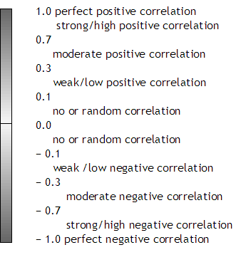
Note that perfect has to be perfect: 0.99999 is very close, but not perfect. In real world systems perfect correlation, positive or negative, is rarely or never seen. A correlation of 0.0000 is also rare. Systems that are purely random are also rarely seen in the real world.
Spreadsheets usually round to two decimals when displaying decimal numbers. A correlation r of 0.999 is displayed as "1" by spreadsheets. Use the the Format menu to select the cells item. In the cells dialog box, click on the numbers tab to increase the number of decimal places. When the correlation is not perfect, adjust the decimal display and write out all the decimals.
The correlation r of − 0.93 is a strong negative correlation. The relationship is strong and the relationship is negative. The equation of the best fit line, y = −0.18x + 5.8 where y is the mean number of cups and x is the distance from the main town. The equations that generated the slope, y-intercept, and correlation can be seen in the earlier image.
The strong relationship means that the equation can be used to predict mean cup values, at least for distances between 3.0 and 15.5 kilometers from town.
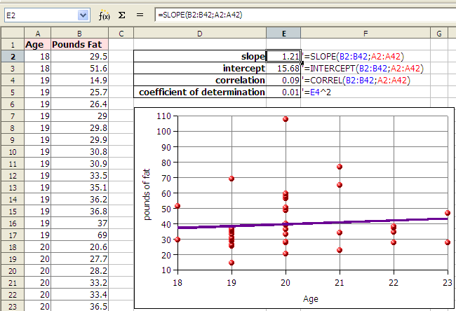
A second example explores the correlation between female students pounds of fat in a statistics course. The table provides the x and y data.
The table below continues beyond the boundaries of the page.
| Age/years (x) | 18 | 18 | 19 | 19 | 19 | 19 | 19 | 19 | 19 | 19 | 19 | 19 | 19 | 19 | 19 | 19 | 20 | 20 | 20 | 20 | 20 | 20 | 20 | 20 | 20 | 20 | 20 | 20 | 20 | 20 | 20 | 21 | 21 | 21 | 21 | 22 | 22 | 22 | 22 | 23 | 23 |
|---|---|---|---|---|---|---|---|---|---|---|---|---|---|---|---|---|---|---|---|---|---|---|---|---|---|---|---|---|---|---|---|---|---|---|---|---|---|---|---|---|---|
| Fat/pounds (y) | 29.5 | 51.6 | 14.9 | 25.7 | 26.4 | 29.0 | 29.8 | 29.9 | 30.8 | 30.9 | 33.5 | 35.1 | 36.2 | 36.8 | 37.0 | 69.0 | 20.6 | 27.7 | 28.2 | 33.2 | 33.4 | 36.5 | 39.3 | 39.4 | 40.2 | 48.9 | 50.4 | 56.7 | 57.8 | 59.7 | 107.8 | 22.7 | 34.2 | 65.0 | 76.9 | 28.1 | 34.8 | 37.2 | 38.3 | 28.0 | 46.8 |
The first question a statistician would ask is whether there is a relationship seen in the xy scattergraph between the age of a female student at COMFSM and the pounds of fat? Can we use our data to predict a pounds of body fat based on age alone?
If we plot the points on an xy graph using a spreadsheet, the data does not appear to be strongly linear. The data appears to be scattered randomly about the graph. Although a spreadsheet is able to give us a best fit line (a linear regression or least squares line), we will later have to consider whether the relationship is strong enough to make the equation useful.
Note that the formulas use semi-colons. For Excel and OpenOffice on Ubuntu 9.04 use commas.
In the example above the correlation r is 0.09. Zero would be random correlation. This value is so close to zero that the correlation is effectively random. The relationship is random. There is no relationship. The linear equation y = 1.21x + 15.68, where y is the pounds of fat and x is the age, cannot be used to predict the pounds of fat given the age.
We cannot usually predict values that are the minimum or maximum x values and make meaningful predictions. In the example of the runner, we could calculate how far the runner would run in 72 hours (three days and three nights) but it is unlikely the runner could run continuously for that length of time. For some systems values can be predicted below the minimum x or above the maximum x value. When we do this it is called extrapolation. Very few systems can be extrapolated, but some systems remain linear for values near to the provided x values.
The coefficient of determination, r², is a measure of how much of the variation in the independent x variable explains the variation in the dependent y variable. This does NOT imply causation. In spreadsheets the ^ symbol (shift-6) is exponentiation. In OpenOffice Calc we can square the correlation with the following formula:
=(CORREL(y-values,x-values))^2
For OpenOffice on Windows use a semi-colon.
The result, which is between 0 and 1 inclusive, is often expressed as a percentage.
Imagine a Yamaha outboard motor fishing boat sitting out beyond the reef in an open ocean swell. The swell moves the boat gently up and down. Now suppose there is a small boy moving around in the boat. The boat is rocked and swayed by the boy. The total motion of the boat is in part due to the swell and in part due to the boy. Maybe the swell accounts for 70% of the boat's motion while the boy accounts for 30% of the motion. A model of the boat's motion that took into account only the motion of the ocean would generate a coefficient of determination of about 70%.
Finding that a correlation exists does not mean that the x-values cause the y-values. A line does not imply causation: Your age does not cause your pounds of body fat, nor does time cause distance for the runner.
Studies in the mid 1800s of Micronesia would have shown of increase each year in church attendance and sexually transmitted diseases (STDs). That does NOT mean churches cause STDs! What the data is revealing is a common variable underlying our data: foreigners brought both STDs and churches. Any correlation is simply the result of the common impact of the increasing influence of foreigners.
Some calculators will generate a best fit line. Be careful. In algebra straight lines had the form y = mx + b where m was the slope and b was the y-intercept. In statistics lines are described using the equation y = a + bx. Thus b is the slope! And a is the y-intercept! You would not need to know this but your calculator will likely use b for the slope and a for the y-intercept. The exception is some TI calculators that use SLP and INT for slope and intercept respectively.
Note only for those in physical science courses. In some physical systems the data point (0,0) is the most accurately known measurement in a system. In this situation the physicist may choose to force the linear regression through the origin at (0,0). This forces the line to have an intercept of zero. There is another function in spreadsheets which can force the intercept to be zero, the LINear ESTimator function. The following functions use time versus distance, common x and y values in physical science.
=LINEST(distance (y) values,time (x) values,0)
The formula for OpenOffice on Windows uses a semi-colon:
=LINEST(distance (y) values;time (x) values;0)
Note that the same as the slope and intercept functions, the y-values are entered first, the x-values are entered second.