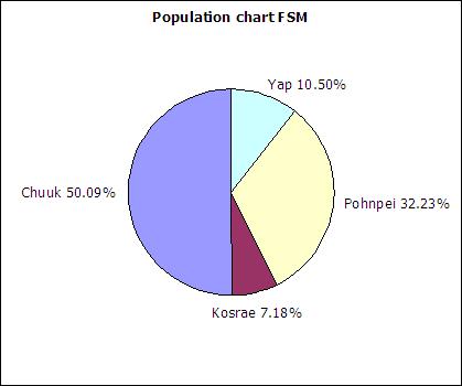
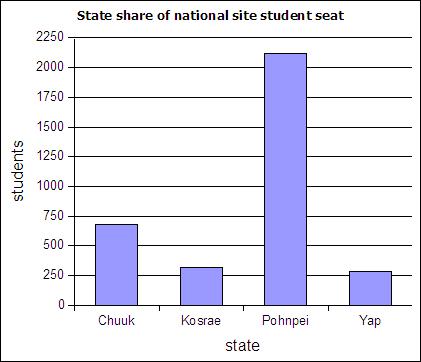
The table below includes FSM census 2000 data and student seat numbers for the national site of COM-FSM circa 2004.
| State | Population (20000 | Fractional share of national population (relative frequency) | Number of student seats held by state at the national campus | Fractional share of the national campus student seats |
|---|---|---|---|---|
| Chuuk | 53595 | 0.5 | 679 | 0.2 |
| Kosrae | 7686 | 0.07 | 316 | 0.09 |
| Pohnpei | 34486 | 0.32 | 2122 | 0.62 |
| Yap | 11241 | 0.11 | 287 | 0.08 |
| 107008 | 1 | 3404 | 1 |
In a circle chart the whole circle is 100% Used when data adds to a whole, e.g. state populations add to yield national population.
A pie chart of the state populations:
Column charts are also called bar graphs. A column chart of the student seats held by each state at the national site:
If a column chart is sorted so that the columns are in descending order, then it is called a Pareto chart. Descending order means the largest value is on the left and the values decrease as one moves to the right. Pareto charts are useful ways to convey rank order as well as numerical data.
A line graph is a chart which plots data as a line. The horizontal axis is usually set up with equal intervals. Line graphs are not used in this course and should not be confused with xy scattergraphs.
When you have two sets of continuous data (value versus value, no categories), use an xy graph. These will be covered in more detail in the chapter on linear regressions.
A distribution counts the number of elements of data in either a category or within a range of values. Plotting the count of the elements in each category or range as a column chart generates a chart called a histogram. The histogram shows the distribution of the data. The height of each column shows the frequency of an event. This distribution often provides insight into the data that the data itself does not reveal. In the histogram below, the distribution for male body fat among statistics students has two peaks. The two peaks suggest that there are two subgroups among the men in the statistics course, one subgroup that is at a healthy level of body fat and a second subgroup at a higher level of body fat.

The ranges into which values are gathered are called bins, classes, or intervals.
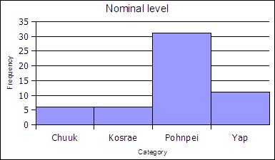
At the nominal level of measurement one can determine the frequency of elements in a category, such as students by state in a statistics course.
| State | Frequency | Rel Freq |
|---|---|---|
| Chuuk | 6 | 0.11 |
| Kosrae | 6 | 0.11 |
| Pohnpei | 31 | 0.57 |
| Yap | 11 | 0.20 |
| Sums: | 54 | 1,00 |
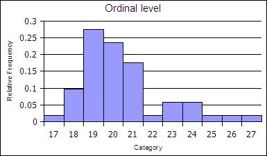
At the ordinal level, a frequency distribution can be done using the rank order, counting the number of elements in each rank order to obtain a frequency. When the frequency data is calculated in this way, the distribution is unbinned, not aggregated.
| Age | Frequency | Rel Freq |
|---|---|---|
| 17 | 1 | 0.02 |
| 18 | 5 | 0.1 |
| 19 | 14 | 0.27 |
| 20 | 12 | 0.24 |
| 21 | 9 | 0.18 |
| 22 | 1 | 0.02 |
| 23 | 3 | 0.06 |
| 24 | 3 | 0.06 |
| 25 | 1 | 0.02 |
| 26 | 1 | 0.02 |
| 27 | 1 | 0.02 |
| sums | 51 | 1 |
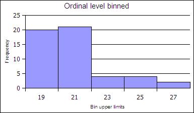
The ranks can be collected together, binned, to reduce the number of rank order categories. in the example below the age data in gathered into two-year cohorts.
| Age | Frequency | Rel Freq |
|---|---|---|
| 19 | 20 | 0.39 |
| 21 | 21 | 0.41 |
| 23 | 4 | 0.08 |
| 25 | 4 | 0.08 |
| 27 | 2 | 0.04 |
| Sums: | 51 | 1 |
At the ratio level data is always gathered into ranges. At the ratio level, binned histograms are used. Ratio level data is not necessarily in a finite number of ranks as was ordinal data.
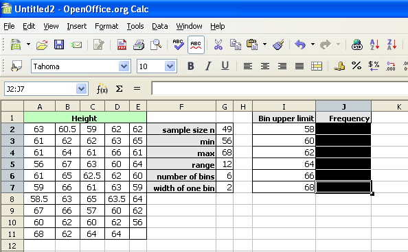
The ranges into which data is gathered are defined by a bin lower limit and a bin upper limit. The width is the bin upper limit minus the bin lower limit. In this class histograms are generated using the bin upper limit in conformance with the usage in spreadsheets.
To calculate the bin lower and upper limits the minimum and maximum value in a data set must be determined. Spreadsheets include functions to calculate the minimum value MIN and maximum value MAX in a data set.
=MIN(data)
=MAX(data)
In OpenOffice the MIN and MAX function can take a list of semi-colon separated numbers or a range of cells in a spreadsheet. In statistics a range of cells is the most common input for these functions. When a range of cells is the usual input, this text uses the word "data" to refer to the fact that the range of cells is usually your data! Ranges of cells use two cell addresses separated by a full colon. An example is shown below where the data is arranged in a vertical column from A2 to A42.
=MIN(A2:A42)
How to make a binned histogram at the ratio level
range = maximum value - minimum value| Bin Upper Limits (BUL) | Frequency |
| =min + bin width | |
| + bin width | |
| + bin width | |
| + bin width | |
| + bin width = max |
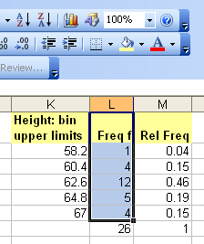
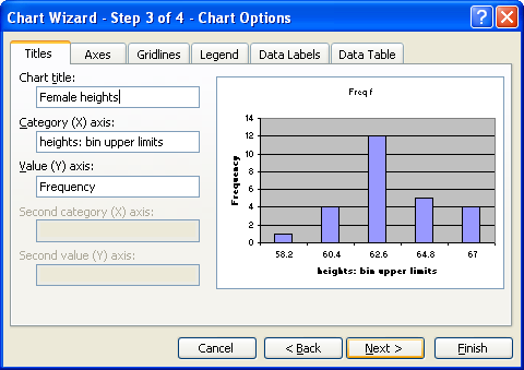
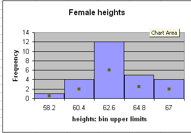
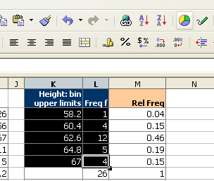
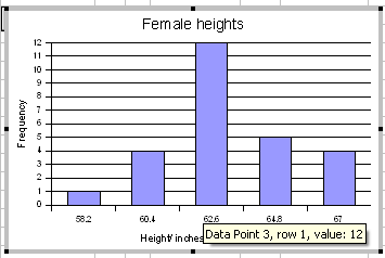
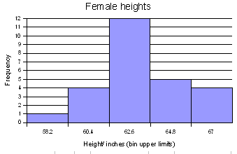
For the female height data:
58, 58, 59.5, 59.5, 60, 60, 60, 60, 60, 61, 61, 61.2, 61.5, 62, 62, 62, 62, 62, 62, 62, 62, 62, 62, 62, 62, 63, 63, 63, 63.5, 64, 64, 64, 64, 65, 65, 66, 66
Five bins would produce the following results:
Min = 58
Max = 66
Range = 66 - 58 = 8
Width = 8/5 = 1.6
| Calculation | Height (BUL) | Frequency |
|---|---|---|
| 58 + 1.6 | 59.6 | 4 |
| 59.6 + 1.6 | 61.2 | 8 |
| 61.2 + 1.6 | 62.8 | 13 |
| 62.8 + 1.6 | 64.4 | 8 |
| 64.4 + 1.6 | 66 | 4 |
| Sum: | 37 |
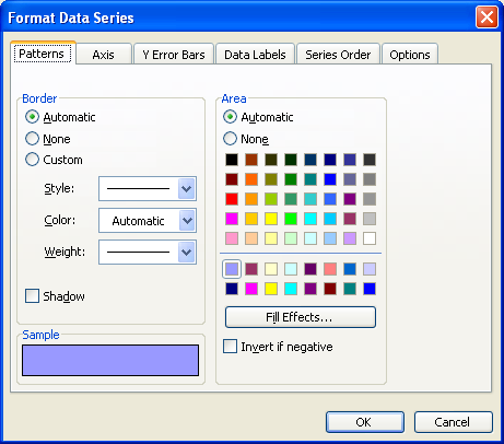
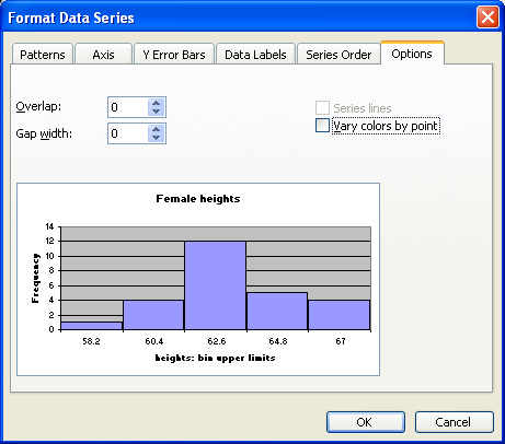
Note that 61.2 is INCLUDED in the bin that ends at 61.2. The bin includes values at the bin upper limit. In other words, a bin includes all values up to and including the bin upper limit. After making the column chart, double click on the columns to open the data series dialog box. Find the Options tab and set the spacing (or gap width) to zero.
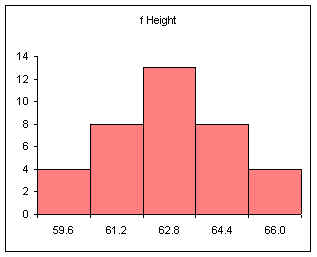
Note that the spacing or gap width on the columns has been set to zero.
Relative frequency is one way to determine a probability.
Divide each frequency by the sum (the sample size) to get the relative frequency
| Height BUL | Frequency | Relative Frequency f/n or P(x) |
|---|---|---|
| 59.6 | 4 | 0.11 |
| 61.2 | 8 | 0.22 |
| 62.8 | 13 | 0.35 |
| 64.4 | 8 | 0.22 |
| 66 | 4 | 0.11 |
| Sum: | 37 | 1.00 |
The relative frequency always adds to one (rounding causes the above to add to 1.01, if all the decimal places were used the relative frequencies would add to one.
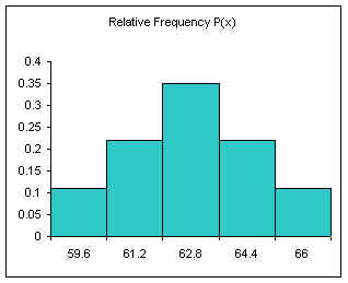
The area under the relative frequency columns is equal to one.
Another example using integers:
0, 1, 2, 2, 3, 3, 3, 4, 4, 4, 4.5, 5, 5, 5, 6, 6, 7, 8, 9, 10
Five bins
min = 0
max = 10
range = 10
width = 10/5 = 2
| Bin Num | Calculation | Bins | Frequency | Relative Frequency f/n or P(x) |
|---|---|---|---|---|
| 1 | min + width | 2 | 4 | 0.20 |
| 2 | + width | 4 | 6 | 0.30 |
| 3 | + width | 6 | 6 | 0.30 |
| 4 | + width | 8 | 2 | 0.10 |
| 5> | + width | 10 | 2 | 0.10 |
| Sum: | 20 | 1.00 |
The above method produces equal width bins and to conforms the inclusion of the class upper limit by spreadsheet packages.
For more advanced spreadsheet users, frequency data can be obtained using the frequency function FREQUENCY. This function is also very useful when working with large data sets. In OpenOffice.org Calc on Ubuntu 9.04, 9.10, and 10.04 the frequency function is:
=FREQUENCY(DATA,BINS)
Microsoft Excel and Gnumeric also use a comma in the formula.
OpenOffice.org Calc on Windows computers use a semi-colon instead of a comma:
=FREQUENCY(DATA;BINS)
In this book, if a formula in a spreadsheet does not work using a comma, try a semi-colon. Likewise, if a semi-colon does not work, try a comma.
DATA refers to the range of cells containing the data, BINS refers to the range of cells containing the bin upper limits.
The data set seen below are the height measurements for 49 female students in statistics courses during two consecutive terms.
The frequency function built into spreadsheets works very differently from all other functions. The frequency function called an "array" function because the function places values into an array of cells. For the function to do this, you must first select the cells into which the function will place the frequency values.
With the cells still highlighted, start typing the frequency function.
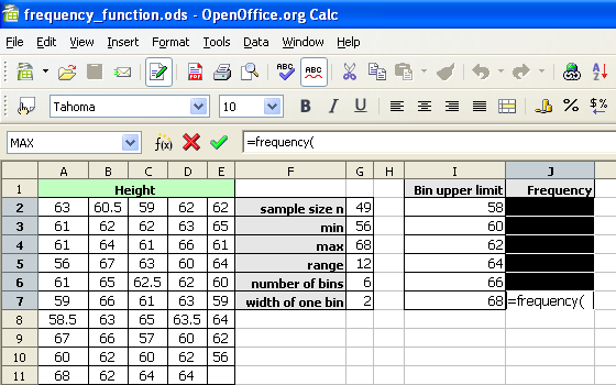
After typing the opening parenthesis, drag and select the data to be binned. If the data is more than can be selected by dragging, type the data range in by hand.
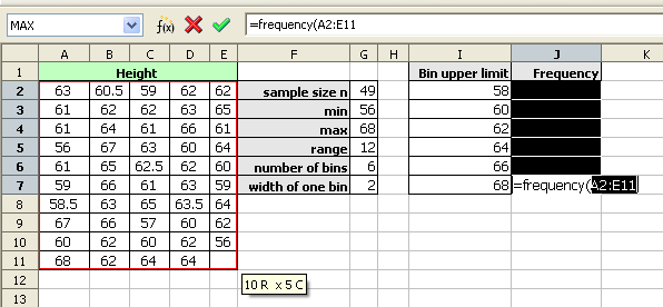
For OpenOffice.org Calc, type a semi-colon. For Microsoft Office Excel, type a comma.
Drag and select the bin upper limits.
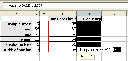
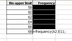
Type the closing parenthesis.
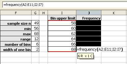
Then press and hold down BOTH the CONTROL (Ctrl) key and the SHIFT key. With both the control and shift keys held down, press the Enter (or Return) key.
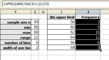
As noted above, the frequencies should add to the sample size. When working with spreadsheets, internal rounding errors can cause the maximum value in a data set to not get included in the final bin. In the last bin, use the value obtained by the MAX function and not the previous bin + a width formula to generate that bin upper limit.
The shapes of distributions have names by which they are known.
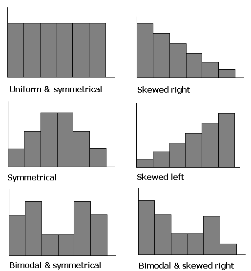
One of the aspects of a sample that is often similar to the population is the shape of the distribution. If a good random sample of sufficient size has a symmetric distribution, then the population is likely to have a symmetric distribution. The process of projecting results from a sample to a population is called generalizing. Thus we can say that the shape of a sample distribution generalizes to a population.
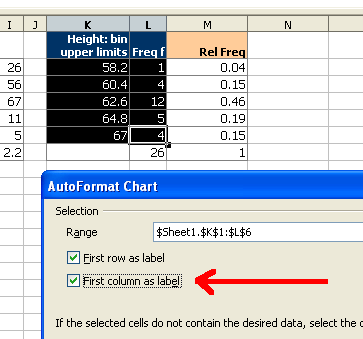
Select both the column with the bins and the column with the frequencies.
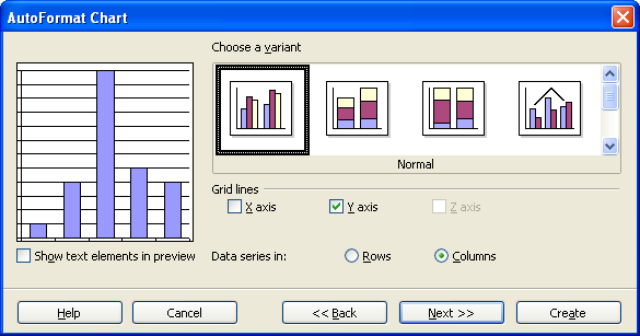
Click on the chart wizard button and then drag the mouse to place and size the histogram.
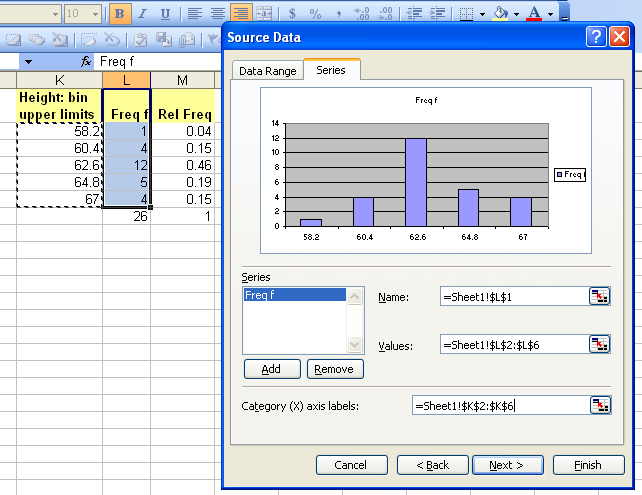
At the first dialog box be sure to click on the "First column as label" check box as indicated by the arrow in the diagram below.
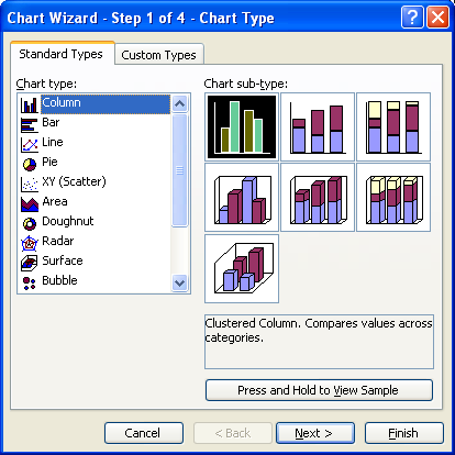
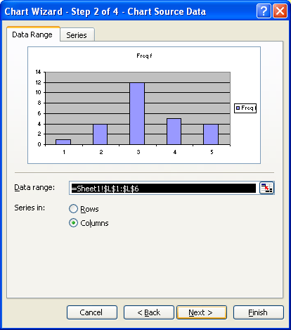
For the next two screens simply click on "Next"
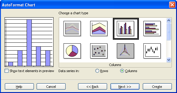
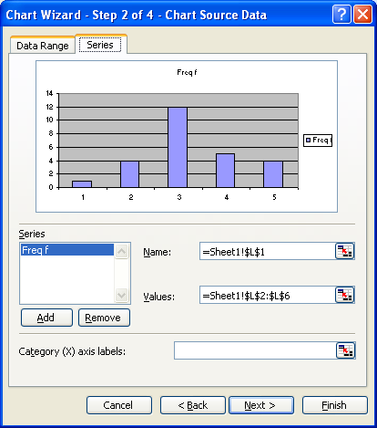
On the next screen fill in the appropriate titles. The legend can be "unchecked" as seen below.
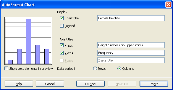
When done, click on Create.
Double click any column to open up the data series dialog box.
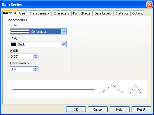
Click on the options tab and set the spacing to zero.
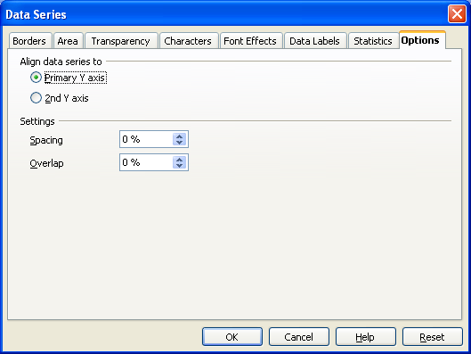
Click on OK.
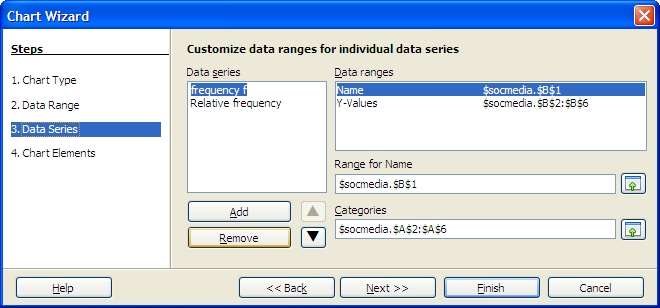
The chart wizard for OpenOffice.org 3.1 running on Ubuntu 9.10 will not produce a two-dimensional column chart from a "split selection." This complicates producing a relative frequency chart. To produce a relative frequency chart, select all three columns and then delete the frequency column.
In step three, remove the frequency series to chart only the relative frequency.