Design
Data entry
Data form
Data sorting
AVERAGE function
Copying a formula down a column
Other functions
Arithmetic operations in cells
Point and select range entry into
formulas
Data summary
information on a separate worksheet
If Then functions
Basic If Then
Conditional operators
Nested If Then
Choose function
Frequency function
Charting
Column charts
Pie Charts
Other types of charts:
Population pyramids
Subtotals
Set Up the Subtotals
Other Subtotal functions
Filtering
Pivot Tables
Graphing Pivot Tables
These notes are designed to be used in a workshop environment in connection with an Excel spreadsheet called Gradebook. The workshop presumes familiarity with the Windows 95 user interface and prior acquaintance with a Microsoft Office application such as Microsoft Word.
Excel cells are like many calculators arranged in a grid. Each cell is capable of making mathematical calculations. The calculation can be one such as 1 + 3 or a calculation using values in other cells in the spreadsheet. Referring to other cells requires knowing how Excel refers to cells. A spreadsheet is an address grid with the grid consisting of:
Columns labeled by letters A, B, C,… X, Y, Z, AA, AB,
AC,…AX, AY, AZ, BA, BB,…IU, IV for 256 possible columns.
Rows labeled by numbers 1…16384 (Office 97 allows more rows).
Cells are specified by the intersection of the column letter and row
number such as F9.
Ranges which are a group of cells specified by the address of the upper
left cell and lower right cell separated by a full colon.
| A | B | C | D | E | F | G | |
| 1 | Field Name 1 | Field Name 2 | Field Name 3 | Field Name 4 | Column E | Column F | Column G |
| 2 | Datum 1 | ||||||
| 3 | Datum 2 | ||||||
| 4 | Datum 3 | Row Range B4:D4 |
|||||
| 5 | Datum 4 | ||||||
| 6 | |||||||
| 7 | |||||||
| 8 | |||||||
| 9 | Row 9 | Cell F9 |
|||||
| 10 | |||||||
| 11 | Column Range |
Block range C11: E15 |
|||||
| 12 | |||||||
| 13 | |||||||
| 14 | |||||||
| 15 | |||||||
| 16 | |||||||
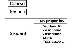
A field is the name of a particular type of data or a property. Design of a grade book or any other data holding spreadsheet demands planning in advance. Below is a chart depicting the structure of some of the data fields which we put in our spreadsheet.
A |
B |
C |
D |
E |
F |
G |
H |
I |
J |
K |
L |
|
1 |
Course | Sect | Last | First | Sx |
St |
HS |
Elem | Lang |
T1 |
T2 |
T3 |
2 |
MS 101 | M08 | Albert | Abenaa | F |
K |
KHS |
Lelu | Kosraen |
82 |
81 |
80 |
3 |
MS 101 | M08 | Aldis | Adjoa | F |
P |
PICS |
PCS | Pohnpeian |
75 |
74 |
73 |
4 |
MS 101 | M08 | Elidok | Ama | F |
C |
CHS |
Puluwat | Puluwatese |
93 |
93 |
93 |
5 |
MS 101 | M08 | George | Kweku | M |
K |
KHS |
Malem | Kosraen |
51 |
49 |
47 |
6 |
MS 101 | M08 | Jacob | Kofi | M |
C |
CHS |
Iras | Mortlockese |
67 |
66 |
65 |
Open up the Gradebook Excel workbook to the worksheet with grades on it.
Scroll down to the bottom of the student list. Click in cell A31 and enter the following data:
31 |
MS 101 | M08 | Mensah | Kwesi | M |
K |
KHS |
Malem | Kosraen |
87 |
86 |
85 |
Be careful to type the number zero in both MS 101 and M08 (Monday 0800 hours) and not a capital O. After typing an entry, press the Tab key to move to the next cell to the right. To move to the cell to the left press Shift-Tab.
When a spreadsheet is designed for data the menu item Data: Data Form can be used for data entry. Select Data Form from the Data menu. Click on the New button in the upper right corner. Enter the data shown below. Use the Tab key to move to the next field blank. Do NOT use the down arrow key: it will cause the Data form to "go blank." The reason for this is because the down arrow generates a next New record.
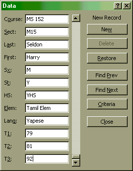
Use of the tab key to move from one field to the next has been a standard in the data entry industry for over 30 years. The Tab key will work in Excel, Microsoft Access, and fill-in-the-blank fields found on the Internet and all other data entry applications.
When a spreadsheet is designed for data the menu item Data: Sort will detect the field names and offer to sort by field name.
Select Sort from the Data menu.
Set up your sort as follows:
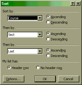
Click on OK.
A sort can be done on any column. When done on a test score column, sorting allows determining the high, low, and median score at a glance.
In cell M1 type the characters Avg
Click on cell L1, then click on the Format Painter toolbar button ![]() , and then click on M1 to transfer the
field style to M1. The button may be a different color on your computer
, and then click on M1 to transfer the
field style to M1. The button may be a different color on your computer
Click in the cell M2. In the cell M2 type:
=average(J2:L2)
The computer screen will look something like the following:
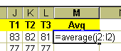
and then press enter after completing the formula. Note that there are NO spaces in a formula. The average function averages all the cells from J2 to L2. J2:L2 is called a "range." A range includes all of the cells between the cells. A range can be a portion of a row, a portion of a column, or a rectangular area of a spreadsheet.
To copy the formula down the Avg column there are at least three methods:
1. For the mouse adept: using the fill handle
Click in M2.
Roll the cursor over the lower right hand corner of M2, directly over the small black square
. The cursor should turn into a solid black bold plus sign.
The small black square is called the smart-fill control or the "fill handle". Click directly on the small black square and drag down to fill the formula down the Avg column. The farther one goes off the bottom edge of the spreadsheet the faster the scroll speed. To control the fill speed move only a tiny distance off the bottom edge of the spreadsheet. In some versions of Excel double-clicking the fill handle automatically fills the formula down to the bottom of your data.
2. For the mouse adept: another way.
Click in the center of M2, drag down to the bottom of the student list. Then:
a. Use the key combination Control-D to fill down. This invokes a non-smart fill down and is useful when Excel insists on creating an undesired series of increasing values during a smart-fill. OR
b. Use the menu sequence Edit: Fill: Down
3. For those who prefer the keyboard:
Click in the center of M2. Release the mouse button. Hold down the shift key and use the down arrow to select the portion of the Avg column with the student list. Then:
a. Use the key combination Control-D to fill down. This invokes a non-smart fill down and is useful when Excel insists on creating an undesired series of increasing values during a smart-fill. OR
b. Use the menu sequence Edit: Fill: Down
Functions that could be put in M2 (or any other column to the right) and filled down include:
=average(J2:L2) Finds the mean of the values in the range.
=count(J2:L2) The number of cells containing values in the range.
=max(J2:L2) Displays the smallest value in the range.
=median(J2:L2) Returns the median of the range.
=min(J2:L2) Displays the smallest value in the range.
=mode(J2:L2) Returns the most common value in a range.
=stdev(J2:L2) Displays the standard deviation of the range.
=sum(J2:L2) Returns the sum of the values in a range.
Try entering some of these formulas in M2 and filling the result down the M column. Note that all functions begin with an equals sign.
In the event that one needs to weight a cell differently, arithmetic operators can be used with cell addresses to accomplish this task. The operators are:
Suppose test T1 and test T2 are worth 25% each, and test T3 is 50% of the student’s grade. Then the following formula would be used in M2:
=0.25*J2+0.25*K2+0.50*L2
Type this formula in M2 and fill down. Do not forget the leading equals sign! Remember, there are NO spaces in any formula.
Mathematical operators can be combined with functions to perform complex calculations. Suppose that one wanted to toss out the lowest test and find the average of the remaining two tests. The formula to do this would be:
=(sum(J2:L2)-min(J2:L2))/2
Enter this formula into M2 and fill down.
This formula would work for three tests, it could be generalized to work for any number of tests with the following formula:
=(sum(J2:L2)-min(J2:L2))/(count(J2:L2)-1)
Enter this formula into M2 and fill down. Be careful when typing parentheses!
Another way to enter ranges into formulas is to use the mouse to select the cells in the range. Start by typing:
=average(
Do not forget either the = or the open parentheses, these are necessary to activate the point and select method of range entry. Immediately after typing the open parentheses, click with the mouse in the center of the cell J2 and hold the mouse button down. Roll the mouse slowly to the right (this is called "dragging the mouse") until you reach the center of the cell L2. Release the mouse button. Type a close parentheses:
)
and press enter. This method of entry is most useful when working with formulas that refer to data on another sheet.
Suppose we want to know the overall average for all students in all of our classes. We could go to the bottom of the student averages in the M column and type =average(M2:M32), but the next time we sorted our data by average the average at the bottom would appear in the middle of the student name list. There is a good chance we would not be able to resort it back to the bottom of the data where it started.
The underlying database principle we violated that led to the above problem is that each row of the gradesheet must correspond to a student. The summary calculation of average represented a row that was not a student. The result can be a scrambled worksheet. The way to avoid this problem is to put the summary calculations on another sheet altogether.
From the Insert menu choose Worksheet to add a new
worksheet to the workbook. A blank sheet called Sheet1 will appear (the number at the end
may differ). Click with the RIGHT mouse button (not the left one!) on the
name Sheet1 ![]() and choose Rename
from the menu that appears. Rename the new worksheet Stat.
and choose Rename
from the menu that appears. Rename the new worksheet Stat.
In cell A1 type Overall Average. Adjust the width of the cell to fit the word by moving
the cursor between the A and B letters at the top of the column ![]() , clicking, and dragging slowly to the right. Format the
text and background as you prefer.
, clicking, and dragging slowly to the right. Format the
text and background as you prefer.
In the cell B1 type the following:
=average(
and then click the mouse on the Data tab at the bottom of the worksheet. Carefully drag the mouse from M2 to the bottom of the student averages (probably M32 on the worksheet.) Then type a close parentheses:
)
and press enter. The Stat worksheet should be set up something like the following image at this point:
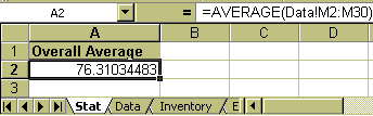
Note the range specification Data!M2:M30 (the one being used in class more likely reads Data!M2:M32). The range specification now includes a reference to a separate worksheet, the Data worksheet. This is one reason giving worksheets a name that conveys meaning is important: it makes formulas such as the above more "readable."
An Excel Workbook is comprised of one or more worksheets. The workshop workbook is
called Gradebook ![]() .
.
The grades are on a worksheet called Data. ![]() . Some of the titles of other worksheets can be seen to the
right of the Data tab. The arrows to the left of the Data tab help us scroll through the
tabs. This is necessary only if there are many worksheets in the workbook.
. Some of the titles of other worksheets can be seen to the
right of the Data tab. The arrows to the left of the Data tab help us scroll through the
tabs. This is necessary only if there are many worksheets in the workbook.
If the average function is not already in column Avg, click in cell M2, enter
=average(J2:L2)
and fill down to the bottom of the list.
A |
B |
C |
D |
E |
F |
G |
H |
I |
J |
K |
L |
M |
N |
O |
P | |
1 |
Course | Sect | Last | First | Sx |
St |
HS |
Elem | Lang |
T1 |
T2 |
T3 |
Avg |
Pass |
GP |
Grade |
The If-Then function consists of three parts: a condition, what to do when the condition is true, what to do when the condition is false. The structure of the function is as follows:
=IF(condition,true,false).
Note that the three parts are separated by commas. In the If-Then function letters of the alphabet must be surrounded by quotes, numbers do not need to be surrounded by quotes.
In the cell N2 type
=IF(M2>69,"Promote","Repeat")
Type carefully, computers are extremely literal. The sequence is:
equals IF open-parentheses M2 greater-than (shift-period) 69 comma quote Promote quote comma quote Repeat quote close-parentheses
Then press the enter key.
This function first determines if the value in M2 is greater than 69. If the value is greater than 69, then the student is promoted to the next mathematics course else the value was less than or equal to 69 and the student must repeat the mathematics course.
Fill down by any of the previously introduced methods.
Take a look at the results, note cases where the condition is met and not met.
There are other conditional operators that can be used. Conditional operators include =, >, and <. These operators can be combined as in >= or <=.
The following is a nested If-Then function. The nested If-Then function parses data in data bins. We will use a nested If-Then function to automatically assign a grade point value to each average.
Type the following function into O2 being careful to include each comma and parentheses:
=IF(M2<60,0,IF(M2<70,1,IF(M2<80,2,IF(M2<90,3,4))))
This should look something like (the multi-colored parentheses appear only in Excel 97, they help show the nesting structure):
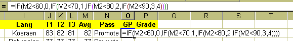
The above is a nest If-Then function. For those who have worked in other computer languages, the above is equivalent to:
     If M2 < 60
     Then O2 = 0
     Else If M2 <70
          Then O2 = 1
          Else If M2 < 80
               Then O2 = 2
               Else If M2 < 90
                    Then O2 = 3
                    Else O2 = 4
                    End If
               End If
          End If
     End If
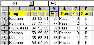
Fill the formula down the GP column by the method of your choice. The result is that Excel has calculated the grade as expressed in grade point value for each student. The frequency function, which we will look at later, cannot handle letters, hence the choice to use grade point values here.
The choose function selects the Nth item from a list.
The syntax for choose is =choose(n,firstItem,secondItem,thirdItem,fourthItem,…) where n must be a cell address that contains an integer. The Nth item is chosen by the integer.
Click in the cell P2. Enter
=CHOOSE(O2+1,"F","D","C","B","A")
Note the O2+1: there is no zeroth item allowed in choose. The O2+1 converts a GP of 0 to 1 (there is no zeroth element of a list in Excel. Special note for users of Microsoft Works only: In a single encounter with Microsoft Works 4.0 there appears to be a zeroth element in the choose function.)
Fill down the grade column. The worksheet should now look something like:
| A | B | C | D | E | F | G | H | I | J | K | L | M | N | O | P | |
| 1 | Course |
Sect |
Last |
First |
Sx |
St |
HS |
Elem |
Lang |
T1 |
T2 |
T3 |
Avg |
Pass |
GP |
Grade |
| 2 | MS 101 |
M08 |
Albert |
Abenaa |
F |
K |
KHS |
Lelu |
Kosraen |
83 |
82 |
81 |
82 |
Promote |
3 |
B |
| 3 | MS 101 |
M08 |
Aldis |
Adjoa |
F |
P |
PICS |
PCS |
Pohnpeian |
77 |
77 |
77 |
77 |
Promote |
2 |
C |
| 4 | MS 101 |
M08 |
Elidok |
Ama |
F |
C |
CHS |
Puluwat |
Puluwatese |
94 |
92 |
90 |
92 |
Promote |
4 |
A |
| 5 | MS 101 |
M08 |
George |
Kweku |
M |
K |
KHS |
Malem |
Kosraen |
58 |
59 |
60 |
59 |
Repeat |
0 |
F |
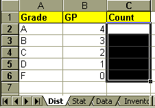
Inserting a new worksheet in the workbook
On the new worksheet:
A |
B |
C |
|
1 |
Grade | GP | Count |
2 |
A | 4 | |
3 |
B | 3 | |
4 |
C | 2 | |
5 |
D | 1 | |
6 |
F | 0 |
The frequency function tallies the frequency with which a piece of numberical data appears. The frequency function can count the number of occurrences of a number in a list of numbers. The list of numbers is referred to as the data cells. The bins that will accumulate the number of occurences requires a set of index numbers that are referred to as the binIndexCells. The basic frequency function syntax is
=FREQUENCY(dataCells:binIndexCells)
The syntax if the data and the bins are on different worksheets is
=FREQUENCY(workSheetName!dataCells:workSheetName!binIndexCells)
The frequency function we will be using is an "array" function which means it will occupy more than one cell. We must select all of the cells the frequency function will occupy.
Select the cells C2 to C6. It ought to look something like this...
Type
=frequency(
then left click with the mouse on the Data worksheet tab
Drag the mouse to select the grade point values column (the numbers only, do not include the label in the first row) on the Data worksheet. The grade point values are likely in column O on the Data worksheet.
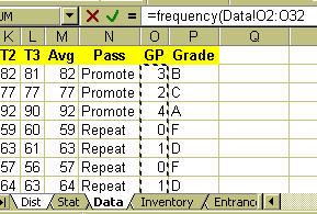
10. Type a comma ,
11. left click on the Dist worksheet tab
12. Drag the mouse to select B2 to B6
13. Type a close parentheses ).
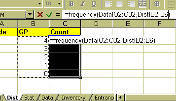
14. Hold down the control and the shift key, then with the control (Ctrl) and shift key still down, press the enter key. The Control-Shift-Enter key combination tells Excel that the formula is an array and to enter the formula into all the selected cells. If you make an entry error with an array function, you cannot edit an individual cell: the formula is in no one cell. Deleting and re-entering the array formula is the easiest way to fix an error in an array formula.
15. When you have done the above, the formula you will have constructed will look like
=FREQUENCY(Data!O2:O32,Dist!B2:B6).
When viewed in the cell Excel will add brackets to remind you that the formula is an array formula:
{=FREQUENCY(Data!O2:O32,Dist!B2:B6)}
The reason for using the frequency function is that the function creates a dynamic distribution. Try going to the Grades worksheet and changing a student’s grade point number by changing the test scores T1 to T3, then return to the Dist worksheet and note that the change is reflected in the counts.
Note that Office 97 does things a little differently in a slightly different order with dialog boxes that, unfortunately, look very different.
Design for charting is like designing for data. Include a field name row at the top of the data. Make the leftmost ("first") column a column of labels. The Dist worksheet is set up this way already.
| Grade | GP |
Count |
| A | 4 |
5 |
| B | 3 |
7 |
| C | 2 |
8 |
| D | 1 |
6 |
| F | 0 |
3 |
What many call a "bar chart" Excel calls a "Column chart" or column graph.
To make a column chart, select the cells A1 to A6.
Hold down the Control (Ctrl) key and select the cell C1 to C6. The control key allows the selection of non-adjacent data. Always include all label rows and columns in the selection, this will cause automatic labeling of the chart axes.
Click on the Chart wizard button in the tool bar ![]() . This button has slightly different appearance in Excel 95
and Excel 97. From here on forward the two versions differ significantly. This document
will follow the Excel 95 version.
. This button has slightly different appearance in Excel 95
and Excel 97. From here on forward the two versions differ significantly. This document
will follow the Excel 95 version.
Excel 95 only: Drag the mouse to form a small dotted line square on the worksheet to set the location of the chart on the worksheet. Releasing the mouse should cause a chart wizard dialog box to pop up.
Excel 97 ONLY: Excel 97 skips the above step and the next step altogether. Excel 97 automatically creates a "default" chart size that can be changed later. Excel 97 relegates step 1 below to a tab hidden in the new step one.
Click on Next to leave step 1.
Click on Column chart option in the middle of the top row of step 2 and then on Next.
Click on format option 1 in the upper left corner of step 3 for a basic column chart and then on Next.
The dialog box for step 4 is the first of two options dialog boxes that are important. This is where one can specify whether the data is in rows or columns. If one has more than one label row or column, this is the place to specify multiple label rows or columns. We have only one label column if we used the Control key properly. Excel should have chosen the following set-up:
The series radio buttons should be set as follows:
![]()
Click on Next.
In step 5 options dialog box select No under "Add a legend?" For a single data set a legend is unnecessary. If desired, type in a chart title, x-axis and y-axis label. Click on finish.
Excel 97 ONLY: This is step 3 in Excel 97 and the dialog box differs in the extreme from Excel 95. Turning off the Legend requires clicking on the Legend tab and clicking on the check mark to the left of the words "Show legend" to turn the check mark off.
If the Pie chart option had been taken at step 2, then a pie chart would have been the result. The pie chart option 7 includes percentages.
Enter the following data below the grade distribution on the Dist tab.
State |
Pop |
| Chuuk | 52870 |
| Kosrae | 7354 |
| Pohnpei | 33372 |
| Yap | 11128 |
Excel 95: To make a pie chart, select the data including the field names row and the labels column.
Click on the Chart wizard button in the tool bar.
Drag the mouse to set the location of the chart on the worksheet.
Click on Next.
Click on pie chart option and then on Next.
Click on option 7 for a basic labeled pie chart and then on Next.
This first of two options dialog boxes is important. This is where one can specify whether the data is in rows or columns. If one has more than one label row, this is the place to specify multiple label rows. It is likely that no adjustments need to be done for this graph: Excel will likely "guess" correctly based on the existence of a field name row and the labels column. Click on Next when done.
In this second options dialog box select No under "Add a legend?" For a single data set a legend is unnecessary. Type in a chart title. Click on finish.
Age |
Female |
Male |
0-4 |
-7117 |
7545 |
5-9 |
-7158 |
7932 |
10-14 |
-7288 |
7656 |
15-19 |
-5893 |
6532 |
20-24 |
-4703 |
4489 |
25-29 |
-3528 |
3514 |
30-34 |
-3407 |
3393 |
35-39 |
-2949 |
3049 |
40-44 |
-2456 |
2975 |
45-49 |
-1660 |
1941 |
50-54 |
-1160 |
1111 |
55-59 |
-1091 |
998 |
60-64 |
-965 |
1013 |
65-69 |
-669 |
639 |
70-74 |
-627 |
542 |
75-79 |
-281 |
263 |
80-84 |
-176 |
137 |
85-89 |
-58 |
41 |
90-94 |
-30 |
26 |
95-99 |
-8 |
4 |
There are many types of charts available. The math teacher is likely to find the x-y scatter diagrams useful for graphing functions. Put the x values in the first column and the y-values or a function in the second column.
Excel will, with a little thought, make specialty graphs that are not immediately evident from an inspection of the chart wizard. In attempt to stretch thinking, the following will produce a population pyramid type chart.
Select the data including the field names row and the labels column. Note the use of negative values for the first column.
Click on the Chart wizard button in the tool bar.
Drag the mouse to set the location of the chart on the worksheet.
Click on Next.
Click on Bar chart option and then on Next.
Click on option 8 for then on Next.
This first of two options dialog boxes is important. This is where one can specify whether the data is in rows or columns. If one has more than one label row, this is the place to specify multiple label rows. It is likely that no adjustments need to be done for this graph: Excel 95 will likely "guess" correctly based on the existence of a field name row and the label column. Click on Next when done.
In this second options dialog box select Yes under "Add a legend?" The wizard may already have selected yes. For two or more data columns a legend is informative. A field name row is necessary for Excel to correctly set up the legend. Type in a chart titled, x-axis, and y-axis labels. Click on finish.
Excel 95: Double-click on the chart to select the chart. A hashed line should appear around the chart, or, alternatively, the chart should appear in its own window. Excel is now in graphing mode. The menus are different in graphing mode. This modality (regular versus graphing) is a source of confusion for many learning to use Excel. From the Format menu choose Chart Type.
Click on the Options button in the Chart Type dialog box.
Click on the Options tab at the top of the Format Bar Group dialog box.
Set the Overlap to 100 and the gap width to 0. Click on OK. Click outside the area of the graph to turn off the hash mark border. This also takes Excel out of the graphing mode and into the regular mode.
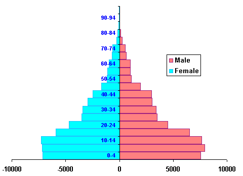
Excel 97: Instead of double clicking on the chart to select the chart as noted above, single click on the chart. Then go to the Chart menu and then double click on the actual population bars in the chart. This brings up the format data series dialog box. Click on the options tab. Set the Overlap to 100 and the gap width to 0. click on OK. Excel 97 may make a mess of the graph labels. Double click on the offending labels and set their font size and style to reasonable values.
Using Excel to generate subtotals by course and section
Suppose we wanted to know whether our course averages differed from one section to the next or wanted to know the relative performance of the students by state or gender. Excel can sort and summarize such data using subtotals.
In order for Excel to generate subtotals the data must be sorted by the criterion to be summarized.
Click in cell A1 of the Grades sheet of the Gradebook workbook. Do not select any cells: sort will make the presumption that only the selected cells are to be sorted and will mix up the data.
Choose Sort from the Data menu. Excel should have detected the field names and the radio button "My List has… Header Row" should already have been selected by Excel. Good initial design for data is important to proper sorting and subtotaling.
Sort by Course and Then By Sect and Then By Last (name). Click on OK.
Choose Subtotals from the Data menu in Excel.
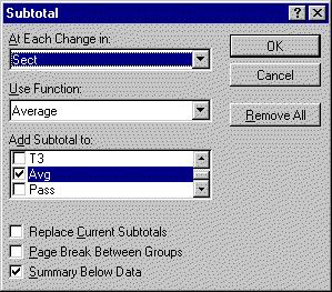
Set at "At Each Change in" to Sect by clicking on the downward pointing triangle on the right side of the "At Each Change in" list box.
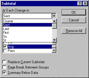
Set the "Use Function" list box to Average.
In the "Add Subtotal to:" list click on the check boxes next to T1, T2, T3, Avg, and GP. Scroll the list box to see T1, T2, T3, Avg, and GP. Click on OK.
| Note the change in the worksheet: a new panel has appeared on the left, the subtotals control panel. There are three levels shown at the top by three numbered buttons. Click on button number 1 to see only the Grand Average. | 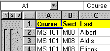 |
Click on button number 2 to see the individual section averages. Note the buttons with the plus signs that appear. Clicking on a plus sign button opens up the details for a single section. After clicking on a plus button, a minus button appears. Click on the minus button to collapse the section.
Click on button number 3 to see the list of all students.
Suppose we now wanted to see the overall student averages by state. Changing a subtotals view is a three phase process.
The key concept here is that the sort order must mirror the "subtotal at each change in" choice. Subtotals subtotal at each change as Excel moves down the list. If the states are not in alphabetic order, then at each and every change of state from row to row Excel will insert a subtotal. Subtotals on one field cannot be resorted on another without removing all existing subtotals first, hence the first step of removing the subtotals.
Subtotals functions include sum (the additive total), count (how many items), the average, the maximum value in the subset, the minimum value in the subset, and standard deviations among other specialized functions. The sum and average functions are the most commonly needed functions. On the worksheet tab labeled Inventory is an example of an inventory spreadsheet demonstrating the use of the Sum function to tally up the value of property in the A204 laboratory. Click on the Subtotal control panel numbered buttons to explore the different levels of this spreadsheet.
Filtering allows one to display subsets of the data based on specific condition. Suppose we want to display only the students who will be on the deficiency list, those with an average less than 70.
Start filtering by removing the subtotals. Choose Subtotals on the Data menu and then click on the "Remove All" button.
| Choose Sort on the Data menu and sort by last name and then by first name. Click on
OK. Scroll to the top of the worksheet. From the Data menu choose Filter. On the submenu that pops up choose Autofilter. Small grey buttons with triangles in them should appear in the top row of your spreadsheet. |
 |
| Click on the grey button in the M (Avg) column to see a "drop-down" list of options. This list includes preset values one can select to filter the data. Choose (Custom…), the third item down the list. The following dialog box should appear: | 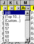 |
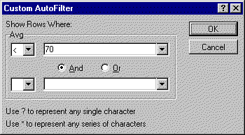
Use the little "down triangle" button to the right of the equals sign in the first blank under the word "Avg" to choose a less than < sign.
Either select 70 from the drop down list in the next box or type 70 in the next blank box as seen above. Click on OK.
The result is a list of students who are deficient (below 70). If one chooses print with a filter on then only the names shown will print.
Getting back all of your data: Choose Filter again from the Data menu and this time select "Show All" on the submenu.
Filters are another powerful use of Excel provided that your spreadsheet is set up in database format (field names in row one and no blank rows, one physical item per row in rows two and higher). Assets larger or smaller than a given number could be displayed, or students with a TOEFLs above or below a specific point could be shown. The "Top ten" filter option can display just that, the "top ten" in a category.
Using Excel to set up a pivot table to study course versus gender grade averages. This section presumes that the worksheet named Dist has already been inserted in the workbook during work on the frequency function.
Pivot tables are easiest to set up when the spreadsheet is designed for data. Field names should be in row one of the table, with data below. There should be no blank rows within the data.
Pivot tables (known in Microsoft Access as a cross-tab table) groups data by two categories, producing summary information such as average, sum, or count according to two or more categorizations. As a part of this process, pivot tables have the ability to take categories in data rows and turn them into field names. The result feels like a "rotation" of the data, hence the name Pivot table. As an example, the data on the left below is pivoted to produce the result on the right.
| A | B | C | D | E | F | G | H | |
| 1 | State | Sex | T3 | Average of T3 | Sex | |||
| 2 | Pohnpei | F | 80 | State | F | M | Grand Total | |
| 3 | Pohnpei | M | 65 | Chuuk | 82.5 | 67.5 | 75 | |
| 4 | Pohnpei | F | 70 | Pohnpei | 75 | 70 | 72.5 | |
| 5 | Pohnpei | M | 75 | Grand Total | 78.75 | 68.75 | 73.75 | |
| 6 | Chuuk | F | 95 | |||||
| 7 | Chuuk | M | 60 | |||||
| 8 | Chuuk | F | 70 | |||||
| 9 | Chuuk | M | 75 | |||||
The result are averages based on state and sex. The data in the Sex column, F and M, has become field names in a new row one of a table. The data has, in a sense, been "pivoted" or "rotated" up out of a column and tabulated across as field names in a new table (hence the use of term "cross-tab" by Microsoft Access).
To start a pivot table in the Gradebook workbook, click anywhere inside the field row or the data rows of the Grades worksheet. Do not select a cell, just have the cursor in a cell inside the data to be pivot tabled.
Choose Pivot Table from the Data menu.
Click on Next in the first dialog box. The default Microsoft Excel List or Database is usually selected and is the correct selection.
Click on Next in the second dialog box. If the spreadsheet is designed properly for data then Excel will have correctly detected the data range.
Dialog box three presents the screen where choices are made as to row and column groups.
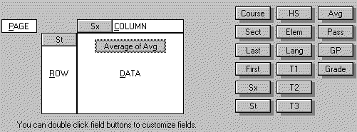
Drag and drop the button marked State (St) from the right hand area of the dialog box to the area marked Row.
Drag and drop the button marked Sex (Sx) from the right hand side to the Column area.
Drag and drop the button marked Avg from the area on the right to the Data area.
| Double click on the Avg button in the Data layout area at the center of the screen. From the PivotTable Field pop-up dialog box choose the function average. Note that all of the basic functions are available including sum, average, and count among others. These are the same functions we encountered on the first day. Click on OK. | 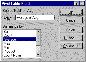 |
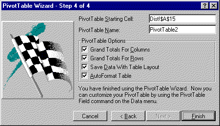
Click on Next.
The next dialog requests a location for the pivot table. Click on the Dist worksheet tab (created during the frequency function lesson). Click in A15 (below the chart if one exists in the gradebook). Click on Finish.
The data in the resulting PivotTable summarizes averages by state and sex for the fictional College of Micronesia-FSM spreadsheet.
To make the data more presentable:
Select the data in the pivot table by dragging the mouse across the number data.
Choose Cells… on the Format menu.
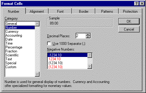
The dialog box should open to the Number tab. If not, click on the tab marked Number.
Click on the item Number in the Category list box.
Note the default number of decimal places is preset to 2. This can be changed. For now, click on OK and the numbers in the table will be displayed to two decimal places.
The data in a pivot table can be graphed to produce charts as was covered in the second session. Be careful to select only the state and sex breakdown data and not the grand total data. Look carefully at the diagram below and the note following the diagram.
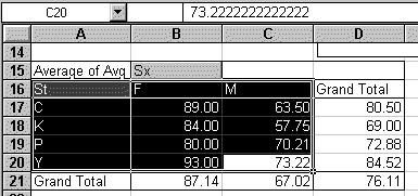
Making the selection shown must be done by dragging from C20 to A16. Dragging from A16 to C20 is not possible as A16 is a button that activates when clicked.
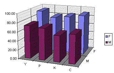
Note that in the particular chart shown has been adjusted by rotating the chart 180° from the initial position. This was done by double-clicking on the chart and then choosing 3-D View from the Format menu. In the 3-D View dialog box the rotation was set to 200° (initial rotation was 20°).
Pivot tables are best produced by good data designs. In turn, good data designs are produced by considering the pivot table implications. Good design requires that each data row be a single object or instance, not a an aggregate of data. Gradebooks almost naturally generate good data designs: a single student in a single class per row (a "student-seat"). In other applications forethought may be necessary. In a study of lizards, for example, proper design of a good table is likely to involve listing each individual lizard in its own row. This would be as opposed to a table where each row was a location and the data was the number of lizards in that location. The following fictitious table is not well thought out from a pivot table perspective. For example, although the original tallies might have indicated the number of females with tails, the resulting table has lost that information. The design is also prone to typographic errors that result in internally inconsistent data: examine the sum of the number of males and females on trees.
| Location | Number of lizards |
Number of Females |
Number of Males |
Num w/ tail |
| Beach | 2 | 1 | 1 | 0 |
| Pond | 6 | 3 | 3 | 5 |
| River | 8 | 5 | 3 | 4 |
| Rock | 7 | 5 | 2 | 7 |
| Tree | 10 | 6 | 5 | 9 |
A better design would have been:
| Location | Sex | With Tail |
| Tree | F | 1 |
| Tree | F | 1 |
| Tree | F | 1 |
| Tree | F | 1 |
| Tree | F | 1 |
| Tree | M | 0 |
| Tree | M | 1 |
| Tree | M | 1 |
| Tree | M | 1 |
| Tree | M | 1 |
| Tree | M | 1 |
| Pond | F | 0 |
| Pond | F | 1 |
| Pond | F | 1 |
| Pond | M | 1 |
| Pond | M | 1 |
| Pond | M | 1 |
… and so forth. The resulting table can be subtotaled or pivoted to obtain accurate summary information. Although the original data table will be lengthy, most reports will use the results of subtotal calculations and pivot tables. The table may have typographic errors, but the totals will at least be consistent with the data, there will not be any internally conflicting data. Typos will also not likely affect counts the way they can in the earlier table.