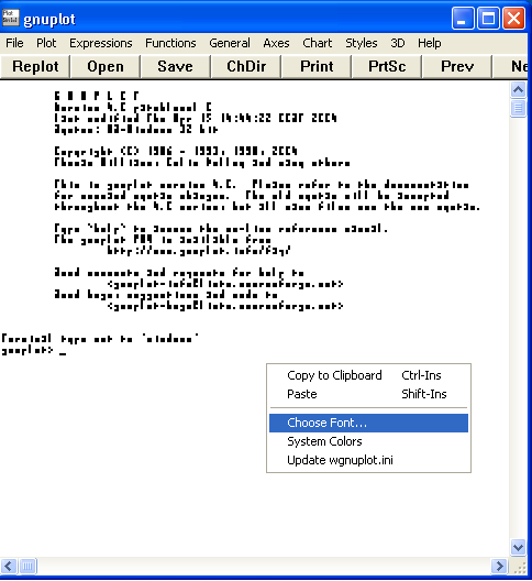
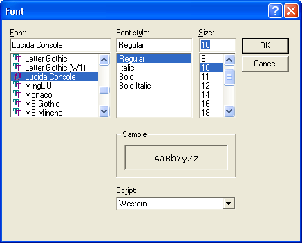
This guide does not cover installation of Gnuplot. After installation and launch, Gnuplot may appear unreadable. Right click on Gnuplot and select Choose font.
I prefer Lucida console 10 point, a font that like typewritten letters produced equally spaced letters.
Gnuplot is command line oriented. Type a command and appropriate arguments for the command and then press enter. If the command is a plot command, a graph will appear.
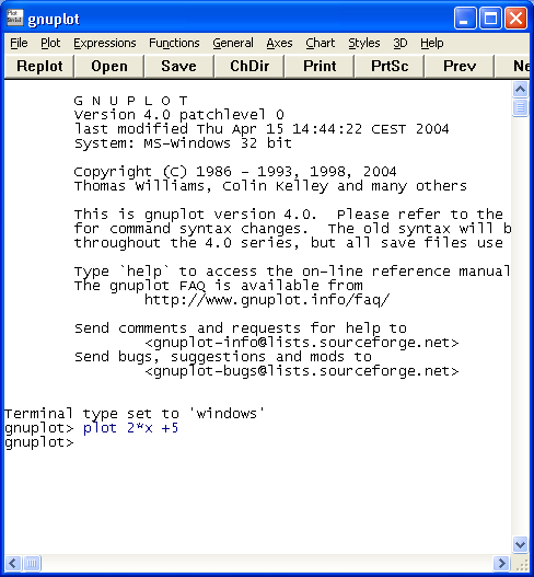
Type plot 2*x+5 as seen above and a graph will appear. Note that an asterisk is used for multiplication.
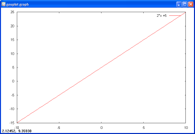
The above graph is rather unadorned and plain. The above graph was reduced in size using photoimaging software from the original size. Gnuplot has hundreds of command and argument combinations that can be used to produce grids, borders, variable line widths, line colors, and line styles.
Graphing an exponent requires telling Gnuplot that you are raising the variable x to an exponent. Here is the one place Gnuplot differs from the convention used in most other programs. Gnuplot uses two asterisks for exponentiation. Thus plot x**2+8*x+15 produces a quadratic with x-intercepts at -3 and -5.
![]()
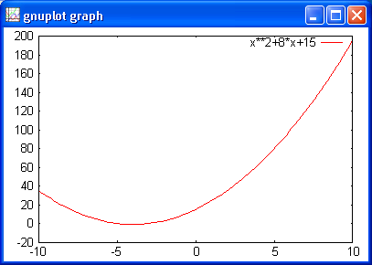
Gnuplot helpfully reminds one of what is being graphed in the upper right corner.
Commands can be issued in a sequence to modify the graph appearance. After each command, press enter. The appearance on the computer screen can be seen on the right.
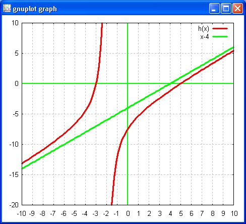
set border
set grid
set xrange [-10:10]
set yrange [-20:10]
f(x)= x**2-2*x-15
plot f(x)
The last command then produces the plot seen below.
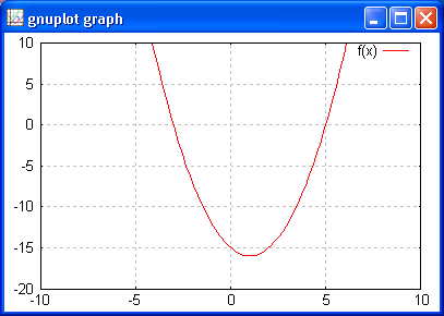
The border is the border on the plot, the grid are the grid lines. The range for x and y are specified by the set xrange and set yrange commands. Note the use of f(x)= x**2-2*x-15 and then the plotting of f(x). Gnuplot understands function notation.
One common use I have for Gnuplot is the production of graphs for tests and quizzes. I find myself fiddling with settings repeatedly. The easiest way to do this is to create a text file of the commands and then open that file with Gnuplot. Notepad or any other text editor will easily create the
 reset
set border
set xtics 1
set grid
set xzeroaxis lt 2 lw 2
set yzeroaxis lt 2 lw 2
set style line 1 lw 3
set xrange [-10:10]
set yrange [-20:10]
f(x)=x**2-2*x-15
g(x)=x+2
h(x)=f(x)/g(x)
plot h(x) ls 1,x-4 lw 3
reset
set border
set xtics 1
set grid
set xzeroaxis lt 2 lw 2
set yzeroaxis lt 2 lw 2
set style line 1 lw 3
set xrange [-10:10]
set yrange [-20:10]
f(x)=x**2-2*x-15
g(x)=x+2
h(x)=f(x)/g(x)
plot h(x) ls 1,x-4 lw 3
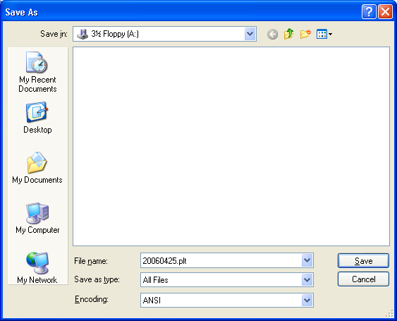
Type the commands into a text editor, then save as a .plt (plot!) file. Using Notepad, be sure to switch the Save as type: to All Files or Notepad will unhelpfully tack on a .txt extension.
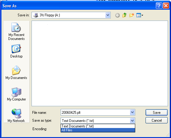
With Notepad set to save as All Files, manually type the name and .plt extension.
Click on the Open button in Gnuplot. Gnuplot will first open in its own home folder. After that Gnuplot will open in the last folder from which a file was opened.
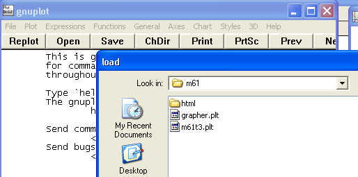
Navigate to the place the .plt file was saved and open the file.
After the file is opened, Gnuplot's command line will show the file and path that was loaded.
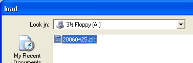
![]()
The load command, path, and filename could be hand typed from the command line using the pattern shown above. Upon loading, due to the plot command in the file, a plot appears.
The list of commands in the text file could have been entered one at a time from the keyboard and the resulting plot would have been the same. The file contains a number of useful commands for formatting a file. The # character causes Gnuplot to ignore the rest of the line, I have borrowed this convention to explain the commands issued.
reset                     # reset restores Gnuplot to startup configuration
set border                # turn on the plot border
set xtics 1               # set the x-axis to display at an interval of one
set grid                  # turn on the plot grid. xtics controls x grid too
set xzeroaxis lt 2 lw 2   # set the x-axis to linetype 2 linewidth 2
set yzeroaxis lt 2 lw 2   # set the y-axis to linetype 2 linewidth 2
set style line 1 lw 3     # set user defined linestyle 1 to linewidth 3
set xrange [-10:10]       # set the x-axis to run -10 to 10
set yrange [-20:10]       # set the y-axis to run -20 to 10
f(x)=x**2-2*x-15          # define f(x)
g(x)=x+2                  # define g(x)
h(x)=f(x)/g(x)            # yes, algebra can be done on function notation
plot h(x) ls 1,x-4 lw 3   # plot h(x) using linestyle 1, on the same graph plot x-4 linewidth 3
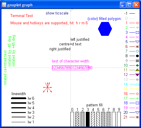
Entering the word test at the Gnuplot command prompt and pressing enter will run the terminal test. This command indicates how Gnuplot plotting commands will appear on the computer on which Gnuplot is running. The test shows the linewidth near the bottom. On the right is the linetype. Linetype 2 is green.
Note that the linetype and thus the color of the line used for the user defined line style 1 was not specified. Gnuplot uses a default color for each subsequent plot starting with linetype 1 for the first plot, linetype 2 for the second. This could be changed by specifying a linetype for the user defined line style or in the plot command directly. Changing two lines in the file above produces a blue h(x) plot and a purple asymptote. Only the two changed lines are displayed.
set style line 1 lt 3 lw 3
plot h(x) ls 1,x-4 lt 12 lw 3
There are many more options. One I recently used was the command set lmargin 100 to create a 100 pixel margin from the left edge to permit space for the y-axis labels to display correctly. Digging through the help file is useful, but sometimes obtuse. Gnuplot also includes many demo files that can help along with three PDF format files buried in the program folder that are useful references for advanced users.
Once I have the graph looking the way I want it to look, and have it at the right size (which takes some trial and error experience), on a Windows based computer I click on the graph once and then press Alt-Print Screen to capture the graph to the clipboard. Then I open either GIMP (my preference) or Microsoft Paintbrush and choose Edit: Paste to get the graph into the image editing software. I then save the graph as a .gif or .png, usually the later. I realize that Gnuplot will natively output PNG files, when I am comfortable with doing that I may make up an instructional page. When I use GIMP I open a new blank file. The new blank file has the menu command "Paste as new" which gives me a precisely sized screen image. Then I save the image as a png at a compression level of six. All of the images in this page were produced that way.
During the summer of 2006 I learned that there is a menu "hidden" under the Gnuplot icon on the graph window that allows one to copy a graph directly to the clipboard. After invoking this menu item I could simply paste the the image directly into an OpenOffice 2.0 Write document. I presume this would also work for Microsoft word. There is also a Gnuplot print command on the same menu, but much of the formatting is lost as a generic print driver is invoked. The clipboard image, however, preserves the formatting of the graph.

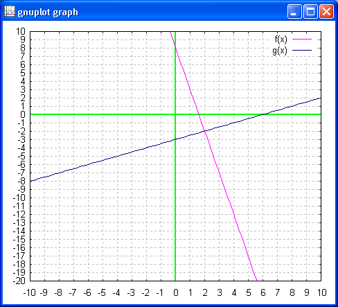
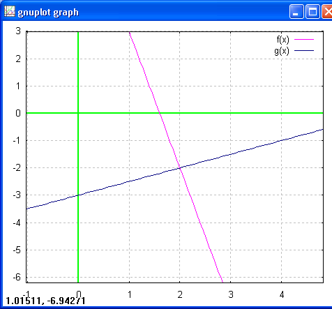
For students, subtleties of format, tics, and grids are less important. Students are also more likely to work from the command line. The following commands issued at the command line generate an intersection of two lines.
f(x)=-5*x+9
g(x)=(x/2)-3
set ytics 1; set xtics 1    # two commands on one line requires semi-colon
plot f(x) lt 4, g(x) lt 5   # not two commands, comma used for plotting two functions
                            # on one plot. Linetype 4 and 5.
Gnuplot may not choose an optimal xrange and yrange, and no grid will be displayed until the set grid command is issued. The following commands were issued prior to generating the graph seen below. A student would still have a usable starting graph with just the four lines above.
gnuplot> set xrange [-10:10]
gnuplot> set yrange [-20:10]
gnuplot> set xzeroaxis lt 2 lw 2
gnuplot> set xzeroaxis lt 2 lw 2
gnuplot> set grid
gnuplot> replot
Gnuplot allows zooming in by clicking and dragging with the right mouse button. Pressing h while the plot window has the focus lists all of the plot window keyboard commands. B1, B2 refer to mouse buttons. To zoom in, move the mouse while holding down the right mouse button (B2). Gnuplot will report the upper left and lower right corners of the zoom.
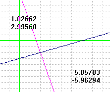
Click with the left mouse button to execute the zoom.
The coordinates at the lower right are not the intersection - they are the location of the mouse. In Gnuplot these numbers track the mouse location on the plot. Press the letter m to make these numbers disappear. Press m again to make them reappear.
After a zoom, press p to return to the previous scale.
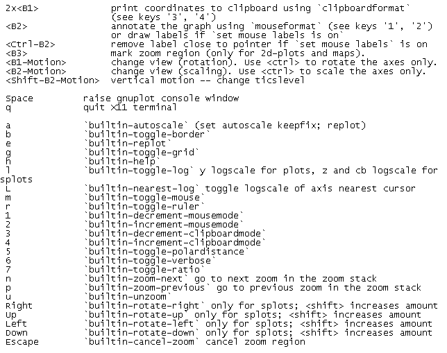
Gnuplot 4.0 features a number of key press commands. Press h to see them all in the Gnuplot command window. To return from the plot window to the command line window just press spacebar!
There are a number of on line references and tutorials for Gnuplot. I benefitted from a paper produced by Nishanth Sastry at IBM.
Graphing hyperbolas and other conics with Gnuplot, or any function with vertical asymptotes, can lead to "gaps" in the graph near the asymptote or where the graph crosses the x-axis when graphed using y = square root(1-x2) types of equations. The solution is to increase the sample rate for the graph (default is 100), as seen in the hyperbolic batch file below. The command is "set samples" following by a sampling rate.
reset
set border
set xtics 1
set ytics 2
set grid
set xzeroaxis lt 9 lw 3
set yzeroaxis lt 9 lw 3
set style line 1 lt -1 lw 4
set style line 2 lt 5 lw 3
set style line 3 lt 12 lw 3
set xrange [-10:10]
# set yrange [-5:18]
set samples 1000
set key off
a=5
b=9
f(x)=sqrt((-b**2)*(1-(x**2)/a**2))
g(x)=-sqrt((-b**2)*(1-(x**2)/a**2))
plot f(x) ls 1, g(x) ls 1
Note that the above generates a hyperbola. The graph was then moved into an OpenOffice 2.0 document by using alt-print screen and simply pasting the graph window into OpenOffice as noted further above. The approach is crude but fast.