MS 101 – Real Life Mathematical Modeling
Today we will use Excel to find a mathematical formula that approximates a set of data. This is called modeling. We will do two exercises—finding a linear model and finding an exponential model.
Basics: In Excel, cells are referenced by the intersecting column and row where the cell is located. Columns start at A and rows start at 1. So the cell in the upper left hand corner is Cell A1, the cell to the right of A1 is Cell B2, etc. You can type a formula into a cell to evaluate data in other cells.
Fitting a Linear Model
Open an Excel notebook and make a column of x-values and y-values by doing the following:
|
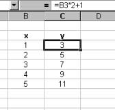
Enter the x-values in Col B. In the cell next to x=1, type the formula “=Cell*2+1” where cell is the cell where the first x-value lies. In my example it is cell B3, so I entered “=B3*2+1”. Hit Enter, then highlight cell C3. Click on the small black square in the corner of C3 and drag the formula down to cell C7. Let go of the mouse and you should have a table that appears like this one. |
|
|
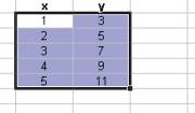
Now we are going have to Excel plot these five data points in an (x-y) coordinate plane. Click on the number 1 and highlight the data down to the number 11. Go to the menu Insert and select Chart. |
|
|
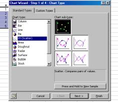
You will see a Chart Wizard which will guide you through the creation of the chart. Select XY(Scatter) as the Chart type: and then select Scatter as the sub-type(appears in black in the picture at right). Click Next. This will bring you to another screen. Click Finish. |
|
|
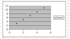
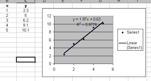
You should see the five data points that you entered plotted in an (x,y)-coordinate plane. Note that we have created a table of data of the form y = f(x) = mx + b. This means that you can draw a straight line that passes directly through all of the points.
|
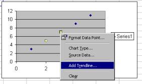
Click on one of the plotted data points to highlight the
data and then right-click and select Add Trendline…
|
|
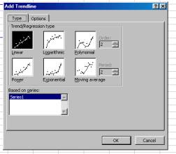
Select the Linear as the Trend/Regression type.
|
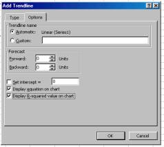
Go to the Options tab and click the boxes for Display equation… and Display R-squared…
|
|
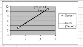
Excel has generated an equation for the data and drawn a
line on your chart that represents the equation it generated. Since the data you typed matches the
equation exactly, the line passes through each of the points. Important note: Excel used the data plotted on the graph
to generate the equation y = 2x +1, it did not know that the data was
generated using the formula =B3*2+1. |
|
Suppose the data you had entered was almost, but not exactly, linear. In other words, suppose you had entered a set of data for which there was no straight line that could pass through all the points. Do you think it is possible to find a line that “fits” the data better than any other line? (The answer is “yes”.) This is called the “best fit model.”
You can change the data that was used to generate the graph and the graph will be updated automatically. Go back to cells where the y-values are and change them to the following:
As you change the y-values, the plotted point on the graph is moved its new location. Notice that as you change the data to represent a set that is not linear, Excel does its best to find the equation of a straight line that best fits the data you have entered. The line moves and the formula printed on the chart is updated to reflect the new formula. The data from which you fit a model usually does not fit the model exactly. This is because real life data is subject to errors and variation that cause individual data points to deviate from the model.
Fitting an Exponential Model
In this example, we will go to the Internet to collect some
population data about Micronesia. We
are going to copy the data from a website and paste it into an Excel
spreadsheet, then ask Excel to fit the data to an exponential model of the form
![]() .
.
Start a Web Browser and go to the following website:
http://www.census.gov/ipc/www/idbprint.html
Select “Total Midyear Population” from the first list.
Select “Micronesia, Federated States” from the second list.
Select “All available years.”
Select “Total”
Submit Query.
You should now see a long list of years together with the corresponding population of Micronesia in that year.
- Highlight the data from year 1950 to 2000.
- Position the pointer over the highlighted data, right click and copy it to the clipboard.
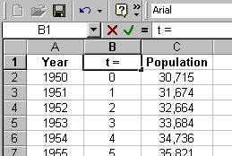
- Go back to a blank worksheet in Excel, highlight cell A2.
- Right click and select Paste Special, then select Text and click OK. You should now have a column with the year and population separated by spaces. We need two distinct columns, so…
- Go to the Data menu, select “Text to Columns”, click the “Delimited” circle, Click “Next”, click on the “Space” box, and click “Finish”. You should now have two columns of data—year and population.
- Click on Col B and select “Insert/Columns” from the menu bar.
- We will now create a column of data which is “years since 1950.”
- Highlight B2 and enter =A2-1950 and hit enter.
- Drag the formula down to make a column of t-values (starting at t = 0).
- Make some nice headings.
|
Highlight the data for t and the population. Then create a chart as before, except choose “Exponential” as the type of regression. Using the formula generated by Excel, create a column of the values predicted by the model. Create another column which shows the difference between the actual population and the predicted population. |
|
|
|
|
|
|
|