MS 150 Statistics Fall 2003
Soy Sauce Project: Monday
This week you will be engaged in data gathering and data analysis. During this week you will practice calculating ranges, minimums, maximums, modes, medians, means, and sample standard deviations.
Task One: Prior to class on Wednesday, go to a local store and record the brand name, price, and volume in milliliters for the different brands and sizes of soy sauce in the store. Each student only needs to go to one store. Amongst your classmates the chances should be good that different stores will get visited.
| Brand Name |
Price/dollars |
Volume/milliliters (ml) |
| | | |
| | | |
| | | |
| | | |
| | | |
| | | |
| | | |
| | | |
| | | |
| | | |
| | | |
Use more rows as necessary. The volume in milliliters is the number that is followed by an ml, you might have to look closely to find the volume. If the volume is listed as 1 liter, 1.2 liters, or 1.6 liters, then the volume is 1000 ml, 1200 ml, or 1600 milliliters respectively.
Bring this sheet with you to class on Wednesday.
Soy Sauce Project: Wednesday
Appoint someone in the class to write the following on the board:
| Brand | Volume in ml | Prices found for that volume |
|---|
| Kikkoman | 148 | |
| Kikkoman | 296 | |
| Kikkoman | 500 | |
| Kikkoman | 591 | |
| Kikkoman | 600 | |
| Kikkoman | 1000 | |
| Kikkoman | 1200 | |
| Kikkoman | 1600 | |
| Kikkoman | 1800 | |
| Kikkoman | 1890 | |
| Yamasa | 150 | |
| Yamasa | 500 | |
| Yamasa | 1000 | |
| Yamasa | 1800 | |
Have each student write the price they found for the brands and volumes shown above. Some people might have found other brands or volumes. Record only prices for Kikkoman and Yamasa volumes. If someone has a Kikkoman or Yamasa volume(s) not shown above, add that to the list of volumes with its price. For each volume, calculate the mean (average price):
| Brand | Mean Price in dollars | Volume in ml |
|---|
| Kikkoman | | 148 |
| Kikkoman | | 296 |
| Kikkoman | | 500 |
| Kikkoman | | 591 |
| Kikkoman | | 600 |
| Kikkoman | | 1000 |
| Kikkoman | | 1200 |
| Kikkoman | | 1600 |
| Kikkoman | | 1800 |
| Kikkoman | | 1890 |
| Yamasa | | 150 |
| Yamasa | | 500 |
| Yamasa | | 1000 |
| Yamasa | | 1800 |
If you added a new volume and price, add that to the list above.
Homework Wednesday
Transfer the data generated in class to the table below. For each row, divide the volume in milliliters by the price in dollars to determine the volume per dollar.
Do not worry if you are missing data for some rows, do the best you can with the information reported in class Wednesday.
After calculating the volume per dollar, find the minimum volume per dollar, maximum volume per dollar, range of the volume per dollar, mode of the volume per dollar, median for the volume per dollar, mean volume per dollar, the sample standard deviation for the volume per unit dollar, and the coefficient of variation for the volume per unit dollar. These calculations are all done on only the rightmost column of your table.
| Brand | Mean Price in dollars | Volume in ml | Volume ÷ Price(volume per dollar) |
|---|
| Kikkoman | | 148 | |
| Kikkoman | | 296 | |
| Kikkoman | | 500 | |
| Kikkoman | | 591 | |
| Kikkoman | | 600 | |
| Kikkoman | | 1000 | |
| Kikkoman | | 1200 | |
| Kikkoman | | 1600 | |
| Kikkoman | | 1800 | |
| Kikkoman | | 1890 | |
| Kikkoman minimum: | |
| Kikkoman maximum: | |
| Kikkoman range: | |
| Kikkoman mode: | |
| Kikkoman median: | |
| Kikkoman mean (average): | |
| Kikkoman sample standard deviation: | |
| Kikkoman coefficient of variation: | |
| Brand | Mean Price in dollars | Volume in ml | Volume ÷ Price(volume per dollar) |
|---|
| Yamasa | | 150 | |
| Yamasa | | 500 | |
| Yamasa | | 1000 | |
| Yamasa | | 1800 | |
| Yamasa | | | |
| Yamasa minimum volume ÷ price: | |
| Yamasa maximum: | |
| Yamasa range: | |
| Yamasa mode: | |
| Yamasa median: | |
| Yamasa mean: | |
| Yamasa sample standard deviation: | |
| Yamasa coefficient of variation:: | |
Which brand has the higher mean volume per dollar? _________________
Which brand is the better buy (most soy sauce for your money? _________________
Which brand do you prefer?_________________
Why?
Soy Sauce Project Friday
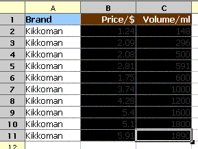
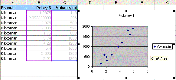
Use the data from Wednesday and Excel to make an XY Scatter Graph of the Price versus Volume data for Kikkoman Soy Sauce.
Do not worry if you are missing data for some rows, do the best you can with the information reported in class Wednesday. If you have rows for which you do not have data, DELETE (or do not type) those rows. The XY Scatter graph cannot have blank rows.
| Brand | Mean Price in dollars | Volume in ml |
|---|
| Kikkoman | | 148 |
| Kikkoman | | 296 |
| Kikkoman | | 500 |
| Kikkoman | | 591 |
| Kikkoman | | 600 |
| Kikkoman | | 1000 |
| Kikkoman | | 1200 |
| Kikkoman | | 1600 |
| Kikkoman | | 1800 |
| Kikkoman | | 1890 |
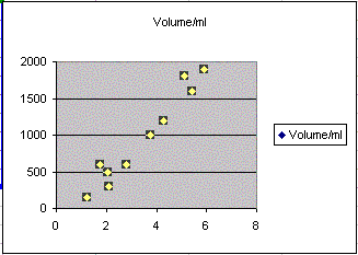
Use Excel to make an XY Scatter Graph of the mean price and volume date. Select ONLY the rightmost two columns: select only the price and volume columns. Bear in mind that your data will differ from the example below.If you succeed in making an XY Scatter graph, it will look something like the image below on the right.
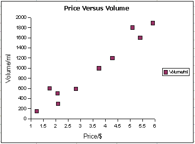
After you make the graph, try to decide if the graph shows a linear, non-linear, or random relationship:
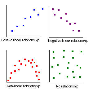
Is the graph roughly linear, non-linear, or completely random? _________________________
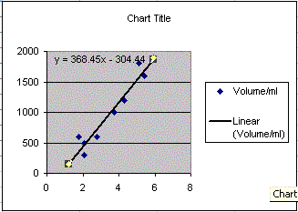
Equation of the Least Squares Line
Is there a relationship between the price of Kikkoman and the volume? Could you imagine a line going through the middle of the points? These lines are called best fit lines or least squares lines by statisticians. Excel calls them trend lines. The least squares line can be thought of as the line that runs "down the middle" splitting the data equally left and right while capturing the general direction of the data.
- Use the XY Scatter graph you made. Click on the chart and then single click on a data point. All of the data points should "light up" (become selected).
- With the data points selected, choose Add trendline from the Chart menu. Add trendline might be "hidden." Hold the menu "open" to make it appear.
- Choose a Linear trend line.
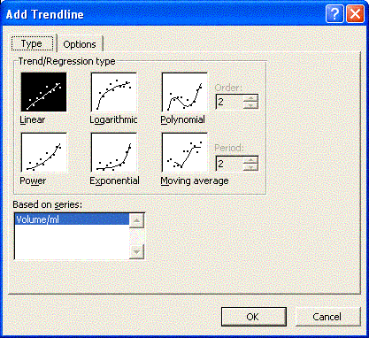
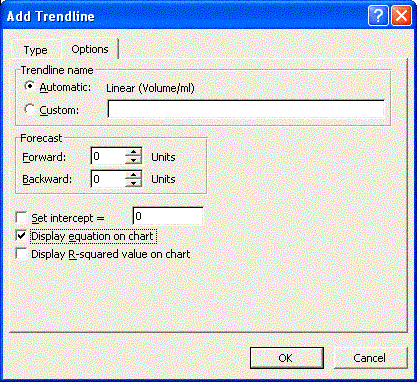
- There is an Options tab at the top of the Add trend line dialog box. Click on the Options tab. Near the bottom is a check box to show the equation. Click on it. Click on OK. If you have succeeded you see something that looks like, with different numbers: