Pairs Slope Intercept Correlation Coefficient of Determination
Paired Data and Scatter Diagrams
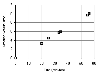
A runner runs from the College of Micronesia-FSM National campus to PICS via the powerplant/Nahnpohnmal back road. The runner tracks his time and distance.
| Location | Time x (minutes) | Distance y (km) |
|---|---|---|
| College | 0 | 0 |
| Dolon Pass | 20 | 3.3 |
| Turn-off for Nahnpohnmal | 25 | 4.5 |
| Bottom of the beast | 33 | 5.7 |
| Top of the beast | 34.5 | 5.9 |
| Track West | 55 | 9.7 |
| PICS | 56 | 10.1 |
Is there a relationship between the time and the distance? If there is a relationship,
then data will fall in a patterned fashion on an xy graph. If there is no relationship,
then there will be no discernable "shape" to the pattern of the data on a graph.
If the relationship is linear, then the data will fall roughly along a line. Plotting the
above data yields the following graph:
The data falls roughly along a line, the relationship appears to linear. If we can determine a line that best fits the points plotted above, we can use the equation to predict how long it will take the runner to cover distances not included in the table above, such as five kilometers. In the image below a "best fit line" has been added to the graph along with an equation for the line.
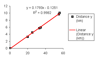
The graph also gives us an equation for the line in the form y = mx + b.
Using the y = mx + b equation we make predictions about how far the runner will travel given a time, or how long the runner will runner given a distance. For example, according the equation above, a 45 minute run will result in the runner covering 0.1793*45 - 0.1251 = 7.94 kilometers. Using the inverse of the equation we can predict that the runner can run a five kilometer distance in 28.58 minutes (28 minutes and 35 seconds).
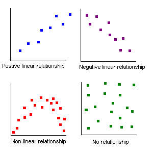
Relationships between two sets of data can be positive: the larger x gets, the larger y
gets.
Relationships between two sets of data can be negative: the larger x gets, the smaller y
gets.
Relationships between two sets of data can be non-linear
Relationships between two sets of data can be random: no relationship exists!
An example of a negative relationship would be the number of beers consumed by a student and a measure of the physical coordination. The more beers consumed the less their coordination!
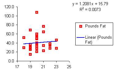
The following is a table from a sample of female students that gives their age and their pounds of fat.
| Age | 18 | 18 | 19 | 19 | 19 | 19 | 19 | 19 | 19 | 19 | 19 | 19 | 19 | 19 | 19 | 19 | 20 | 20 | 20 | 20 | 20 | 20 | 20 | 20 | 20 | 20 | 20 | 20 | 20 | 20 | 20 | 21 | 21 | 21 | 21 | 22 | 22 | 22 | 22 | 23 | 23 |
|---|---|---|---|---|---|---|---|---|---|---|---|---|---|---|---|---|---|---|---|---|---|---|---|---|---|---|---|---|---|---|---|---|---|---|---|---|---|---|---|---|---|
| Pounds Fat | 29.5 | 51.6 | 14.9 | 25.7 | 26.4 | 29.0 | 29.8 | 29.9 | 30.8 | 30.9 | 33.5 | 35.1 | 36.2 | 36.8 | 37.0 | 69.0 | 20.6 | 27.7 | 28.2 | 33.2 | 33.4 | 36.5 | 39.3 | 39.4 | 40.2 | 48.9 | 50.4 | 56.7 | 57.8 | 59.7 | 107.8 | 22.7 | 34.2 | 65.0 | 76.9 | 28.1 | 34.8 | 37.2 | 38.3 | 28.0 | 46.8 |
Is there a relationship between the age of a female student at COMFSM and the pounds of fat? Prediction: Can we use our data to predict a pounds of body fat based on age alone? If we plot the points on an xy graph using Excel, the data does not appear to be strongly linear. The data appears to be scattered randomly about the graph. Although Excel is able to give us a "best fit line," we will later have to consider whether the relationship is "strong" enough to make the equation useful.
The "best fit lines" that Excel generates are called "least squares lines" by statisticians. The least squares line can be thought of as the line that runs "down the middle" splitting the data equally left and right while capturing the directionality of the data.
We use Excel or we use a calculator to find the best fit line.
To get the slope m with an Excel function:
= SLOPE(y values, x values)
Note: Yep, it's backwards! Use insert: function to keep from messing up!
To get the intercept b:
= INTERCEPT (y values, x values)
Note that intercept also reverses the order of the x and y values!
Another way to get a least squares line with Excel:
Make an xy (scatter chart) graph the data, click on the data points, and then add trendline: Linear. This operation will differ between Excel 95 and Excel 95/2000.
In 95 you must double click the chart to "open it." Then you click the data points. Add trendline is on the Insert menu.
In Excel 97 and Excel 2000 you only need to single click the chart and then single click the data points. Add trendline is on the chart menu!
In both versions you must click on the Options tab to add the equation of the line.
Some calculators will generate a best fit line. Be careful. In MS 100 straight lines had the form y = mx + b where m was the slope and b was the y-intercept. In statistics lines are described using the equation y = a + bx. Thus b is the slope! And a is the y-intercept! You would not need to know this but your calculator will likely use b for the slope and a for the y-intercept. The exception is some TI calculators that use SLP and INT for slope and intercept.
Our line does not say how good the fit is (or how bad), but it is a start.
Can't go beyond the minimum or maximum x values and make meaningful predictions. The equation predicts that a five year old will have 21.8 pounds of fat. Given that five year olds typically weigh about thirty-five to fifty pounds, this would imply that five year olds are expected to be on the order of 50% fat or more. This is usually not the case. A thirty-five pound five year was measured recently and she turned out to have only 2.6 pounds of body fat on her 35.2 pound body.
No causation implied. Our line does not say causation: Your age does not cause your pounds of body fat, nor does time "cause" distance for the runner.
Studies in the mid 1800s of Micronesia would have shown of increase each year in church attendance and sexually transmitted diseases. That does not mean churches cause STDs! What the data is revealing is a common variable underlying our data: foreigners brought STDs and churches. We are simply measuring the common impact of the increasing impact of foreigners.
None of the above tells us how "good" a fit we have to our data. The runner's data fell close to the line, the pounds of fat data fell farther from the line.
We use a number called the Pearson product-moment correlation coefficient r to tell us how well the data fits to a straight line.
The Pearson product-moment correlation coefficient r (or just correlation r) values that result from the formula are always between -1 and 1. One is perfect positive linear correlation. Negative one is perfect negative linear correlation. If the correlation is zero or close to zero: no linear relationship between the variables.
A guideline to r values:
- 1.0 Perfect negative linear correlation (perfect has to be perfect: -0.99 is very
high but not perfect)
- 0.9 Very high negative linear correlation
- 0.8 High negative linear correlation
- 0.5 Moderate negative linear correlation
- 0.3 Low negative linear correlation
0.0 No correlation: random correlation
0.3 Low positive linear correlation
0.5 Moderate positive linear correlation
0.8 High positive linear correlation
0.9 Very high positive linear correlation
1.0 Perfect positive linear correlation (perfect has to be perfect: 0.99 is very high but
not perfect)
Excel has a function for correlation:
= CORREL (y values, x values)
The coefficient of determination, r², is a measure of how much of the variation in the independent x variable "explains" the variation in the dependent y variable. This does NOT imply causation. In Excel:
= (Correl(y values, x values))^2
The result, which is between 0 and 1 inclusive, is often expressed as a percentage.
Imagine a Yamaha outboard motor fishing boat sitting out beyond the reef in an open ocean swell. The swell moves the boat gently up and down. Now suppose there is a small boy moving around in the boat. The boat is rocked and swayed by the boy. The total motion of the boat is in part due to the swell and in part due to the boy. Maybe the swell accounts for 70% of the boat's motion while the boy accounts for 30% of the motion. A model of the boat's motion that took into account only the motion of the ocean would generate a coefficient of determination of about 70%.