Mathematically equally likely outcomes usually produce symmetric distributions. Simple probabilities of a single coin or single die are uniform in their shape. The probabilities of multiple coins or dice form a symmetric heap that is called a binomial distribution. As the number of dice and pennies increase, the distribution approaches a shape we will later learn to call the "normal" distribution.
Distributions based on relative frequencies can have a variety of shapes, symmetrical or non-symmetrical.
The shape of the distibution of a sample is often reflective of the shape of the distribution of a population. If the sample is a good, random sample, then the shape of the sample distribution is a good predictor of the shape of the population distribution.
A probability distribution usually refers to a relative frequency histogram drawn as a line chart.
Both discrete and continuous variables can have a probability distribution. Intervals (or bins or classes) can be constructed, relative frequencies (or probabilities) can be calculated and a relative frequency histogram can be drawn. If the data is continuous, then a mean can be calculated for the data from the original data. There is also a way to recover the mean from the bin values and the probabilities, although this depends on the bin values being treated as being a part of a continuous distribution. In later chapters the columns of the histogram chart will be replaced by a line, specifically a "heap" or "mound" shaped line. The diagrams further below show how one might move from a column chart representation of data to a line chart representation.
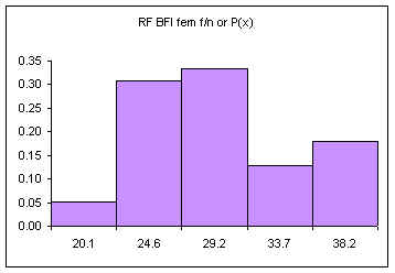
The following data consists of 39 body fat measurements for female students at the College of Micronesia-FSM Summer 2001 and Fall 2001. Following the table is a relative frequency histogram, the probability distribution for this data.
| BFI fem CUL x |
Frequency f |
Relative Frequency f/n or P(x) |
|---|---|---|
| 20.1 | 2 | 0.05 |
| 24.6 | 12 | 0.31 |
| 29.2 | 13 | 0.33 |
| 33.7 | 5 | 0.13 |
| 38.1 | 7 | 0.18 |
| Sum (n): | 39 | 1.00 |
The area under the bars is equal to one, the sum of the relative frequencies. The above diagram consists of five discrete classes. Later we will look at continuous probability distributions using lines to depict the probability distribution. Imagine a line connecting the tops of the columns:
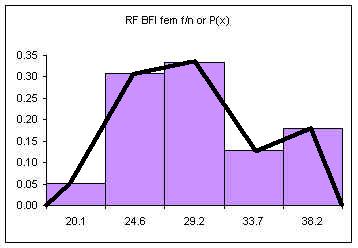
If the columns are removed and the class upper limits are shifted to where the right side of each column used to be:
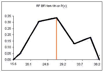
The orange vertical line has been drawn at the value of the mean. This line splits the area under the "curve" in half. Half of the females have a body fat measurement less than this value, half have a body fat measurement greater than this value.
We could also draw a vertical line that splits the area under the curve such that we have ten percent of the area to the left of the orange line and ninety percent to the right of the orange line. This line would be at the value below which only ten percent of the measurements occur.
In some situations we have only the intervals and the frequencies but we do not have the original data. In these situations it would be useful to still be able to calculate a mean and a standard deviation for our data.
If we only have the intervals and frequencies, then we can calculate both the mean and the standard deviation from the class upper limits and the relative frequencies. Here is the mean and standard deviation for the sample of 39 female students:
| BFI fem CUL x |
Frequency f |
Relative Frequency f/n or P(x) | Mean μ: ∑(x*P(x)) |
stdev σ: √(∑((x-μ)˛*P(x))) |
|---|---|---|---|---|
| 20.1 | 2 | 0.05 | 1.03 | 4.52 |
| 24.6 | 12 | 0.31 | 7.58 | 7.29 |
| 29.2 | 13 | 0.33 | 9.72 | 0.04 |
| 33.7 | 5 | 0.13 | 4.32 | 2.23 |
| 38.1 | 7 | 0.18 | 6.86 | 13.56 |
| Sum: | 39 | 1.00 | μ = 29.51 | ∑ = 27.64 |
| σ = 5.26 |
A spreadsheet with the above data is available at:
http://www.comfsm.fm/~dleeling/statistics/statistics_fall2001.xls
Note that the results are not exactly the same as those attained by analyzing the data directly. Where we can, we will analyze the original data. This is not always possible. The following table was taken from the 1994 FSM census. Here the data has already been tallied into intervals, we do not have access to the original data. Even if we did, it would be 102,724 rows, too many for some of the computers on campus.
| Age x | Total f | Relative frequency f/n or P(x) | x*P(x) | (x-μ)²*P(x) |
|---|---|---|---|---|
| 4 | 14662 | 0.14 | 0.57 | 57.78 |
| 9 | 15090 | 0.15 | 1.32 | 33.58 |
| 14 | 14944 | 0.15 | 2.04 | 14.90 |
| 19 | 12425 | 0.12 | 2.30 | 3.17 |
| 24 | 9192 | 0.09 | 2.15 | 0.00 |
| 29 | 7042 | 0.07 | 1.99 | 1.63 |
| 34 | 6800 | 0.07 | 2.25 | 6.46 |
| 39 | 5998 | 0.06 | 2.28 | 12.93 |
| 44 | 3131 | 0.03 | 1.34 | 12.05 |
| 49 | 3601 | 0.04 | 1.72 | 21.70 |
| 54 | 2271 | 0.02 | 1.19 | 19.74 |
| 59 | 2089 | 0.02 | 1.20 | 24.74 |
| 64 | 1978 | 0.02 | 1.23 | 30.62 |
| 69 | 1308 | 0.01 | 0.88 | 25.65 |
| 74 | 1169 | 0.01 | 0.84 | 28.31 |
| 79 | 544 | 0.01 | 0.42 | 15.95 |
| 84 | 313 | 0.00 | 0.26 | 10.93 |
| 89 | 99 | 0.00 | 0.09 | 4.06 |
| 94 | 56 | 0.00 | 0.05 | 2.66 |
| 98 | 12 | 0.00 | 0.01 | 0.64 |
| Sums: | 102724 | 1 | 24.12 | 327.50 |
| sqrt: | 18.10 |
The mean μ = 24.12
The population standard deviation σ = 18.10
The result is an average age of 24.12 years for a resident of the FSM in 1994 and a standard deviation of 18.10 years. This means at least half the population of the nation is under 24.12 years old! Actually, due to the skew in the distribution, fully 56% of the nation is under 19. Bear in mind that 56% is in school. That means we will need new jobs for that 56% as they mature and enter the workplace. On the order of 57,121 new jobs.
How old are you? Below, at, or above the mean (average)? Do you have a job?
Note we used the class upper limits to calculate the average age. Potentially this inflates the national average by as much as half a class width or 2.5 years. Taking this into account would yield an average age of 21.62 years old.
There is one more small complication to consider. Since the population of the FSM is growing, the number of people at each age in years is different across the five year span of the class. The age groups at the bottom of the class (near the class lower limit) are going to be bigger than the age groups at the top of the class (near the class upper limit). This would act to further reduce the average age.
Homework: Use the 2000 Census data to calculate the mean age in the FSM in 2000.
| Age | 2000 |
|---|---|
| 4 | 14782 |
| 9 | 14168 |
| 14 | 14213 |
| 19 | 13230 |
| 24 | 9527 |
| 29 | 7620 |
| 34 | 6480 |
| 39 | 6016 |
| 44 | 5560 |
| 49 | 4650 |
| 54 | 3205 |
| 59 | 1903 |
| 64 | 1733 |
| 69 | 1487 |
| 74 | 993 |
| 79 | 1441 |
Alternate Homework:
Use the following data to calculate the overall grade point average and standard deviation of the grade point data for the Pohnpeian students at the national campus during the terms Fall 2000 and Spring 2001
| Grade Point Value x |
Frequency f |
Relative Frequency f/n or P(x) |
Mean: ∑(x*P(x)) |
stdev: √(∑((x-μ)˛*P(x))) |
|---|---|---|---|---|
| 4 | 851 | ______ | ______ | ______ |
| 3 | 1120 | ______ | ______ | ______ |
| 2 | 1023 | ______ | ______ | ______ |
| 1 | 459 | ______ | ______ | ______ |
| 0 | 690 | ______ | ______ | ______ |
| Sums: | ______ | ______ | ______ | ______ |
| Sqrt: | ______ |