The grid consists of:
| A | B | C | D | E | F | G | H | I | J | K | |
|---|---|---|---|---|---|---|---|---|---|---|---|
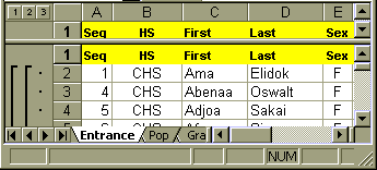
| 1 | Seq | HS | First | Last | Sex | St | Lang | Elem | List | Read | Struct |
| 2 | 1 | CHS | Ama | Elidok | F | C | Puluwatese | Puluwat | 610 | 620 | 590 |
| 3 | 2 | CHS | Abenaa | Oswalt | F | C | Chuukese | Sino Memorial | 560 | 550 | 570 |
| 4 | 3 | CHS | Afua | Siyow | F | C | Chuukese | Houk | 530 | 520 | 530 |
| 5 | 4 | CHS | Kofi | Jacob | M | C | Mortlockese | Iras | 410 | 400 | 400 |
| 6 | 5 | CHS | Adjoa | Sakai | F | C | Chuukese | Iras | 520 | 530 | 540 |
| 7 | 6 | CHS | Kwasi | Likiaksa | M | C | Puluwatese | St. Cecelia | 390 | 370 | 410 |
Scroll down to row 30, click in cell A30 and enter the following data:
30 29 KHS Kweku George M K Kosraen Malem 470 480 460 After typing a cell entry, press the Tab key to move to the next cell to the right. To move to the left press shift-tab.
When a spreadsheet is designed for data the menu item Data: Sort will detect the field names and offer to sort by field name.
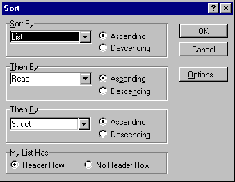
Click on OK.
A sort can be done on any column. When done on a TOEFL score column, sorting allows determination of the high, low, and median score at a glance.
To copy the formula down the L column there are at least THREE methods: 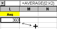
Other functions that could be put in L2 (or any other column to the right) and filled down include:
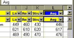
=average(i2:k2) Finds the mean of the values in the range.
=count(i2:k2) The number of cells containing values in the range.
=max(i2:k2) Displays the smallest value in the range.
=median(i2:k2) Returns the median of the range.
=min(i2:k2) Displays the smallest value in the range.
=mode(i2:k2) Returns the most common value in a range.
=stdev(i2:k2) Displays the standard deviation of the range.
=sum(i2:k2) Returns the sum of the values in a range.
In the event that one needs to weight a cell differently, arithmetic operators can be used with cell addresses to accomplish this task. The five operators are:
Weighted averages can also be calculated. Suppose one wants to double the weight on the reading score in order to calculate the average. Then the following formula would be used in L2:
=(2*i2+j2+k2)/4
Do not forget the leading equals sign!
The status bar at the bottom of the Excel window will tally sums and averages for selected cells. Right clicking on the value displayed causes the display of a menu that lets one change the tallying function. By setting the task bar to average and selecting all the individual averages we can obtain the overall average for all students.
Notes: Included in the Excel workbook are other sample spreadsheets. The tabs Gradebook
and Pers exhibit spreadsheets that are structurally similar to the Entrance spreadsheet.
The Gradebook spreadsheet has the following structure: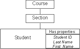
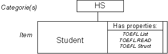
A. An Excel Workbook is comprised of one or more worksheets. Our workbook is called Data. Our worksheet is called Entrance.
B. If the average function is not already in column K, click in cell i2 and enter =AVERAGE(i2:k2)
Fill down to L30.
C. Click on the cell M1 and enter the word IEP
| A | B | C | D | E | F | G | H | I | J | K | L | M | |
|---|---|---|---|---|---|---|---|---|---|---|---|---|---|
| 1 | Seq | HS | First | Last | Sex | St | Lang | Elem | List | Read | Struct | Avg | IEP |
| 2 | 1 | CHS | Ama | Elidok | F | C | Puluwatese | Puluwat | 610 | 620 | 590 | ||
| 3 | 2 | CHS | Abenaa | Oswalt | F | C | Chuukese | Sino Memorial | 560 | 550 | 570 | ||
| 4 | 3 | CHS | Afua | Siyow | F | C | Chuukese | Houk | 530 | 520 | 530 | ||
| 5 | 4 | CHS | Kofi | Jacob | M | C | Mortlockese | Iras | 410 | 400 | 400 | ||
| 6 | 5 | CHS | Adjoa | Sakai | F | C | Chuukese | Iras | 520 | 530 | 540 | ||
| 7 | 6 | CHS | Kwasi | Likiaksa | M | C | Puluwatese | St. Cecelia | 390 | 370 | 410 |
The If-Then function consists of three parts: a condition, what to do when the condition is true, what to do when the condition is false. The structure of the function is as follows: =IF(condition,true,false). Note that the three parts are separated by a comma. In the If-Then function letters of the alphabet must be surrounded by quotes, numbers do not need to be surrounded by quotes.
Note that the above function is not accurate. There are more than two possible destinations for students. State campus, IEP, and national campus. To handle more than two outcomes we can use a nested If-Then function.
In the following exercise, the students below 300 on the TOEFL will be assigned a 0, the students eligible for the IEP will be assigned a 1, students eligible for the national campus and needing EN 079 will be assigned a 2, and students eligible for the national campus and not needing EN 079 will be assigned a 3.
Click on the cell N1 and enter the word Eng
The following is a nested If-Then function. The nested If-Then function parses data in data bins. We will use a nested If-Then function to automatically assign a grade point value to each average.
1. Type the following function into N2 being careful to include each comma and parentheses:
=IF(L2<400,0,IF(L2<470,1,IF(L2<550,2,3)))
| A | B | C | D | E | F | G | H | I | J | K | L | M | N | |
|---|---|---|---|---|---|---|---|---|---|---|---|---|---|---|
| 1 | Seq | HS | First | Last | Sex | St | Lang | Elem | List | Read | Struct | Avg | IEP | Eng |
| 2 | 1 | CHS | Ama | Elidok | F | C | Puluwatese | Puluwat | 610 | 620 | 590 | Natl | ||
| 3 | 2 | CHS | Abenaa | Oswalt | F | C | Chuukese | Sino Memorial | 560 | 550 | 570 | Natl | ||
| 4 | 3 | CHS | Afua | Siyow | F | C | Chuukese | Houk | 530 | 520 | 530 | Natl | ||
| 5 | 4 | CHS | Kofi | Jacob | M | C | Mortlockese | Iras | 410 | 400 | 400 | IEP | ||
| 6 | 5 | CHS | Adjoa | Sakai | F | C | Chuukese | Iras | 520 | 530 | 540 | Natl | ||
| 7 | 6 | CHS | Kwasi | Likiaksa | M | C | Puluwatese | St. Cecelia | 390 | 370 | 410 | IEP |
2. The above is a nested If-Then function. For those who have worked in other computer languages, the above is equivalent to:
  If L2 < 400
  Then N2 = 0
  Else If L2 <470
    Then N2 = 1
    Else If L2 < 550
      Then N2 = 2
      Else N2 = 3
      End If
    End If
  End If
Thus if L2 is less than 400 then N2 is assigned a value of 0 and the rest of the decision tree is not executed. If L2 is 400 or higher, the second If-Then condition is checked and so forth.
3. Fill the formula in N2 down to N30 by the method of your choice. The result is that Excel has assigned a numeric value for each student's entrance program. The use of numbers is intentional: words could have been used but the frequency function, which we will look at later, cannot handle alpha characters, hence the choice to use numeric values in column N.
This nested function is still NOT fully correct. To enter the IEP and the national campus the student must score above 400 in each individual TOEFL subcategory (Listening, Reading, and Structure). This requires either deeper nesting levels or the use of conditional operations such as the AND operator. Math scores also need to be taken into account. If your needs appear to be this complex, please contact me individually.
The syntax for choose is =choose(n,firstItem,secondItem,thirdItem,fourthItem,…) where n must be a cell address that contains an integer. The nth item is chosen by the integer. In cell O1 type "Status".
1. Click in cell O2.
Enter =CHOOSE(N2+1,"SC","IEP","Natl 079","Natl")
Note the N2+1: there is no zeroth item allowed in choose. The N2+1 converts a value of 0 to 1 (there is no zeroth element of a list in Excel.)
2. Fill down to O30.
| A | B | C | D | E | F | G | H | I | J | K | L | M | N | O | |
|---|---|---|---|---|---|---|---|---|---|---|---|---|---|---|---|
| 1 | Seq | HS | First | Last | Sex | St | Lang | Elem | List | Read | Struct | Avg | IEP | Eng | Status |
| 2 | 1 | CHS | Ama | Elidok | F | C | Puluwatese | Puluwat | 610 | 620 | 590 | Natl | 3 | Natl | |
| 3 | 2 | CHS | Abenaa | Oswalt | F | C | Chuukese | Sino Memorial | 560 | 550 | 570 | Natl | 3 | Natl | |
| 4 | 3 | CHS | Afua | Siyow | F | C | Chuukese | Houk | 530 | 520 | 530 | Natl | 2 | Natl 079 | |
| 5 | 4 | CHS | Kofi | Jacob | M | C | Mortlockese | Iras | 410 | 400 | 400 | IEP | 1 | IEP | |
| 6 | 5 | CHS | Adjoa | Sakai | F | C | Chuukese | Iras | 520 | 530 | 540 | Natl | 2 | Natl 079 | |
| 7 | 6 | CHS | Kwasi | Likiaksa | M | C | Puluwatese | St. Cecelia | 390 | 370 | 410 | IEP | 0 | SC |
Note that in the above example O7 corrects the error in the assignment of Kwasi Likiaksa given in M7.
The spreadsheet Day name is an example of a complex nested use of both the If-Then function and the Choose function. One way to learn new techniques is to dissect the work of others, the Day name spreadsheet is designed with that intent. The spreadsheet will also tell you your African day name. U.N. Secretary General Kofi Annan, for example, was born on a Friday.
1. Inserting a new worksheet in the workbook
2. The basic frequency function syntax is =FREQUENCY(dataCells:binCells)
The syntax if the data and the bins are on different worksheets is
=FREQUENCY(workSheetName!dataCells:workSheetName!binCells)
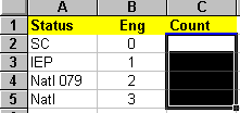
| A | B | C | |
|---|---|---|---|
| 1 | Status | Eng | Count |
| 2 | SC | 0 | |
| 3 | IEP | 1 | |
| 4 | Natl 079 | 2 | |
| 5 | Natl | 3 |
3. Labelling
- In A1 type the word Status.
- In B1 type the letters Eng
- In C1 type the word Count.
4. In the cells A2 to A5 enter SC, IEP, Natl 079, and Natl.
5. In the cells B2 to B5 enter 0, 1, 2, 3.
6. The frequency function we will be using is an "array" function which means it will occupy more than one cell. We must select all of the cells the frequency function will occupy.
Select the cells C2 to C5. It ought to look something like this:
7. Type =frequency(
8. then left click with the mouse on the Entrance worksheet tab
9. Drag the mouse to select N2 to N30 on the Entrance worksheet. Dragging can be done either from the top to the bottom or the bottom to the top: from N2 to N30 or N30 to N2. Dragging from the bottom sometimes help control "overshoot."
10. Type a comma ,
11. left click on the Dist worksheet tab
12. Drag the mouse to select B2 to B5
13. Type a close parentheses ). The result, if the worksheets were named Entrance and Dist, will be as seen below except that the N29 will be N30:
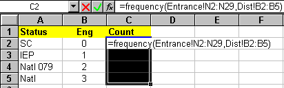
14. Hold down the control and the shift key, then with the control (Ctrl) and shift key still down, press the enter key. The Control-Shift-Enter key combination tells Excel that the formula is an array and to enter the formula into all the selected cells. If you make an entry error with an array function, you cannot edit an individual cell: the formula is in no one cell. Deleting and re-entering the array formula is the easiest way to fix an error in an array formula.
15. When you have done the above, the formula you will have constructed will look like =FREQUENCY(Entrance!N2:N30,Dist!B2:B5).
When viewed in the cell Excel will add brackets to remind you that the formula is an array formula: {=FREQUENCY(Entrance!N2:N30,Dist!B2:B5)}
H. The reason for using the frequency function is that the function creates a dynamic distribution. Try going to the Entrance worksheet and changing a student’s TOEFL numbers, then return to the Dist worksheet and note that the change is reflected in the counts.
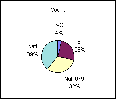
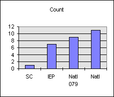
Design for charting is like designing for data. Include a field name row at the top of the data. Make the leftmost ("first") column a column of labels. The Dist worksheet is set up this way already. The counts in your spreadsheet may be different.
| Status | Eng | Count |
|---|---|---|
| SC | 0 | 1 |
| IEP | 1 | 5 |
| Natl 079 | 2 | 12 |
| Natl | 3 | 10 |
1. What many call a "bar chart" Excel calls a "Column chart" or column graph.
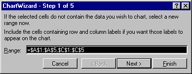
2. To make a column chart, select the cells A1 to A5.
3. Hold down the Control (Ctrl) key and select the cell C1 to C5. The control key allows the selection of non-adjacent data. Always include all label rows and columns in the selection, this will cause automatic labeling of the chart axes.
2. Click on the Chart wizard button in the tool bar
.
3. Drag the mouse to form a small dotted line square on the worksheet to set the location of the chart on the worksheet. Releasing the mouse should cause a chart wizard dialog box to pop up.
4. Click on Next to leave step 1.
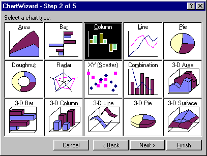
5. Click on Column chart option in the middle of the top row of step 2 and then on Next.
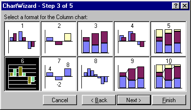
6. Click on format option 6 in the upper left corner of step 3 for a basic column chart and then on Next.
7. This first of two options dialog boxes is important. This is where one can specify whether the data is in rows or columns. If one has more than one label row or column, this is the place to specify multiple label rows or columns. We have only one label column if we used the Control key properly. Excel should have chosen the following set-up:
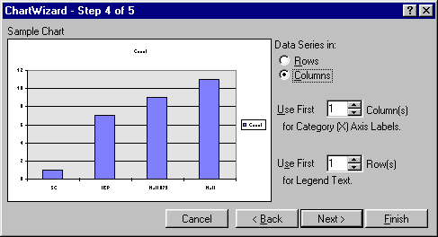
If not, then adjust the settings to match the above dialog box.
Click on Next.
8. In step 5 options dialog box select No under "Add a legend?" For a single data set a legend is unnecessary. If desired, type in a chart title, x-axis and y-axis label. Click on finish.
9. If the Pie chart option had been taken at step 2, then a pie chart would have been the result. The pie chart option 7 includes percentages.
1. To make a pie chart, select the data including the field names row and the labels column.
2. Click on the Chart wizard button in the tool bar.
3. Drag the mouse to set the location of the chart on the worksheet.
State Pop Chuuk 52870 Kosrae 7354 Pohnpei 33372 Yap 11128 4. Click on Next.
5. Click on pie chart option and then on Next.
6. Click on option 7 for a basic labeled pie chart and then on Next.
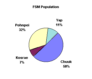
7. This first of two options dialog boxes is important. This is where one can specify whether the data is in rows or columns. If one has more than one label row, this is the place to specify multiple label rows. It is likely that no adjustments need to be done for this graph: Excel will likely "guess" correctly based on the existence of a field name row and the labels column. Click on Next when done.
8. In this second options dialog box select No under "Add a legend?" For a single data set a legend is unnecessary. Type in a chart title. Click on finish.
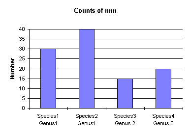
9. Displayed is a table and column chart with two label columns.
Genus Species Number Genus1 Species1 30 Genus1 Species2 40 Genus 2 Species3 15 Genus 3 Species4 20
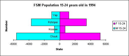
| State | M 15-24 | F 15-24 |
|---|---|---|
| Chuuk | -5603 | 5261 |
| Kosrae | -684 | 688 |
| Pohnpei | -3680 | 3473 |
| Yap | -1054 | 1174 |
1. There are many types of charts available. The math teacher is likely to find the x-y scatter diagrams useful for graphing functions. Put the x values in the first column and the y-values or a function in the second column. Excel will, with a little thought, make specialty graphs that are not immediately evident from an inspection of the chart wizard. In attempt to stretch thinking, the following will produce a population pyramid type chart.
2. Select the data including the field names row and the labels column. Note the use of negative values for the first column.
3. Click on the Chart wizard button in the tool bar.
4. Drag the mouse to set the location of the chart on the worksheet.
5. Click on Next.
6. Click on Bar chart option and then on Next.
7. Click on option 8 for then on Next.
8. This first of two options dialog boxes is important. This is where one can specify whether the data is in rows or columns. If one has more than one label row, this is the place to specify multiple label rows. It is likely that no adjustments need to be done for this graph: Excel will likely "guess" correctly based on the existence of a field name row and the label column. Click on Next when done.
9. In this second options dialog box select Yes under "Add a legend?" The wizard may already have selected yes. For two or more data columns a legend is informative. A field name row is necessary for Excel to correctly set up the legend. Type in a chart titled, x-axis, and y-axis labels. Click on finish.
10. Double-click on the chart to select the chart. A hashed line should appear around the chart, or, alternatively, the chart should appear in its own window. Excel is now in graphing mode. The menus are different in graphing mode. This modality (regular versus graphing) is a source of confusion for many learning to use Excel. From the Format menu choose Chart Type.
11. Click on the Options button in the Chart Type dialog box.
12. Click on the Options tab at the top of the Format Bar Group dialog box.
13. Set the Overlap to 100 and the gap width to 0. Click on OK. Click outside the area of the graph to turn off the hash mark border. This also takes Excel out of the graphing mode and into the regular mode.
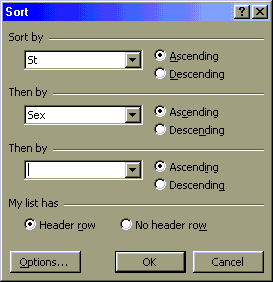
A. Suppose we wanted to know whether our TOEFL averages differed from one state to the next or wanted to know the relative TOEFL performance of the students by state or gender. Excel can sort and summarize such data using subtotals.
B. In order for Excel to generate subtotals the data must be sorted by the criterion to be summarized.
C. Set up the subtotals. 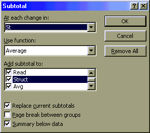
D. Note the change in the worksheet: a new panel has appeared on the left, the subtotals control panel. There are three levels shown at the top by three numbered buttons. Click on button number 1 to see only the Grand Average.
E. Click on button number 2 to see the individual state averages. Note the buttons with the plus signs. Clicking on a plus sign button opens up the details for that section. After clicking on a plus button, a minus button appears. Click on the minus button to collapse the details.
F. Click on button number 3 to see the list of all states and all students.
G. Suppose we now wanted to see the overall student averages by sex. We must first remove the existing subtotals, resort by sex, and then reapply the subtotals. The key concept here is that the sort order must mirror the "subtotal at each change in" choice. Subtotals subtotal at each change as Excel moves down the list. If the students are not in gender order, then at each and every change of sex from row to row Excel will insert a subtotal. Subtotals on one field cannot be resorted on another without removing the subtotals first, hence the first step of removing the subtotals.
H. Set up the subtotals.
Filtering allows one to display subsets of the data based on specific condition. Suppose we want to display only the students whose TOEFL average is above 475.
Start filtering by removing the subtotals. Choose Subtotals on the Data menu and then click on the "Remove All" button.
Choose Sort on the Data menu and sort by last name and then by first name. Click on OK.
Scroll to the top of the worksheet. From the Data menu choose Filter. On the submenu that
pops up choose Autofilter. Small grey buttons with triangles in them should appear in the
top row of your spreadsheet (below left).
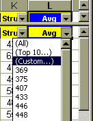
Click on the grey button in the L (Avg) column to see a "drop-down" list of options (above right). This list includes preset values one can select to filter the data. Choose (Custom…), the third item down the list. A dialog boxes similar to the one shown below should appear:
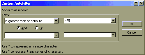
When using Excel 97 set up the dialog box as shown above.
The Excel 95 dialog box will look a little different. In Excel 95 Use the little "down triangle" button to the right of the equals sign in the first blank under the word "Avg" to choose a less than >= sign.
Type 475 in the next blank box as seen above. Click on OK.
The result is a list of students whose average is above 475. If one chooses print with a filter on then only the names shown will print.
Getting back all of your data: Choose Filter again from the Data menu and this time select "Show All" on the submenu.
Filters are another powerful use of Excel provided that your spreadsheet is set up in database format (field names in row one and no blank rows, one physical item per row in rows two and higher). Assets larger or smaller than a given number could be displayed, or students with a TOEFLs above or below a specific point could be shown. The "Top ten" filter option can display just that, the "top ten" in a category.
Using Excel to set up a pivot table to study course versus gender grade averages.
A. Pivot tables are easiest to set up when the spreadsheet is designed for data. Field names should be in row one of the table, with data below. There should be no blank rows within the data.
B. Pivot tables (known in Microsoft Access as a cross-tab table) groups data by two categories, producing summary information such as average, sum, or count according to two or more categorizations. As a part of this process, pivot tables have the ability to take categories in data rows and turn them into field names. The result feels like a "rotation" of the data, hence the name Pivot table. As an example, the data in columns A and B below is pivoted to produce the results in F3:G5.
| A | B | C | D | E | F | G | H | |
|---|---|---|---|---|---|---|---|---|
| 1 | State | Sex | T3 | Average of T3 | Sex | |||
| 2 | P | F | 80 | State | F | M | Grand Total | |
| 3 | P | M | 65 | C | 82.5 | 67.5 | 75 | |
| 4 | P | F | 70 | P | 75 | 70 | 72.5 | |
| 5 | P | M | 75 | Grand Total | 78.75 | 68.75 | 73.75 | |
| 6 | C | F | 95 | |||||
| 7 | C | M | 60 | |||||
| 8 | C | F | 70 | |||||
| 9 | C | M | 75 |
The result are averages based on state and sex. The data in the Sex column, F and M, have become field names in a new row one of a table. The data has, in a sense, been "pivoted" or "rotated" up out of a column and tabulated across in a new table (hence the use of "cross-tab" by Microsoft Access).
B. To start a pivot table in the Gradebook workbook, click anywhere inside the field row or the data rows of the Data worksheet. Do not select a cell, just have the cursor in a cell inside the data to be pivot tabled.
C. Choose Pivot Table from the Data menu.
D. Click on Next in the first dialog box. The default Microsoft Excel List or Database is usually selected and is the correct selection.
E. Click on Next in the second dialog box. If the spreadsheet is designed properly for data then Excel will have correctly detected the data range.
F. Dialog box three presents the screen where choices are made as to row and column groups. The dialog box may have a few additional field buttons not seen in the image as a result of work done earlier on the work book.
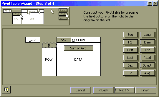
G. Double click on the Sum of Avg button in the Data layout area at the center of the
screen. From the PivotTable Field pop-up dialog box choose the function average. Note that
all of the basic functions are available including sum, average, and count among others.
These are the same functions we encountered on the first day. If the Number... button is
present, then the format of the numbers displayed can be set from the dialog box that this
button activates. Click on OK.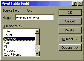
H. Click on Next in the Step 3 of 4 pivot table wizard.
I. The next dialog requests a location for the pivot table. Either use the worksheet scroll bar to scroll down to A55 or type A55 in the PivotTable Starting Cell box. Click on Finish.
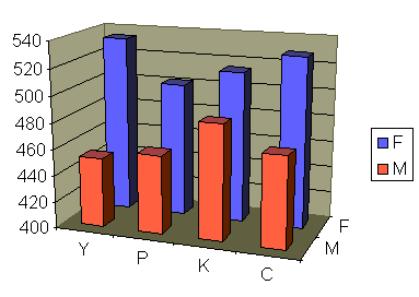
J. The data in the resulting PivotTable summarizes averages by state and sex for the fictional College of Micronesia-FSM spreadsheet.
K. To make the data more presentable:
L. The data in a pivot table can be graphed to produce charts as was covered in the second session.
If you are graphing pivot tables in Excel 97 please let me know. Excel 97, and probably Excel 2000, have an odd inability to select the labels in a pivot table. There is a work-around to this problem that I can cover with you one-on-one.
Note that in the particular chart shown above many adjustments have been made to the default chart settings for a 3-d column graph. Other adjustments include the gap width, gap depth, color choice, 3-D rotation and perspective values. Note too the adjusted the vertical scale: the gaps are smaller than the chart would suggest. The Chuukese male average is not less than half that of the Chuukese female, although the column is less than half as high.
Actually, the above chart was not done in Excel: it was done in Word using Microsoft Graph 5.0. Using Microsoft Graph 5.0 produces Word documents that are much smaller than those generated by embedding Excel charts in Word documents. Later the chart was image captured using Alt-PrtScn and pasting into Paint on a Windows 98 machine. Paint 98 can save GIFs, which is how the above image was placed into this HTML page!
M. Pivot tables are best produced by good data designs. In turn, good data designs are produced by considering the pivot table implications. Good design requires that each data row be a single object or instance, not a an aggregate of data. Gradebooks almost naturally generate good data designs: a single student in a single class per row (a "student-seat"). In other applications forethought may be necessary. In a study of lizards, for example, proper design of a good table is likely to involve listing each individual lizard in its own row. This would be as opposed to a table where each row was a location and the data was the number of lizards in that location. The following fictitious table is not well thought out from a pivot table perspective. For example, although the original tallies might have indicated the number of females with tails, the resulting table has lost that information. The design is also prone to typographical errors: examine the sum of the number of males and females on trees. This error (6 + 5 = 10 ) is an intentional error. Such an error could not occur when using the second table as no summary data is presented in that table.
| Location | Number of lizards |
Number of Females |
Number of Males |
Num w/ tail |
|---|---|---|---|---|
| Beach | 2 | 1 | 1 | 0 |
| Pond | 6 | 3 | 3 | 5 |
| River | 8 | 5 | 3 | 4 |
| Rock | 7 | 5 | 2 | 7 |
| Tree | 10 | 6 | 5 | 9 |
A better design would have been:
| Location | Sex | With Tail |
|---|---|---|
| Tree | F | 0 |
| Tree | F | 1 |
| Tree | F | 1 |
| Tree | F | 1 |
| Tree | F | 1 |
| Tree | M | 0 |
| Tree | M | 1 |
| Tree | M | 1 |
| Tree | M | 1 |
| Tree | M | 1 |
| Tree | M | 1 |
| Pond | F | 0 |
| Pond | F | 1 |
| Pond | F | 1 |
| Pond | M | 1 |
| Pond | M | 1 |
| Pond | M | 1 |
… and so forth. The resulting table can be subtotaled or pivoted to obtain accurate summary information. Although the original data table will be lengthy, most reports will use the results of subtotal calculations and pivot tables.